

A Filho do Padeiro—which means son of the baker—is a heartfelt continuation of a family tradition. The founder learned the craft of baking by his father’s side, mastering the art of slow, handmade bread and carrying it forward with care and ambition.
This project was a celebration of that legacy: the ancient art of bread-making, reimagined with a modern sensibility. I led the branding and creative direction to honour the essence of real, artisanal bread—fermented slowly with natural starters, shaped by hand, and rooted in patience and intention.
In a world that moves too fast, A Filho do Padeiro dares to move slower. The identity I created reflects that vision: warm, honest, and deeply human. Just like the bread it represents—nourishing not only the body, but also the relationships and rituals that bring people together.
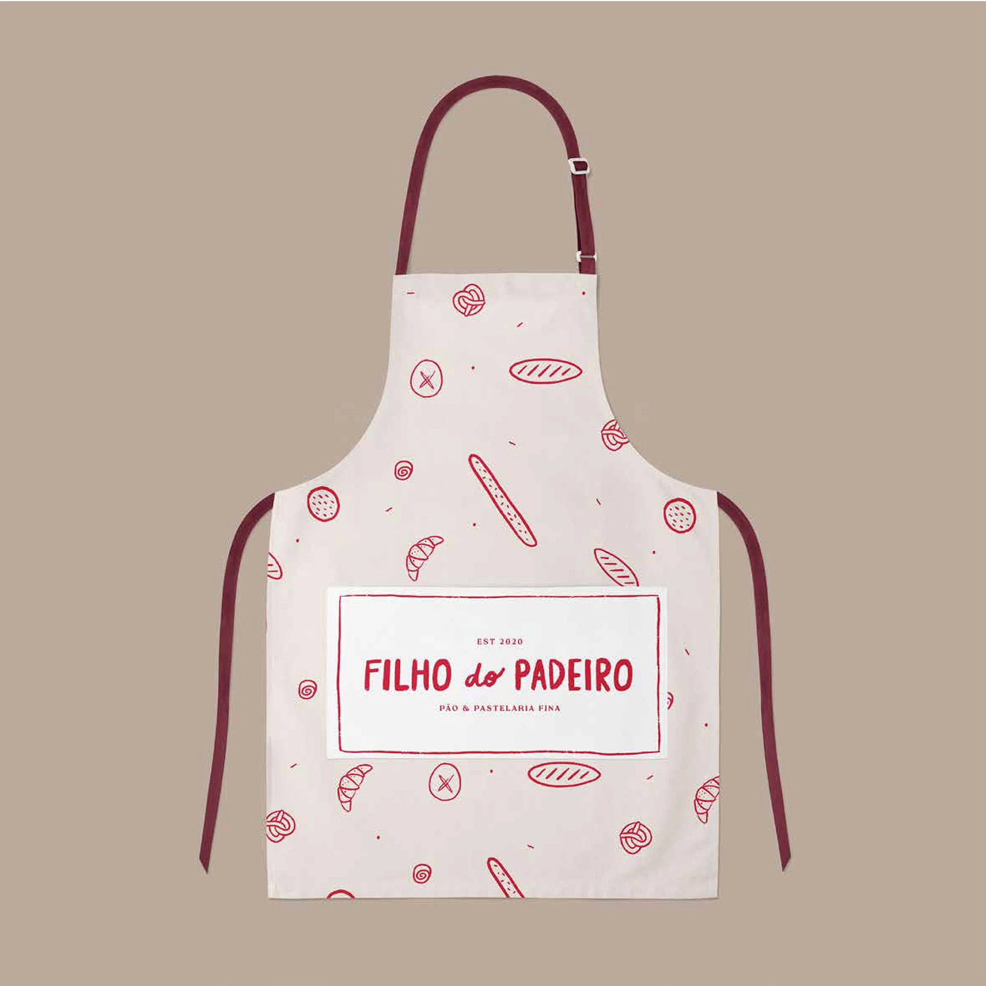
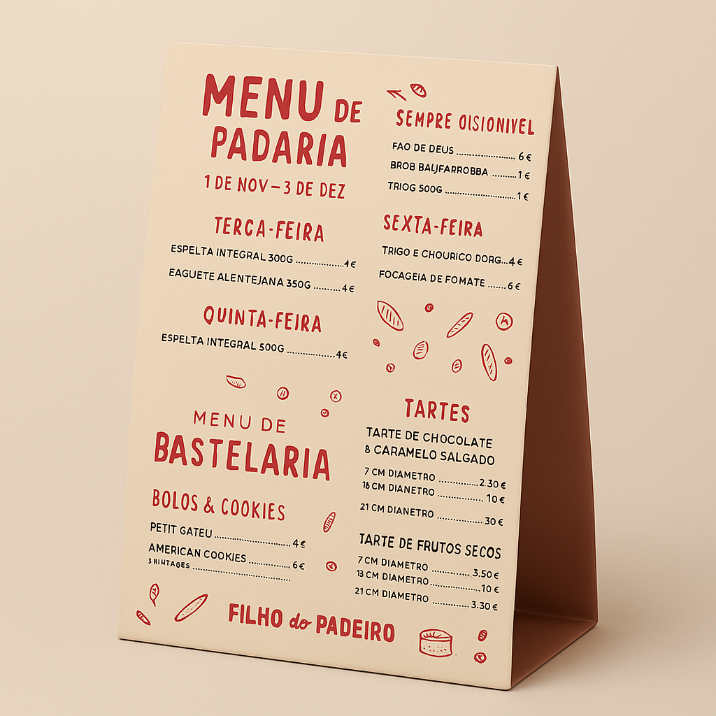
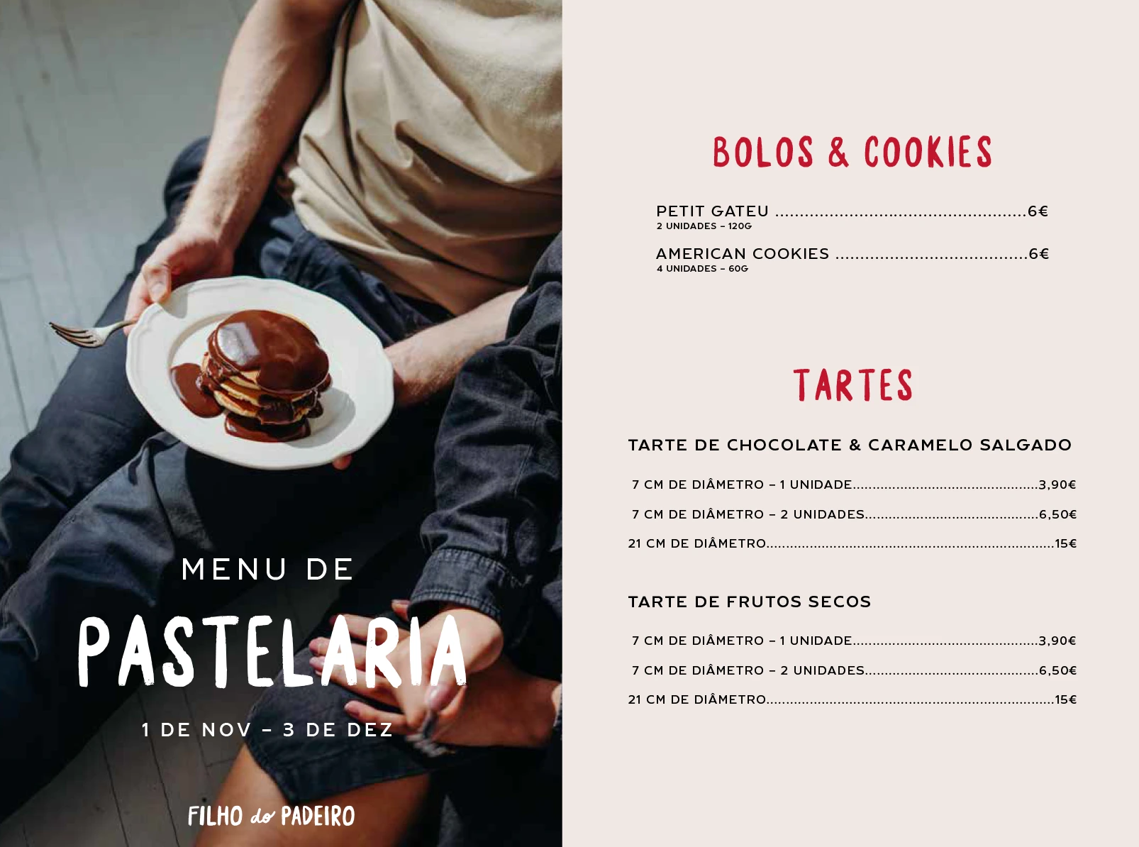
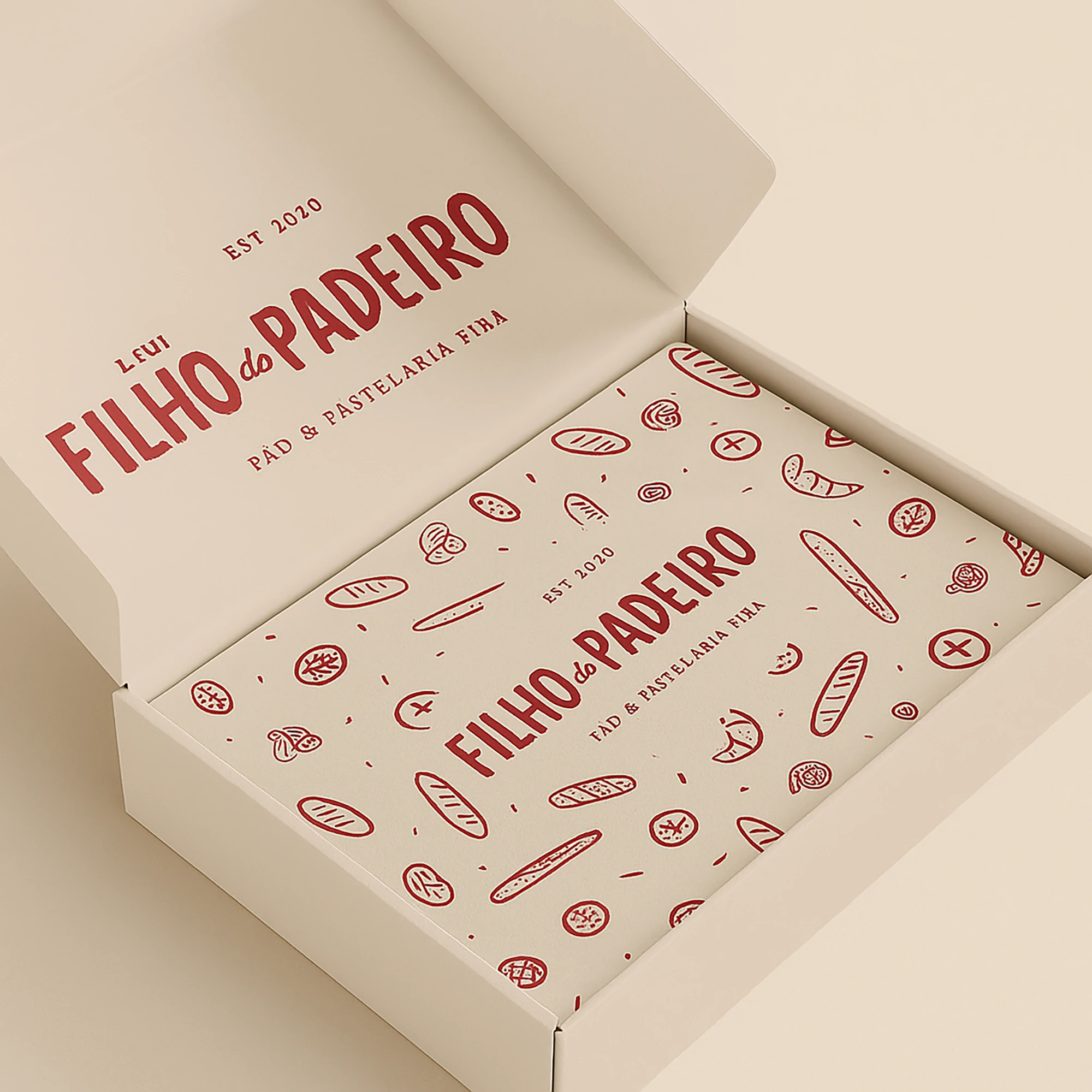
The branding for Filho do Padeiro was designed to reflect the brand’s essence: nostalgic, bold, and deeply human. After immersing myself in its story, I knew the identity had to feel handmade, honest, and full of personality.
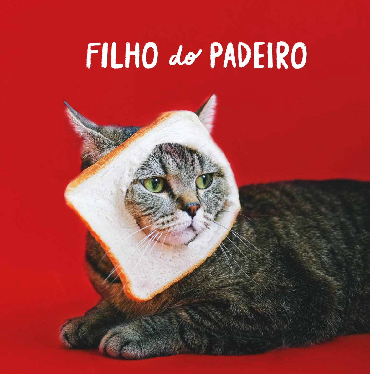
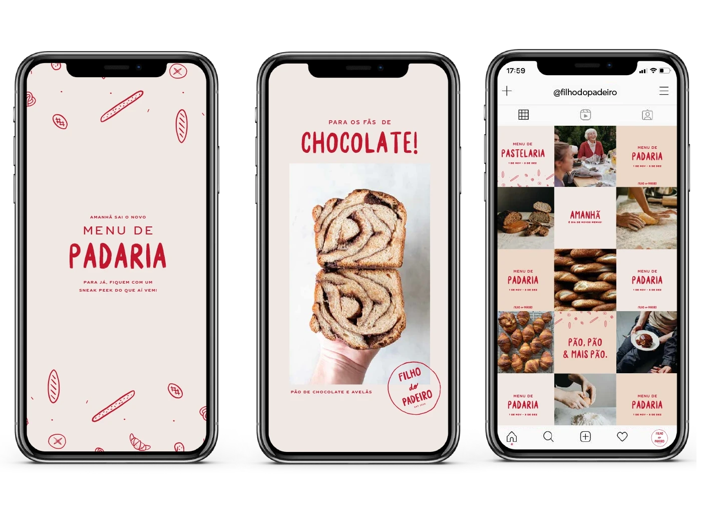
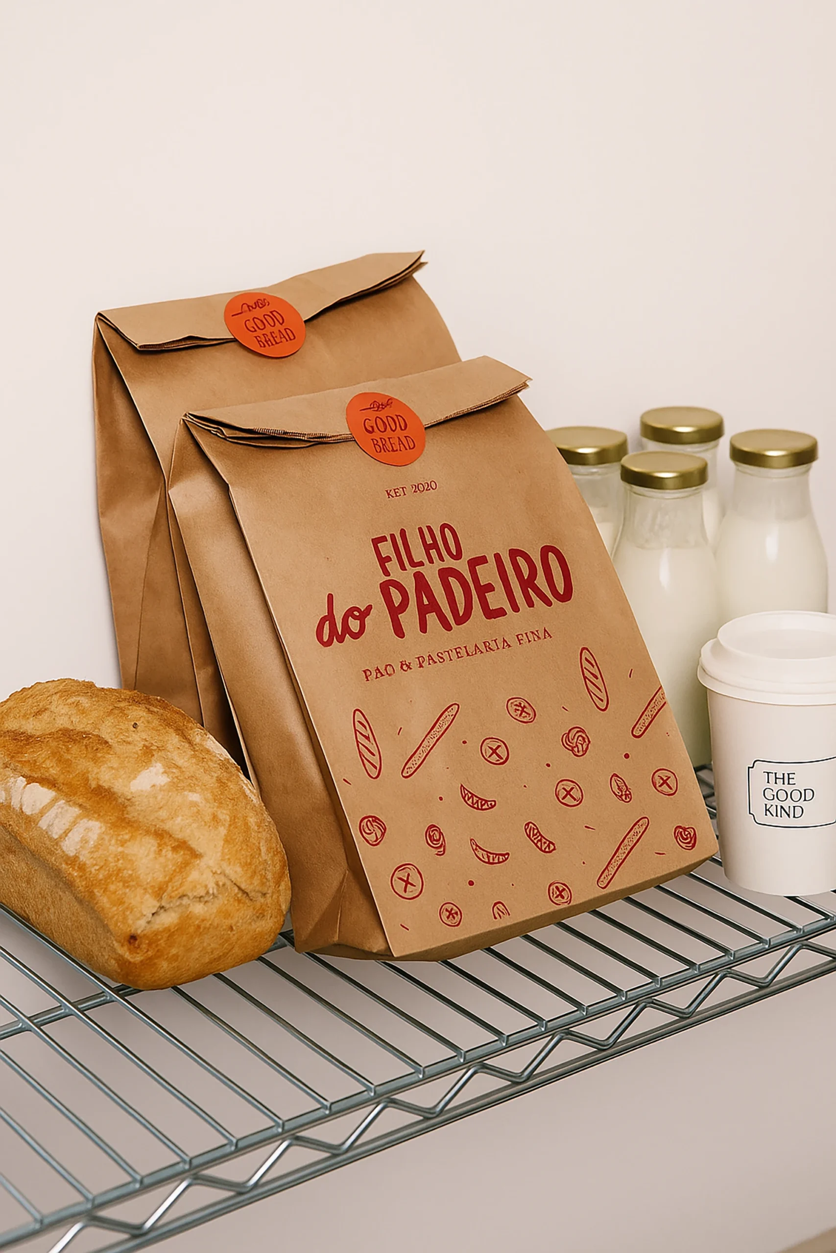
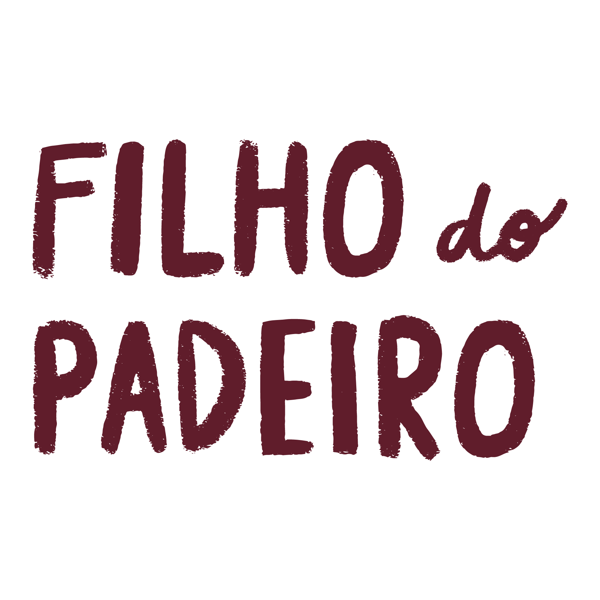
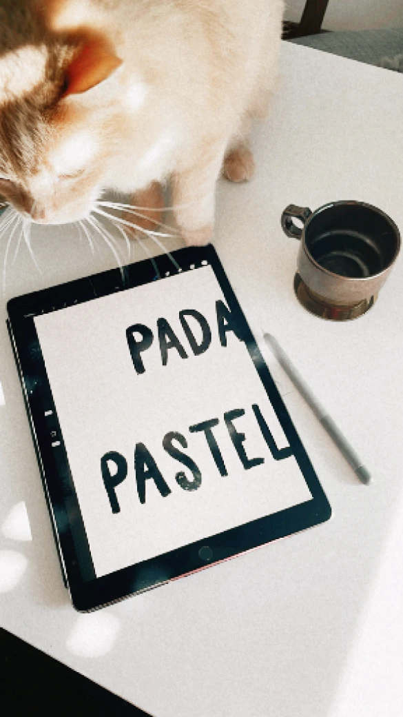
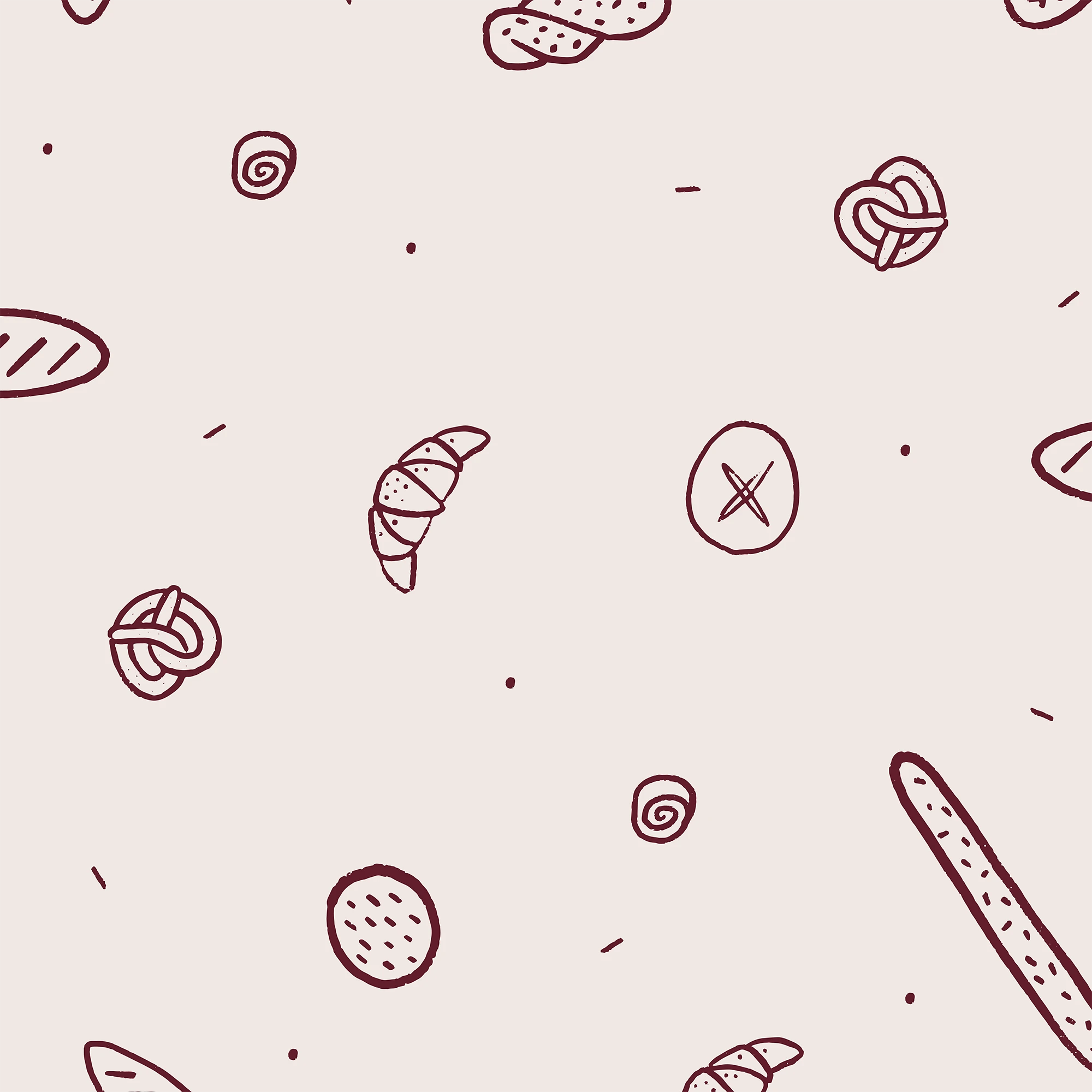
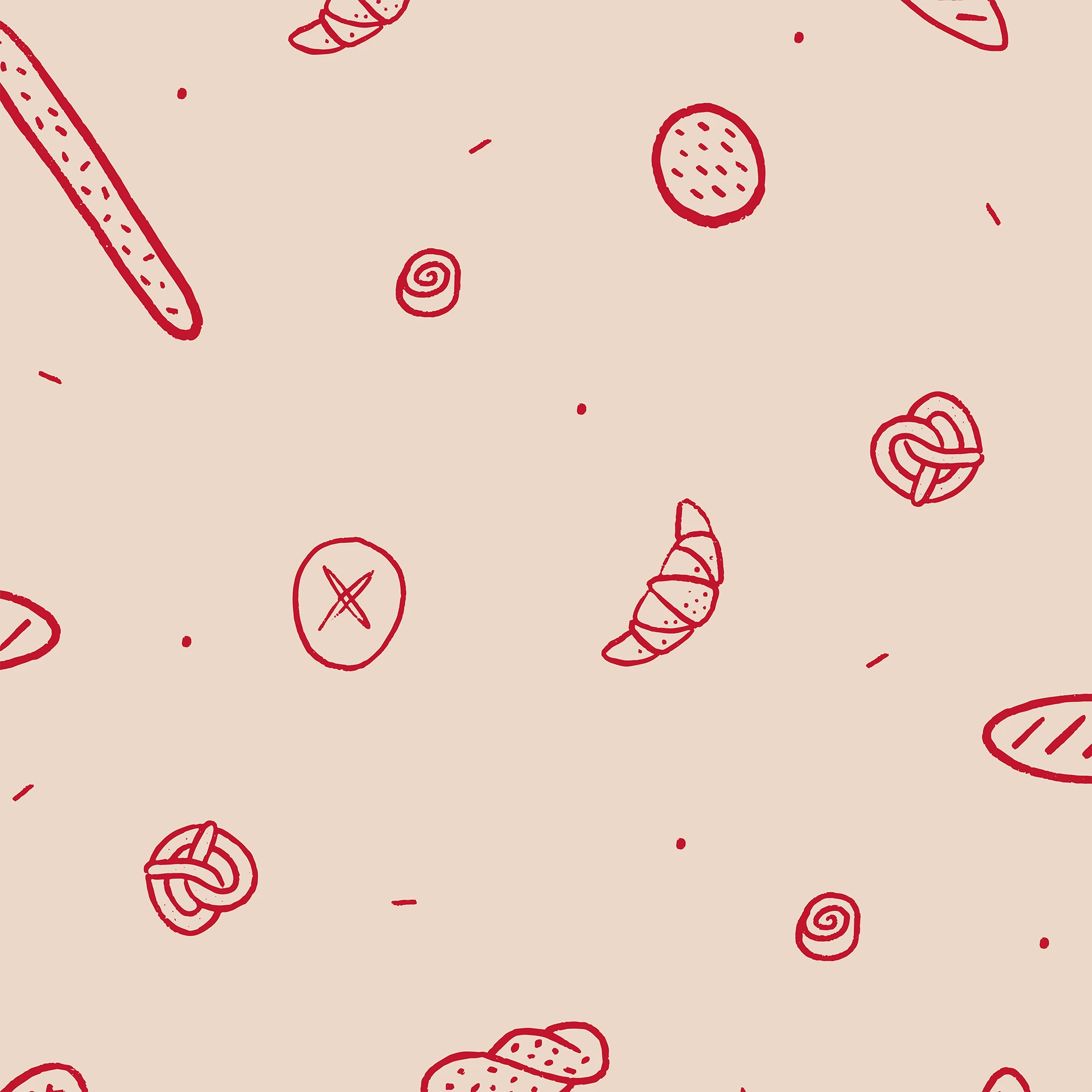
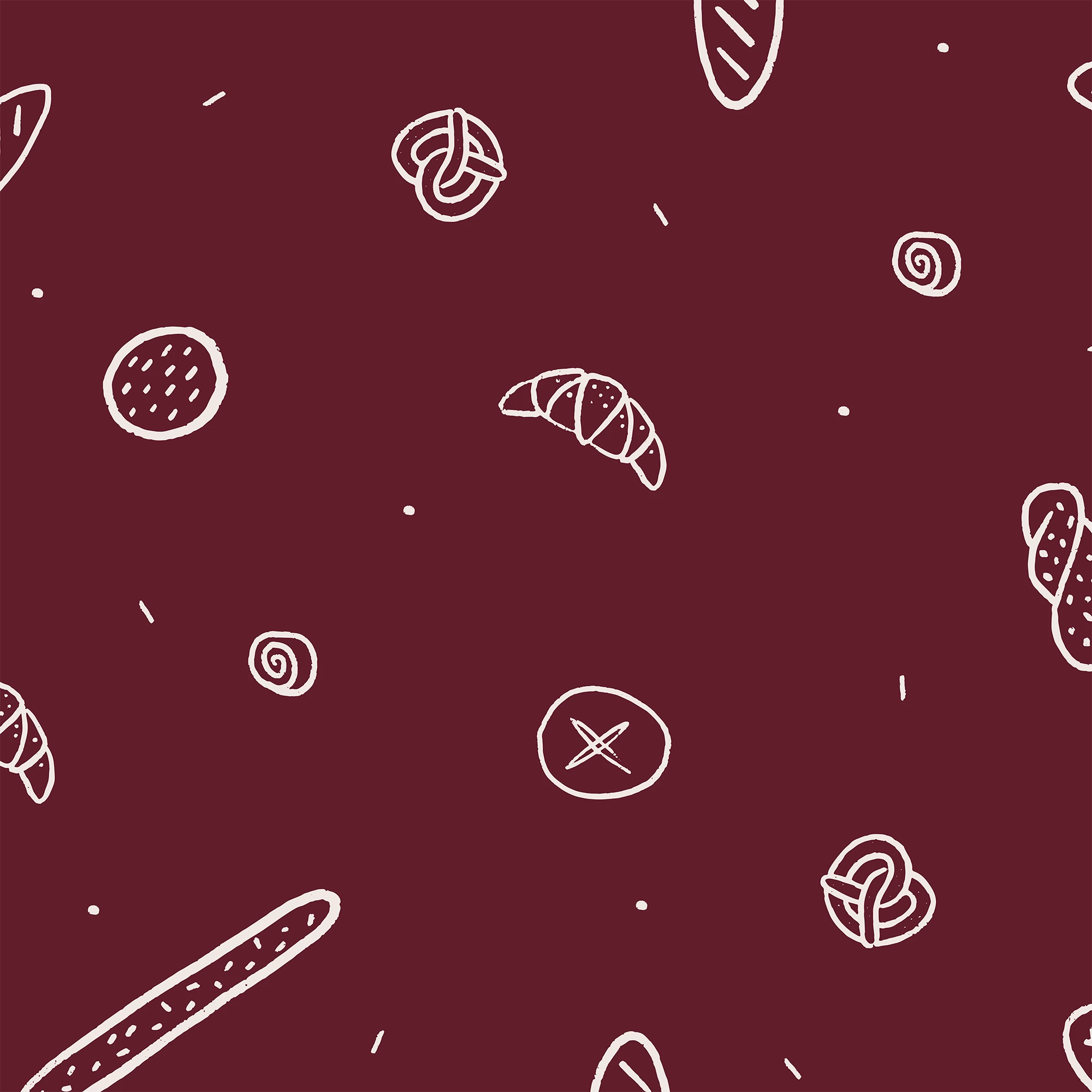
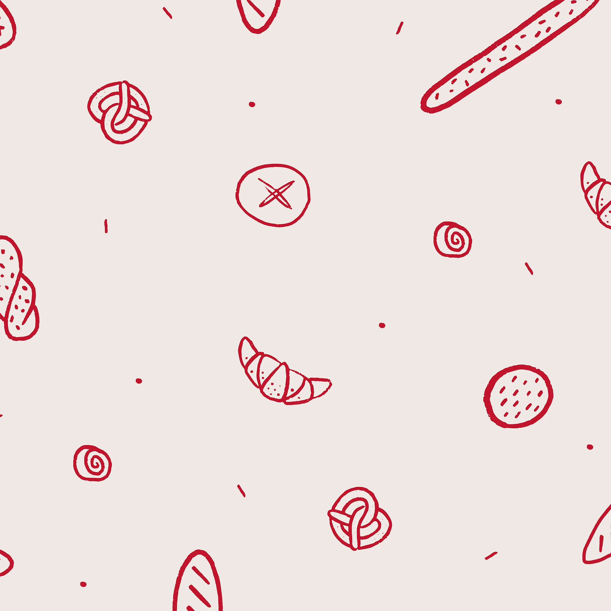
That’s why I leaned into raw textures, uneven lines, and graphic impact. Since the brand lives mostly in digital spaces and on packaging, the logo needed to be flexible and highly legible. I designed a custom, hand-drawn bold typeface that feels like it was sketched with wax crayon—a playful nod to the “son” in Filho do Padeiro, but also a wink to punk poster culture, where visual noise and disruption are key. The parallel was intentional: just as punk challenged the status quo in music, Filho do Padeiro challenges it in bread-making.
To balance this energy with credibility, I paired the primary font with a classic serif secondary typeface—bringing the weight and seriousness needed for a business rooted in quality and craft.
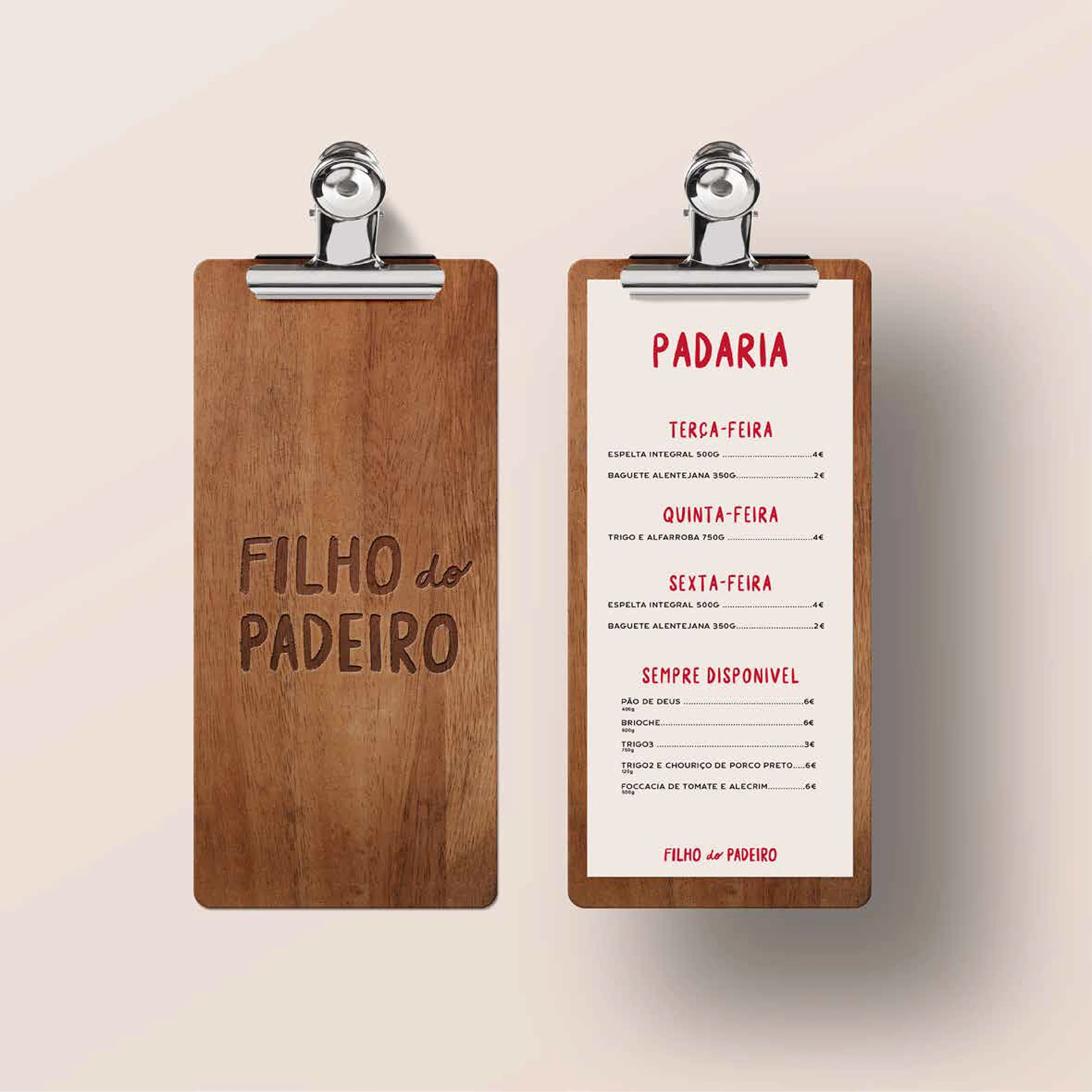
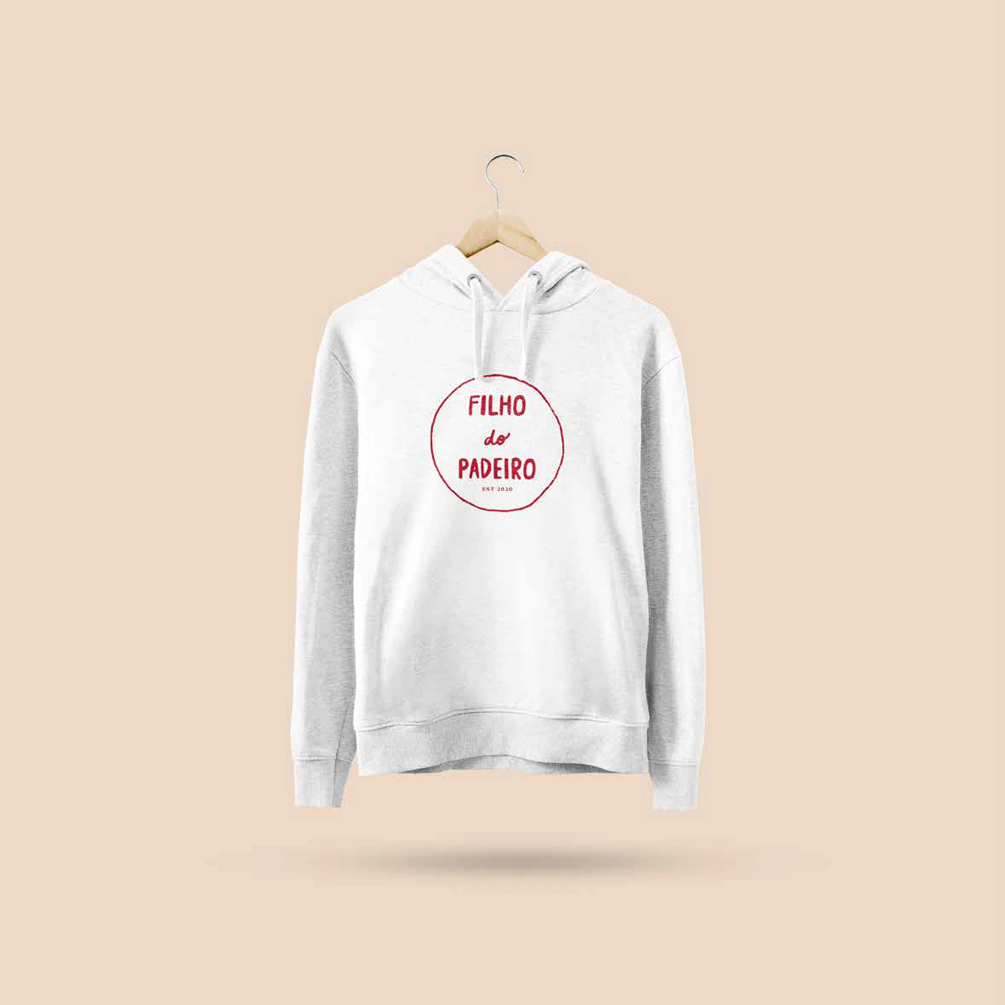
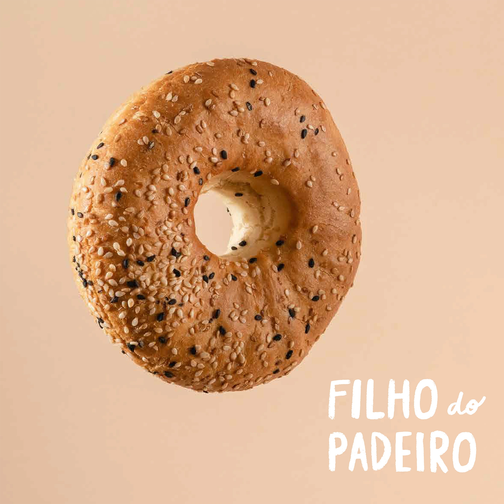
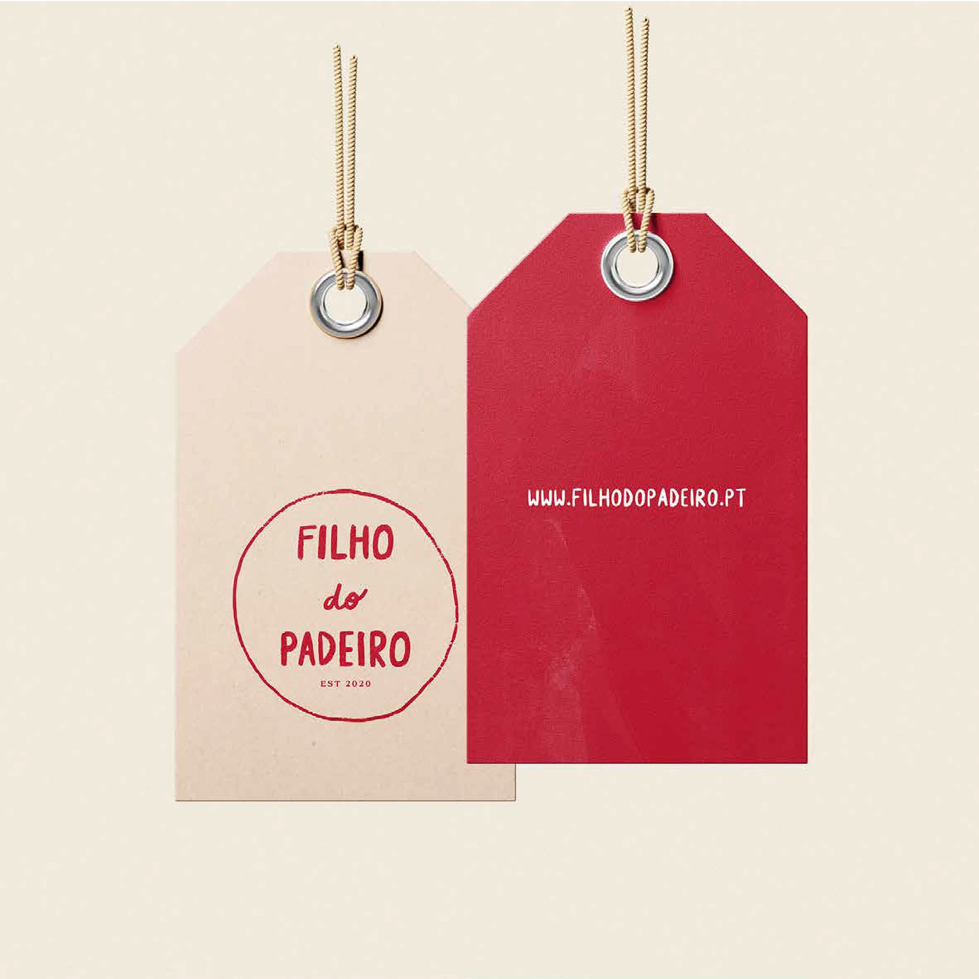
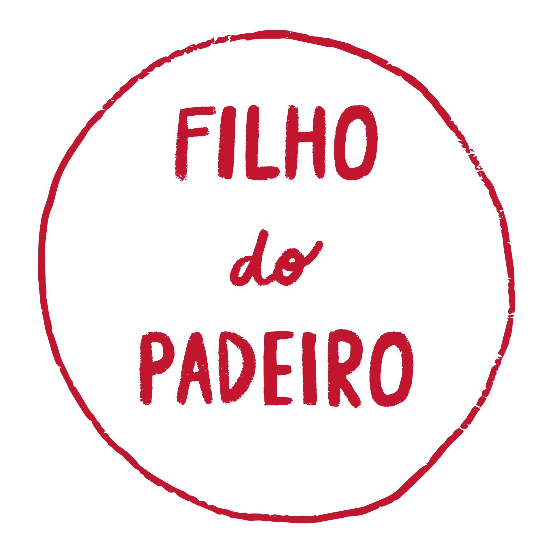
The logo exists in four variations, built for adaptability across formats: a full version, a vertical version for square spaces, a circular stamp for packaging, and a horizontal layout for long formats.
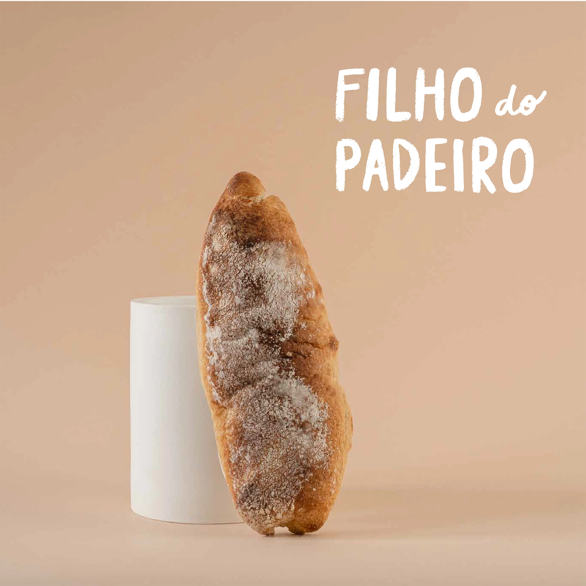
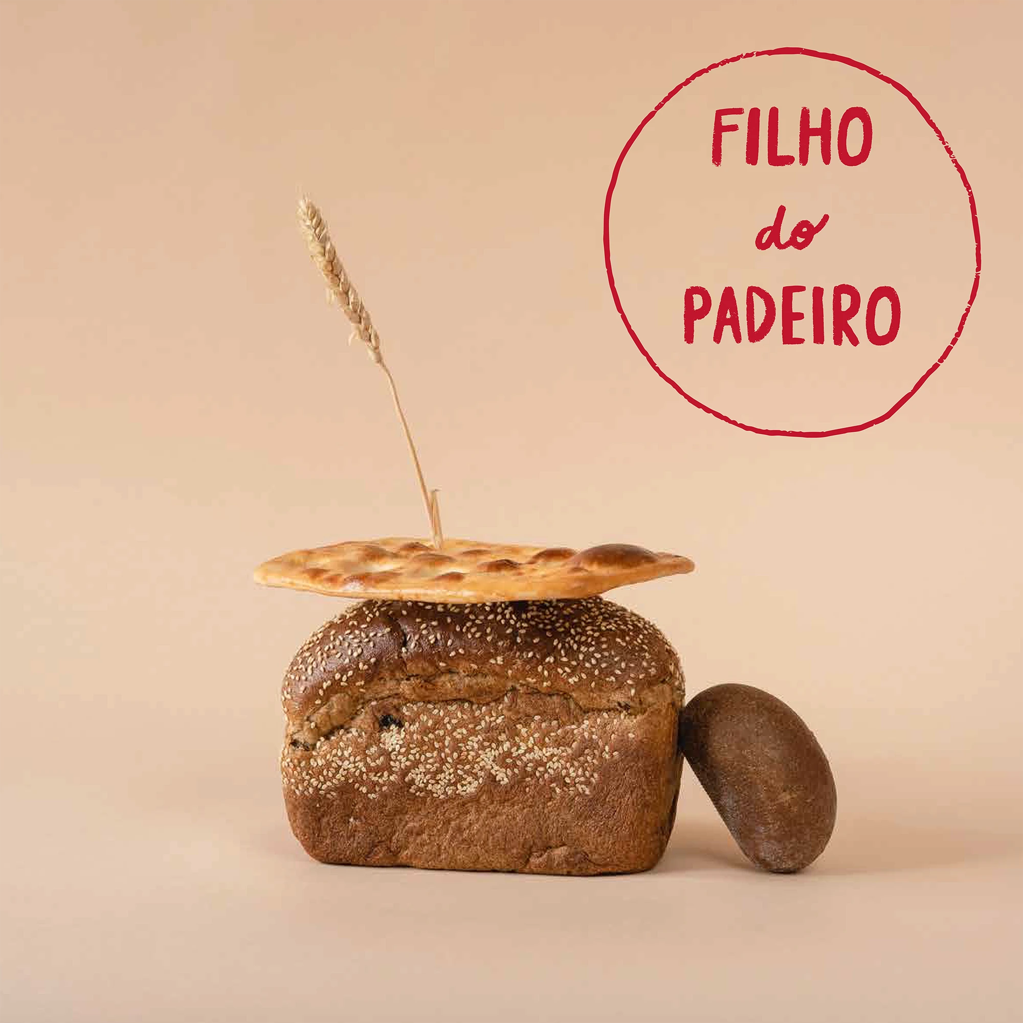
The result is a brand identity that is bold, nostalgic, and unmistakably human—designed to disrupt the norm, just like the bread it represents.
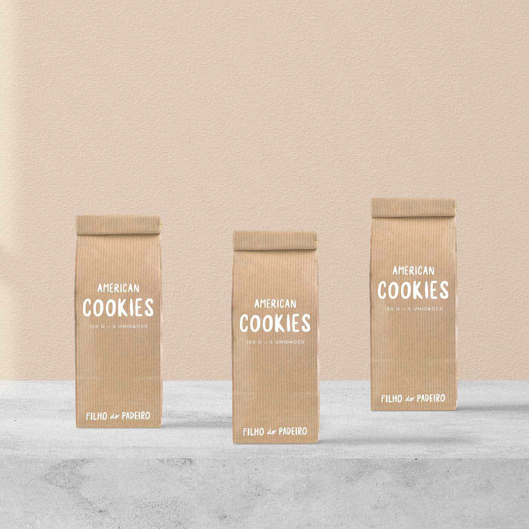
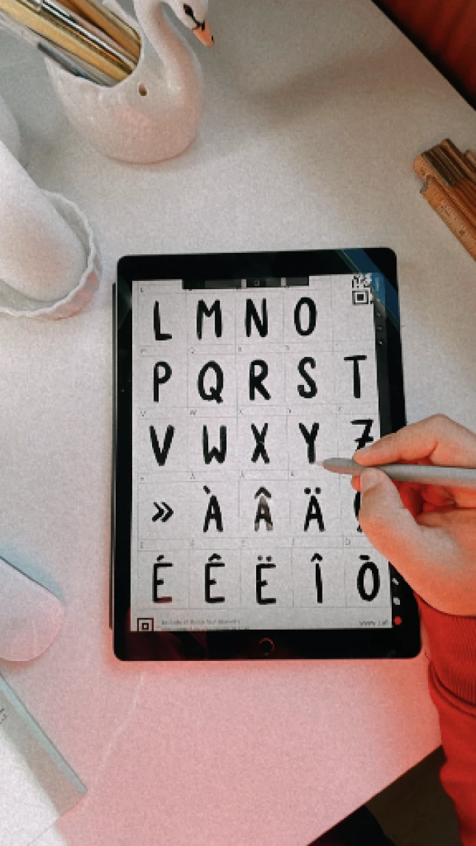
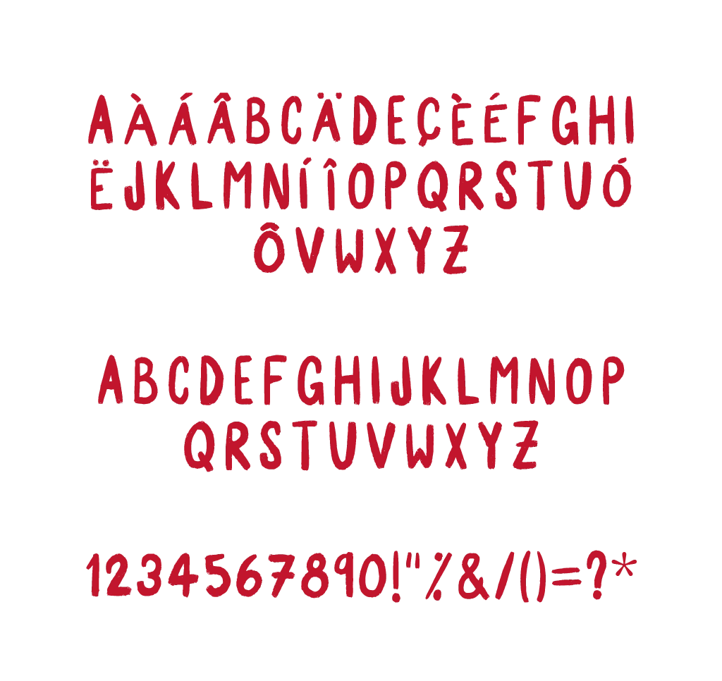
As I began exploring graphic applications, it quickly became clear that the strength of the brand’s identity lay in its typography. I needed that same expressive power to carry through—even in the absence of the logo. That insight led me to design a custom typeface by hand, echoing the brand’s essence: slow, deliberate, and deeply rooted in tradition.
The result was the Filho do Padeiro typeface—crafted exclusively for the brand and infused with the same character and texture as a dusting of flour on a wooden counter. Bold, memorable, and unmistakable, this typeface ensures that every piece of visual communication carries the warmth, honesty, and distinctive identity of the brand, whether or not the logo is present.
