
Humano
by epoch
Humano by Epoch is a clothing brand built around real human stories. Each collection is inspired by honest conversations and shared experiences, transforming emotion into wearable design.
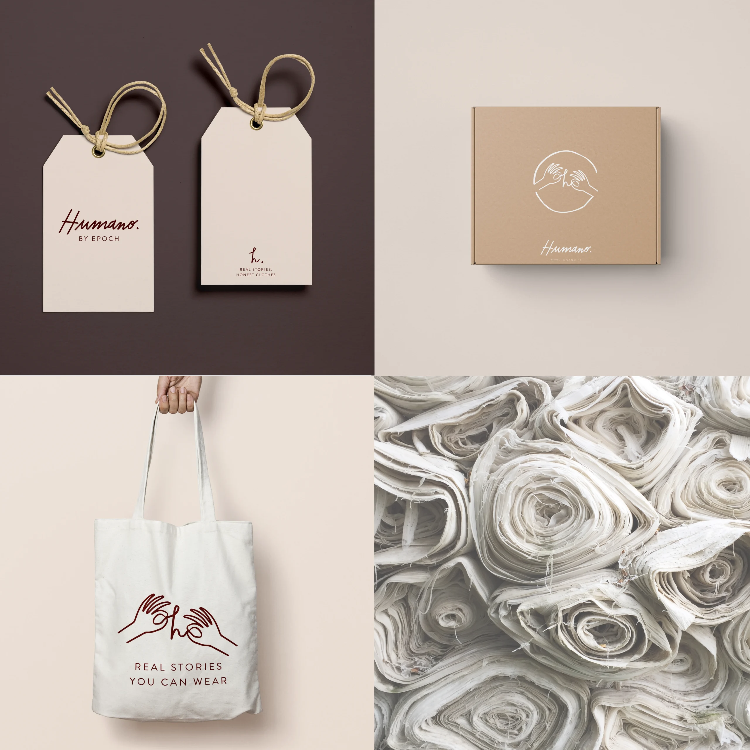
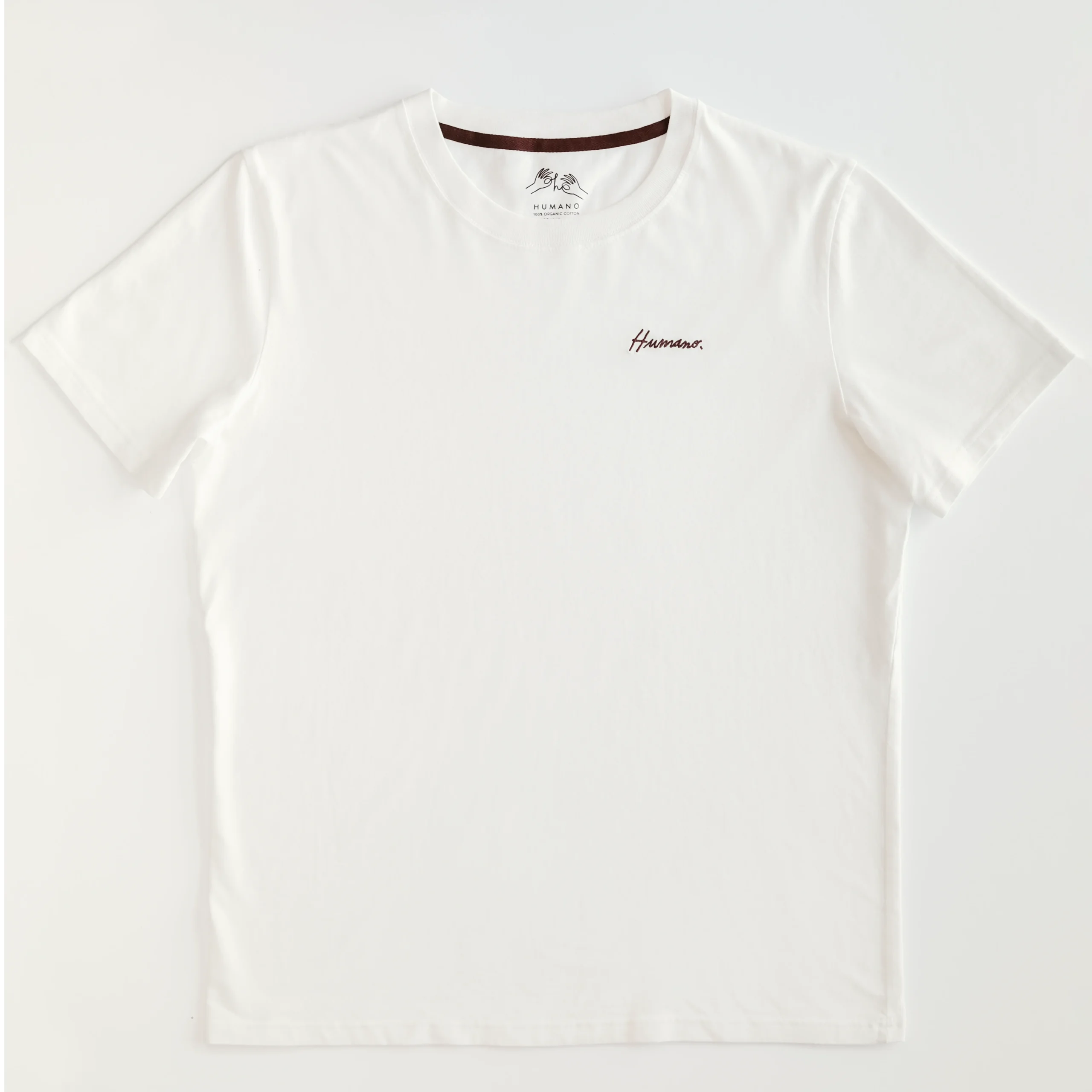
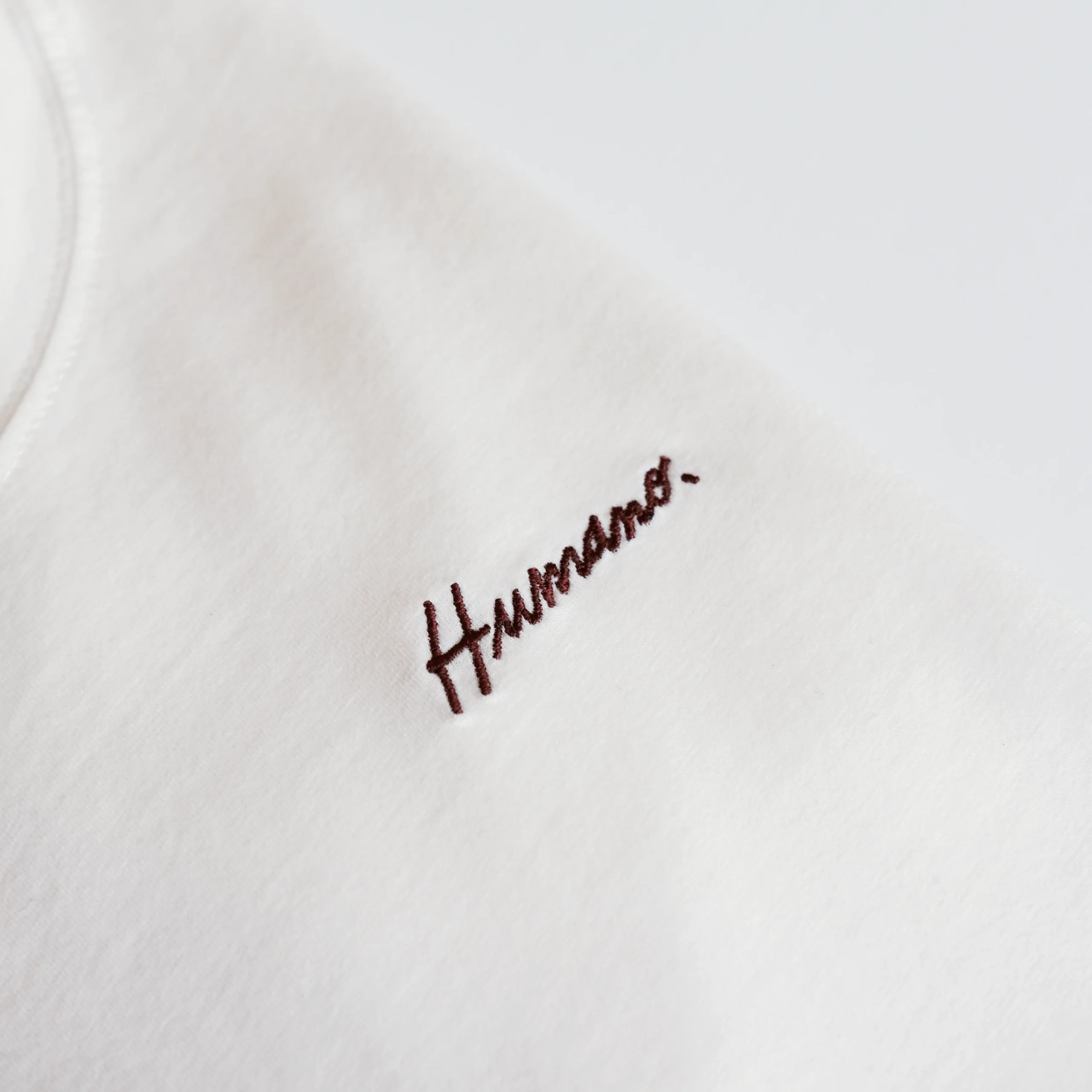
I developed the brand’s visual identity from the ground up, including branding, creative direction, photography for the first two collections, and the illustration behind the brand’s best-selling piece. The goal from the start was to create something sincere, minimal, and deeply connected to people.
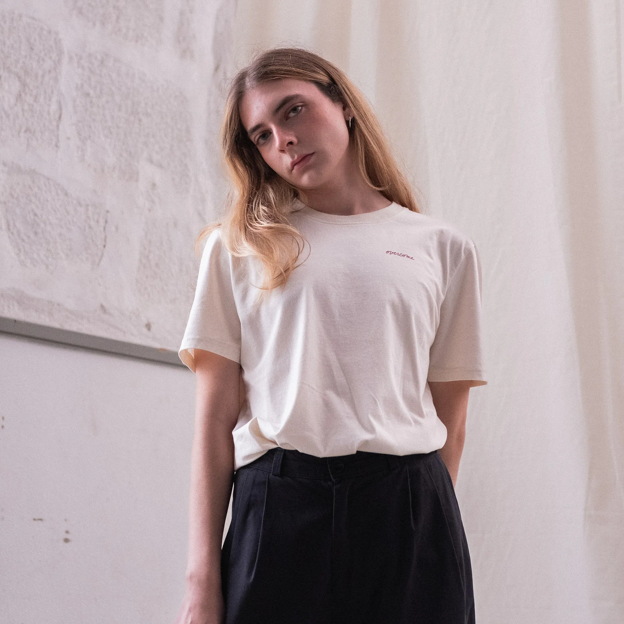
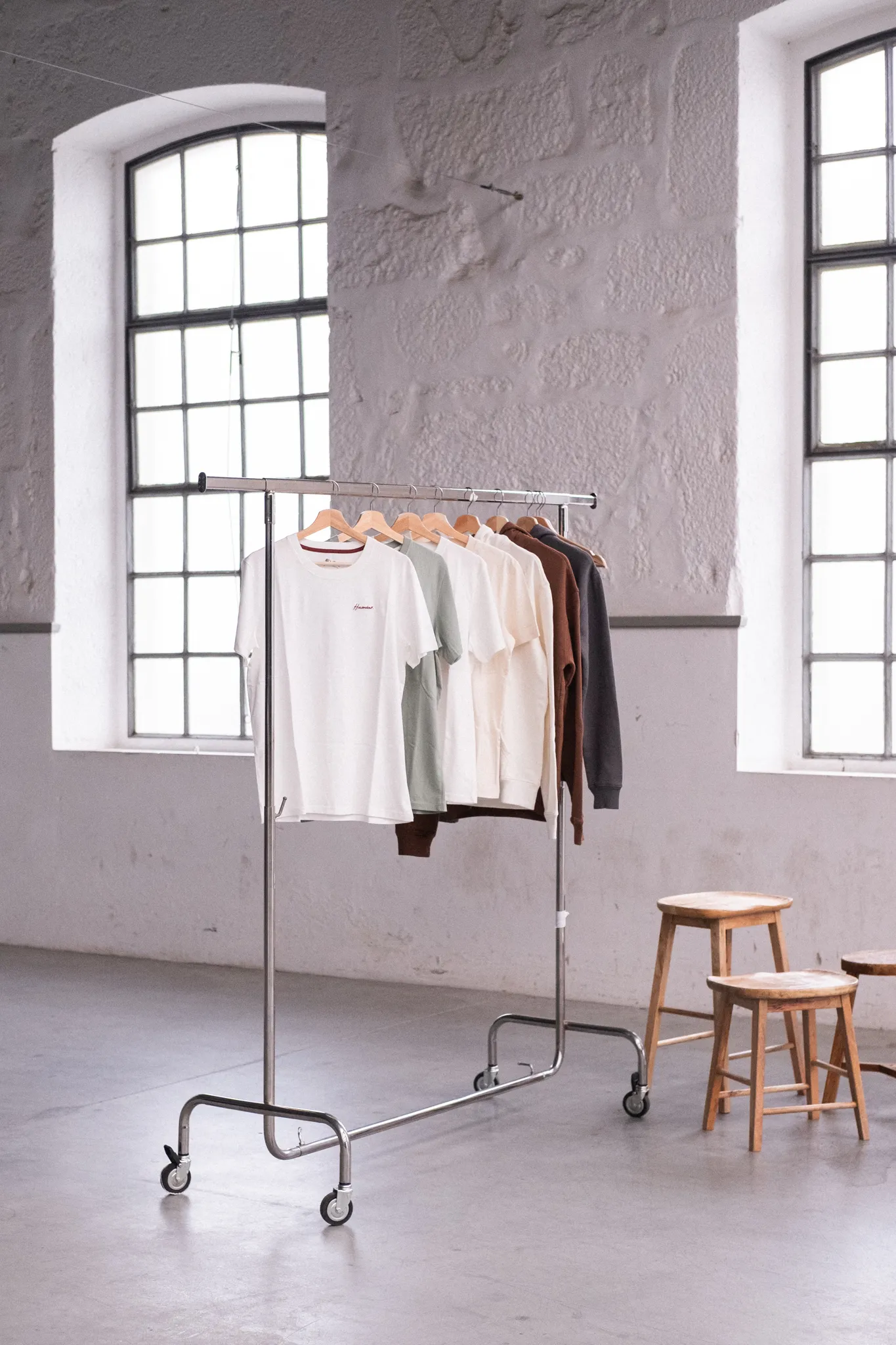
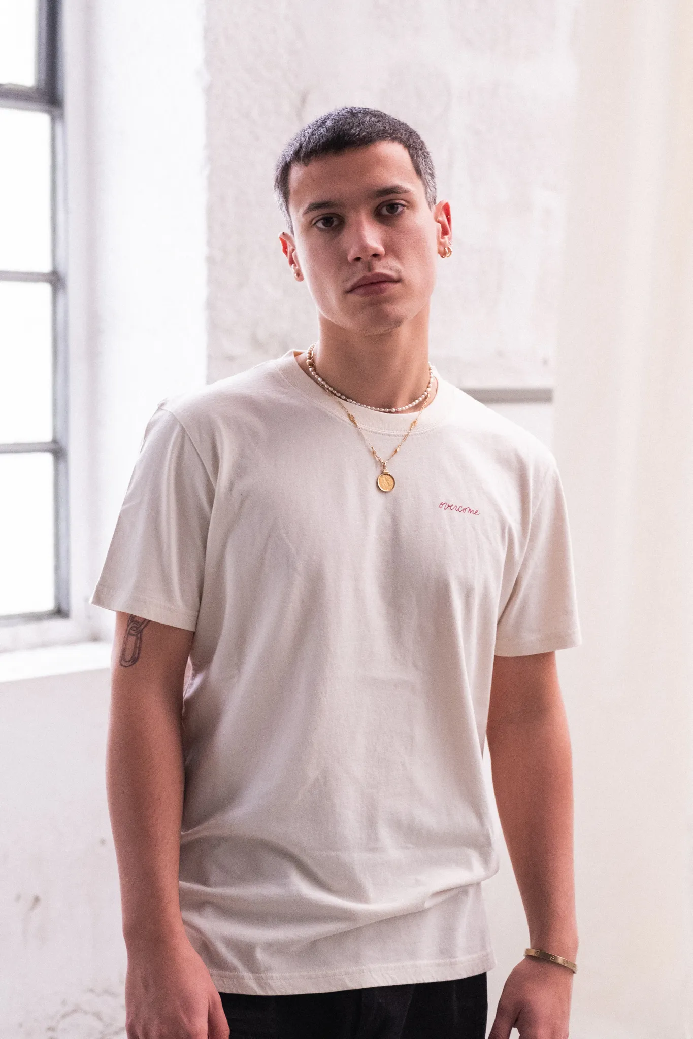
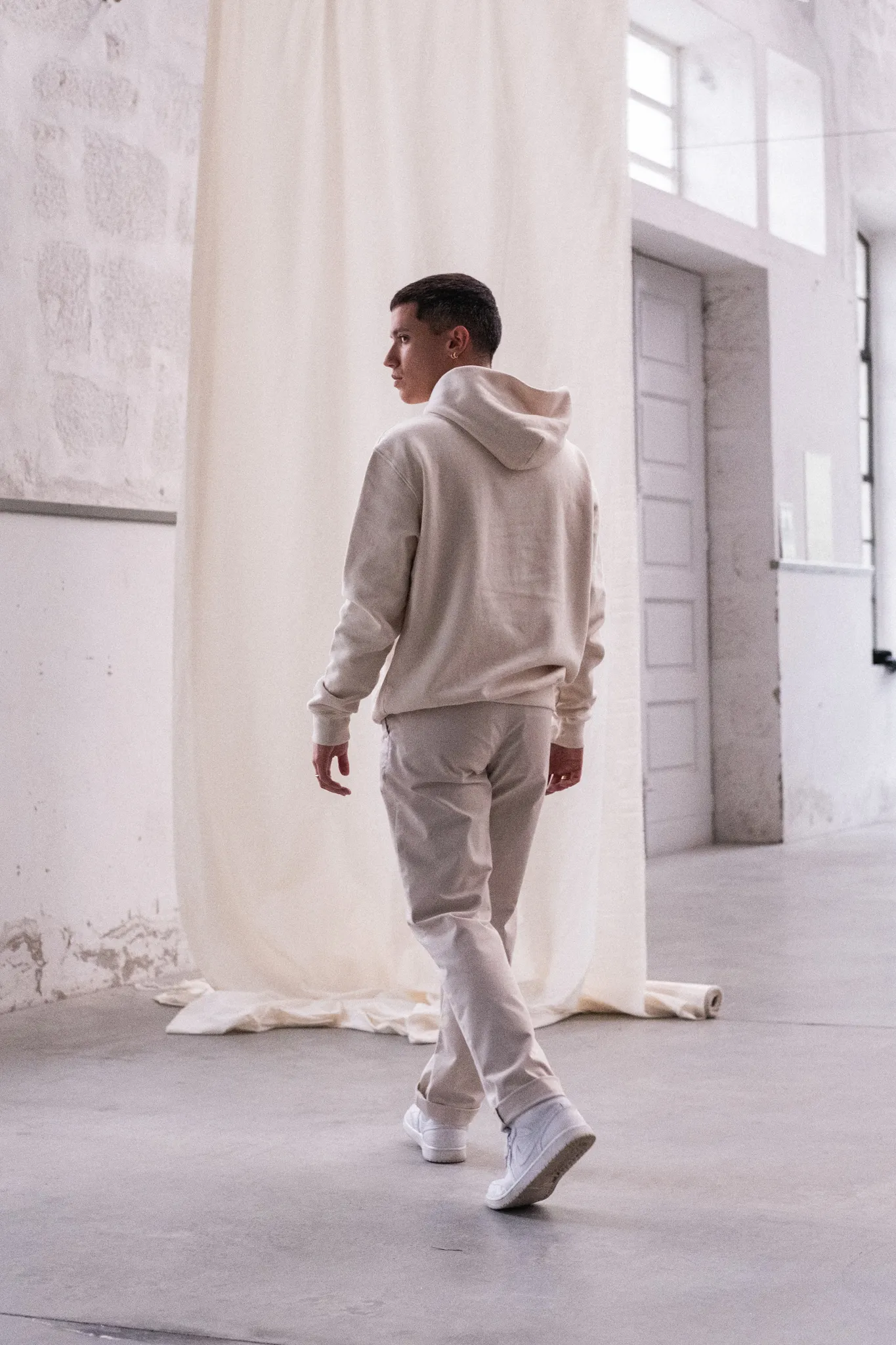
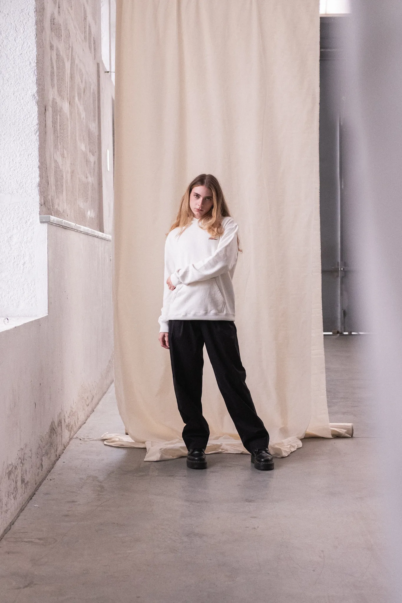
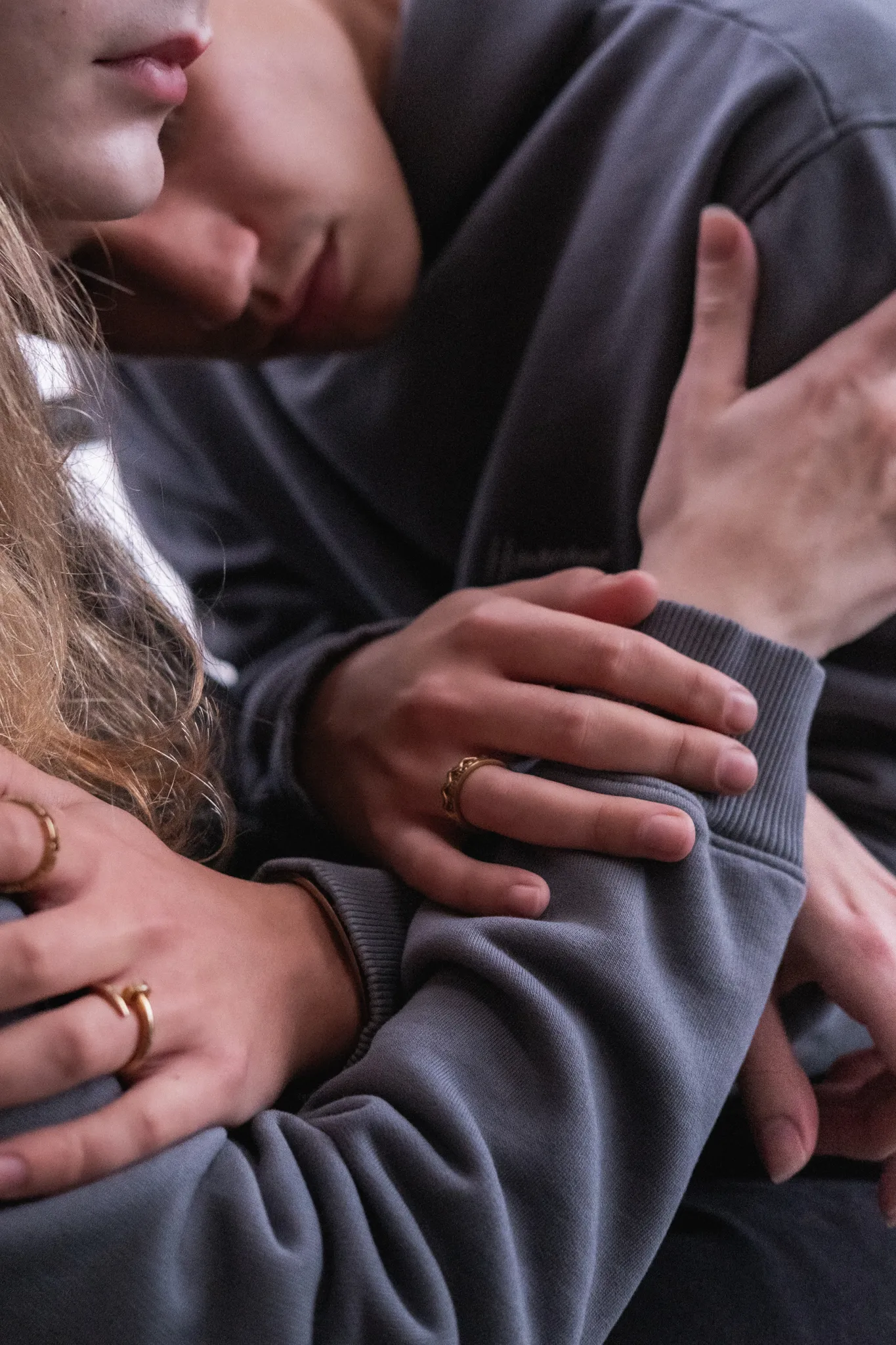
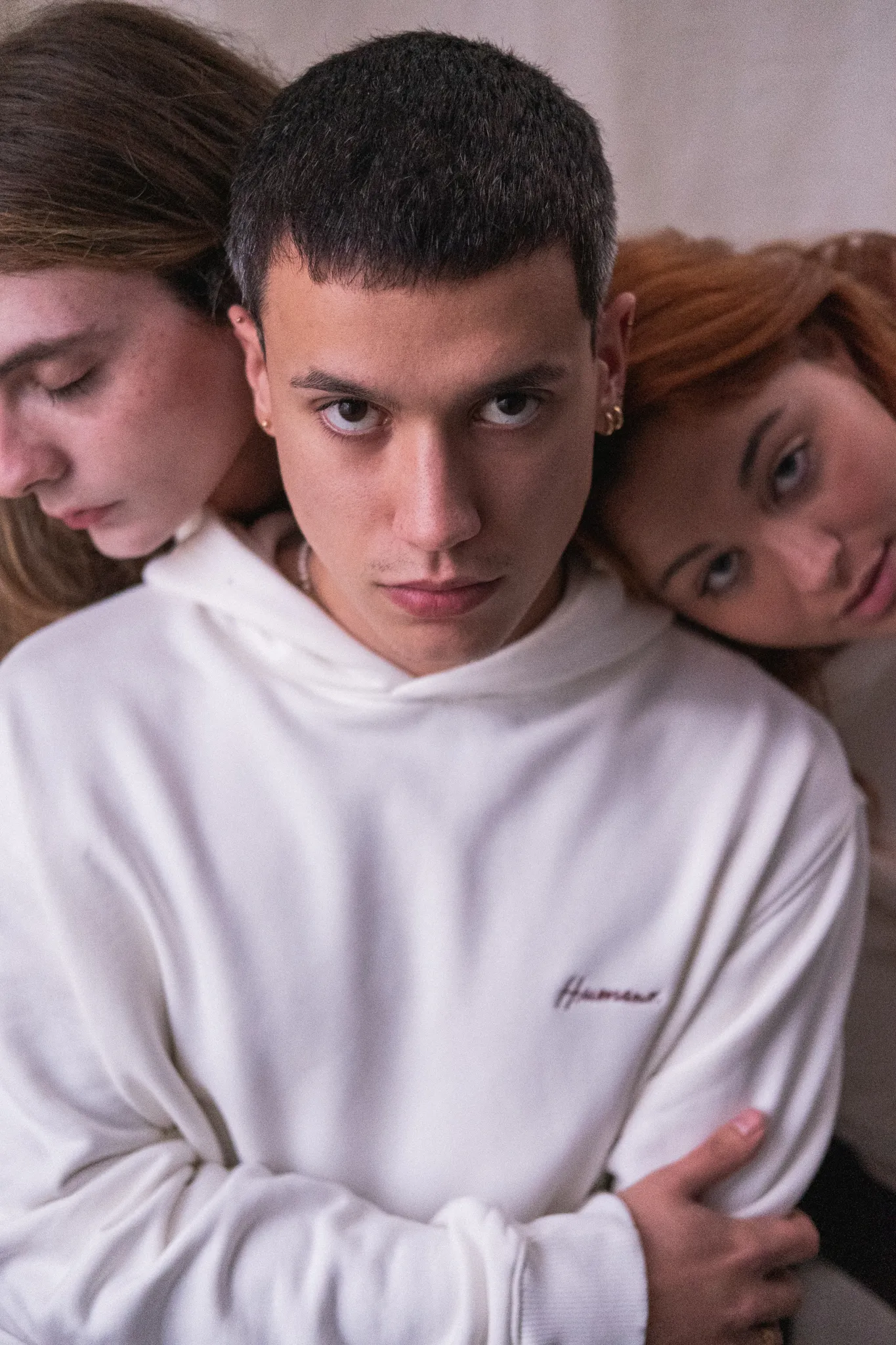
For the photoshoots, I worked closely with the team to shape each collection into a visual narrative. The imagery was guided by the stories behind the clothes, focusing on warmth, texture, and real presence. Often, the models were the very people who inspired the designs, which made the process even more intimate and grounded.
The result is a visual language that feels human and honest, built to reflect the brand’s mission to turn stories into something you can wear and feel.
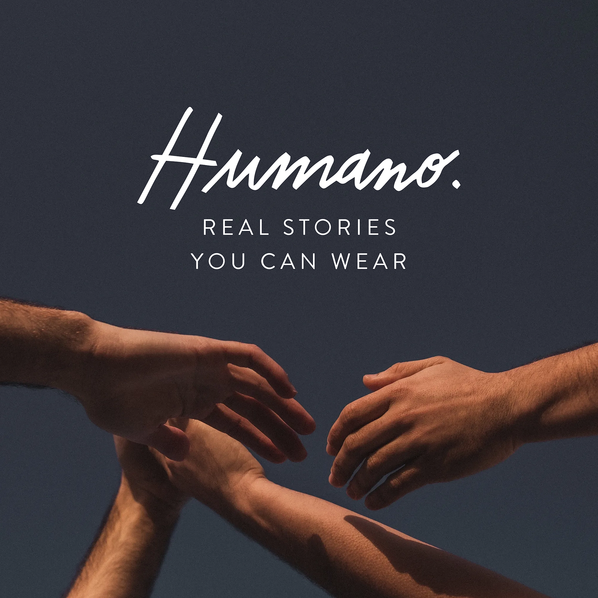
Stories you can wear
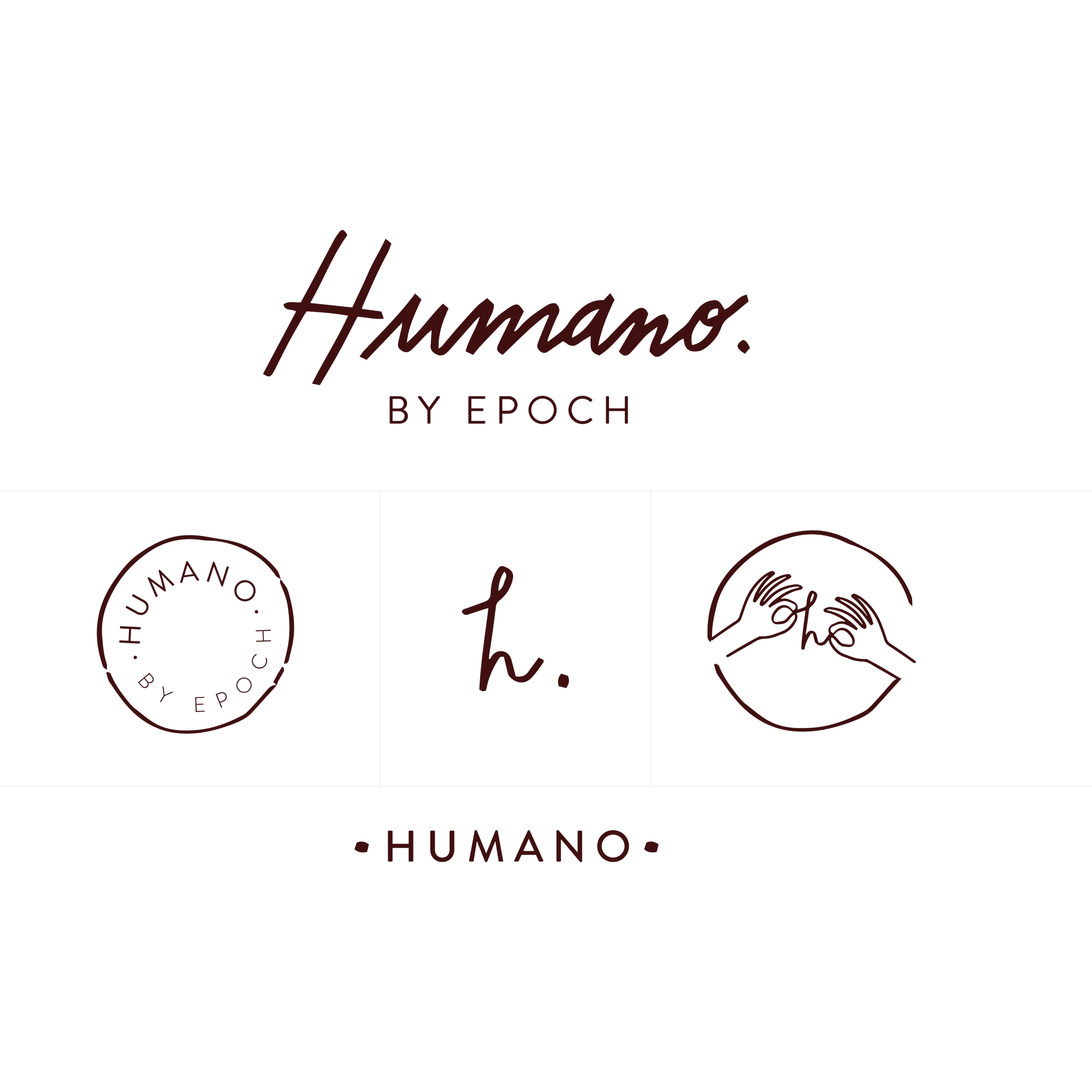
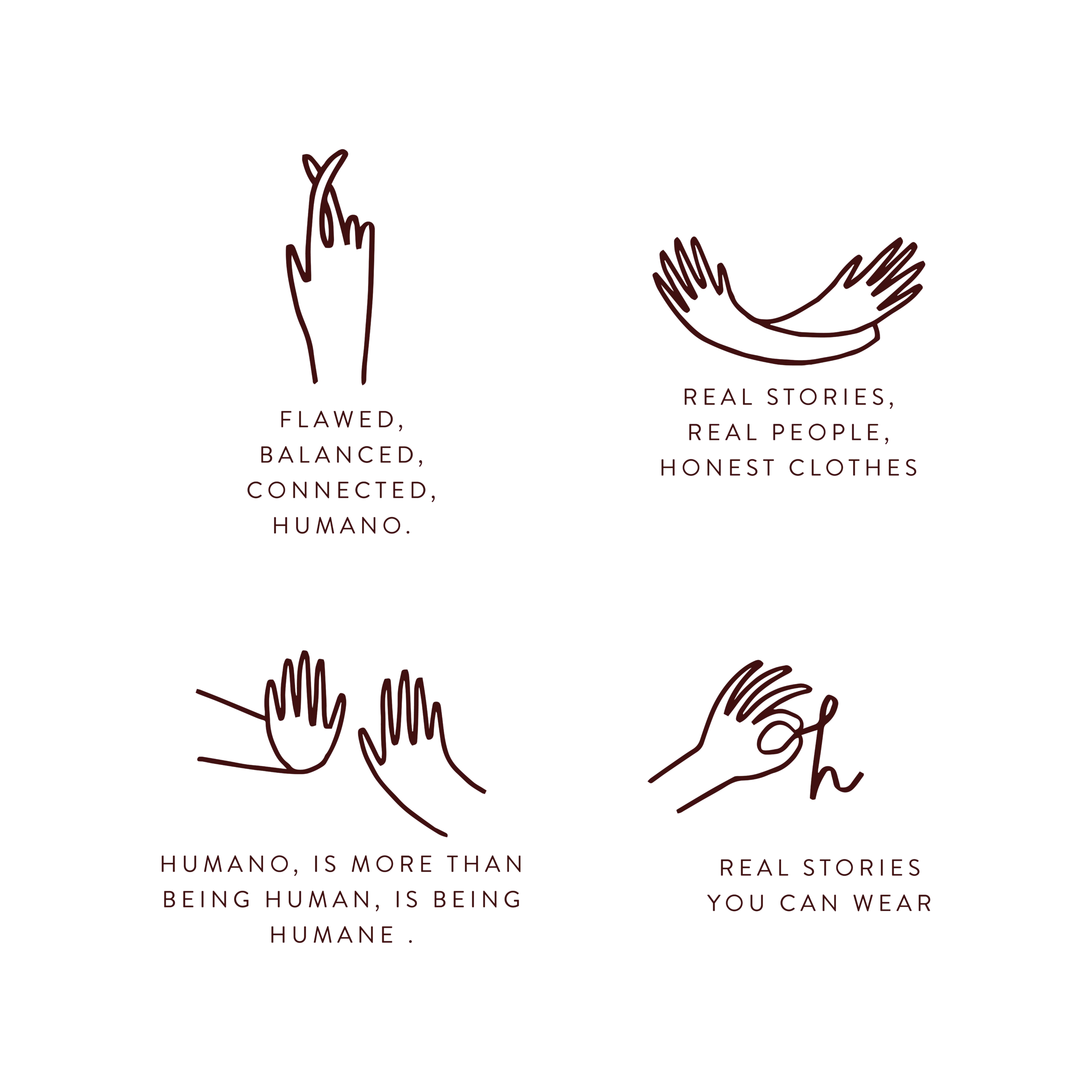
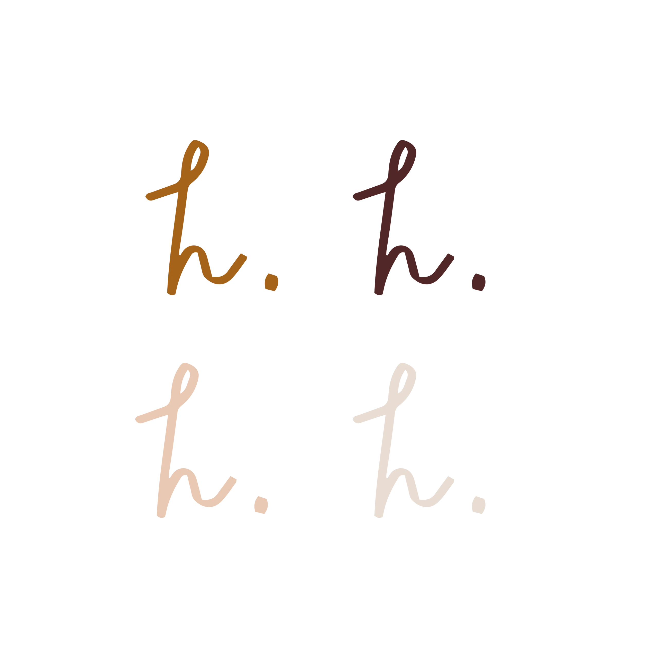
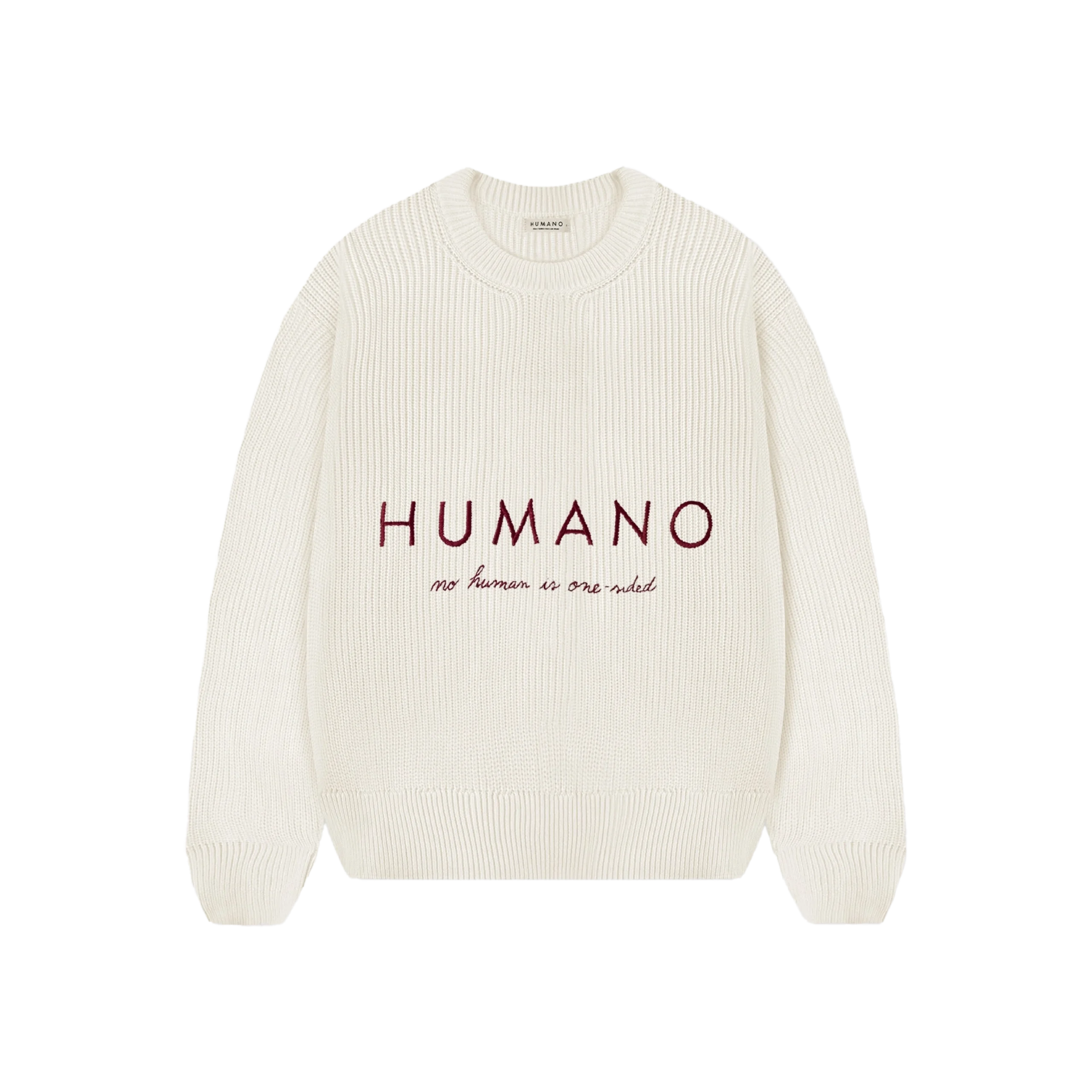
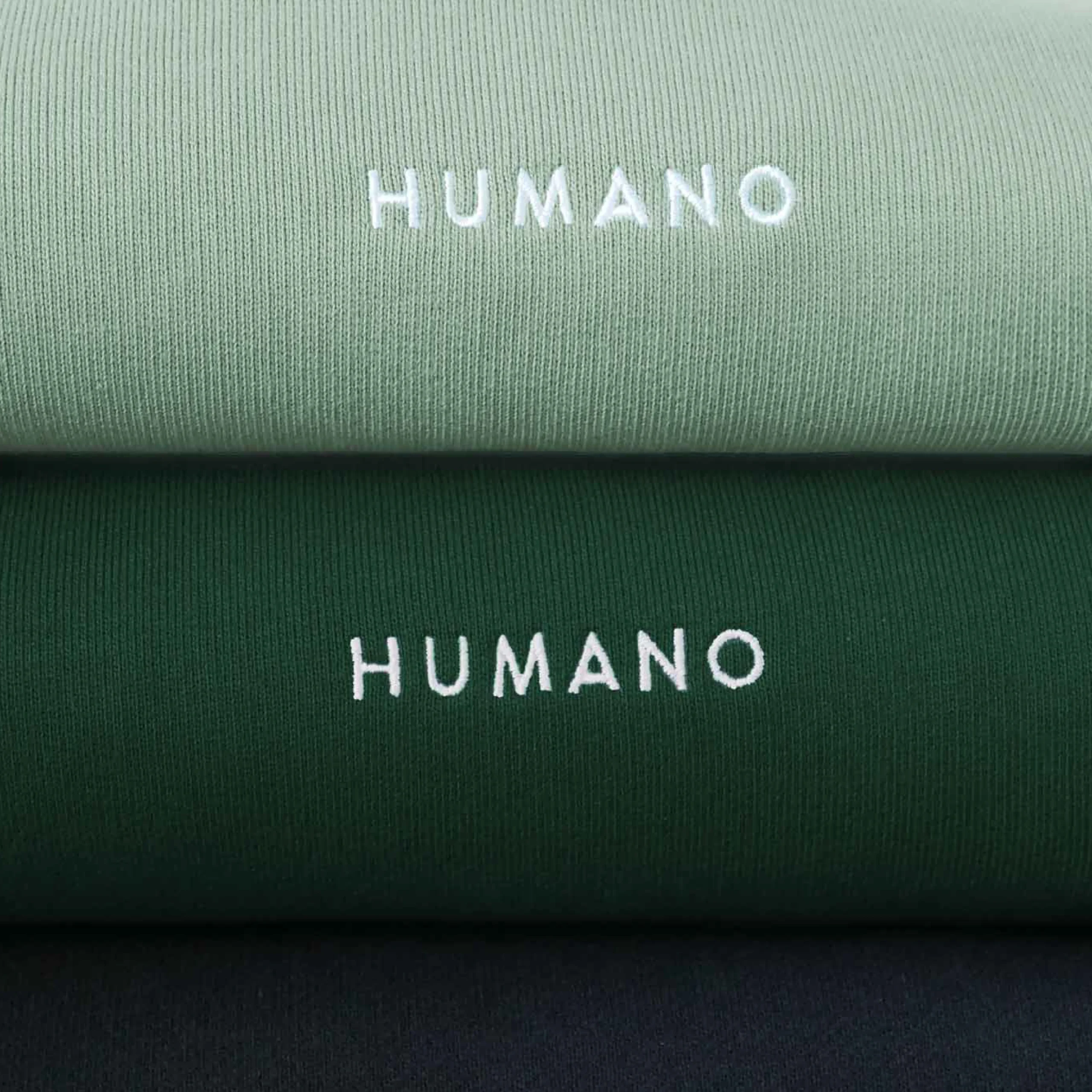
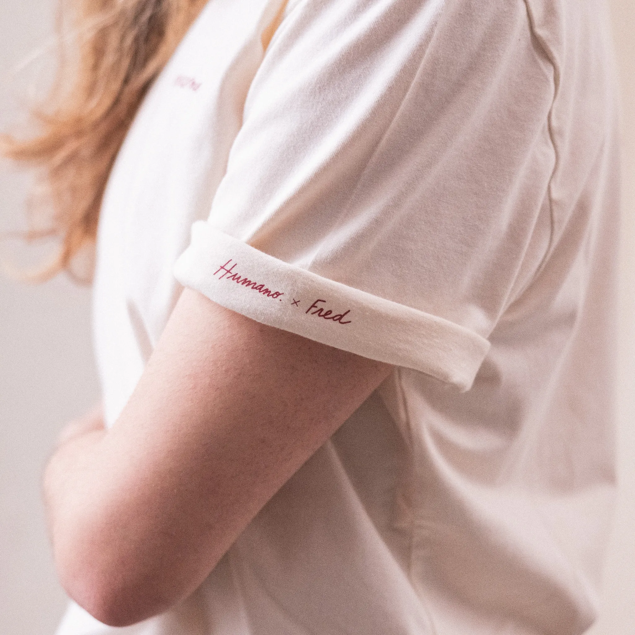
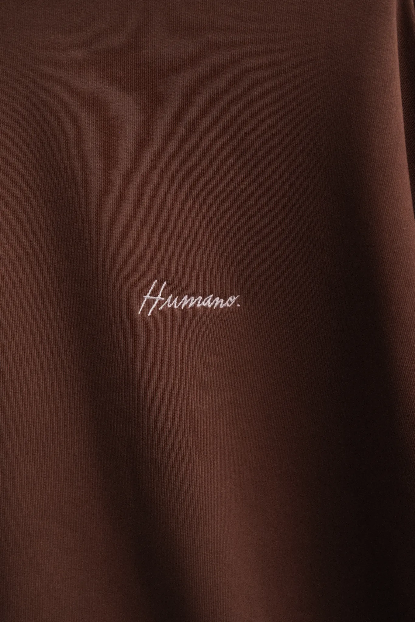
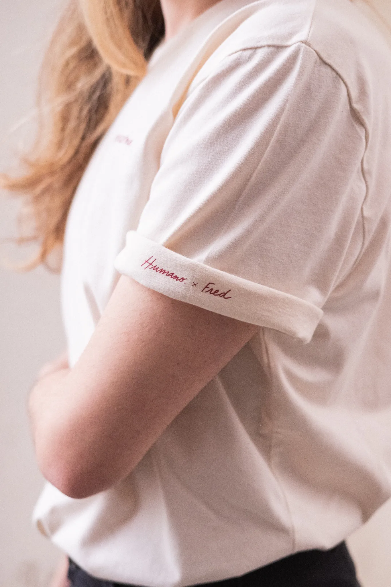
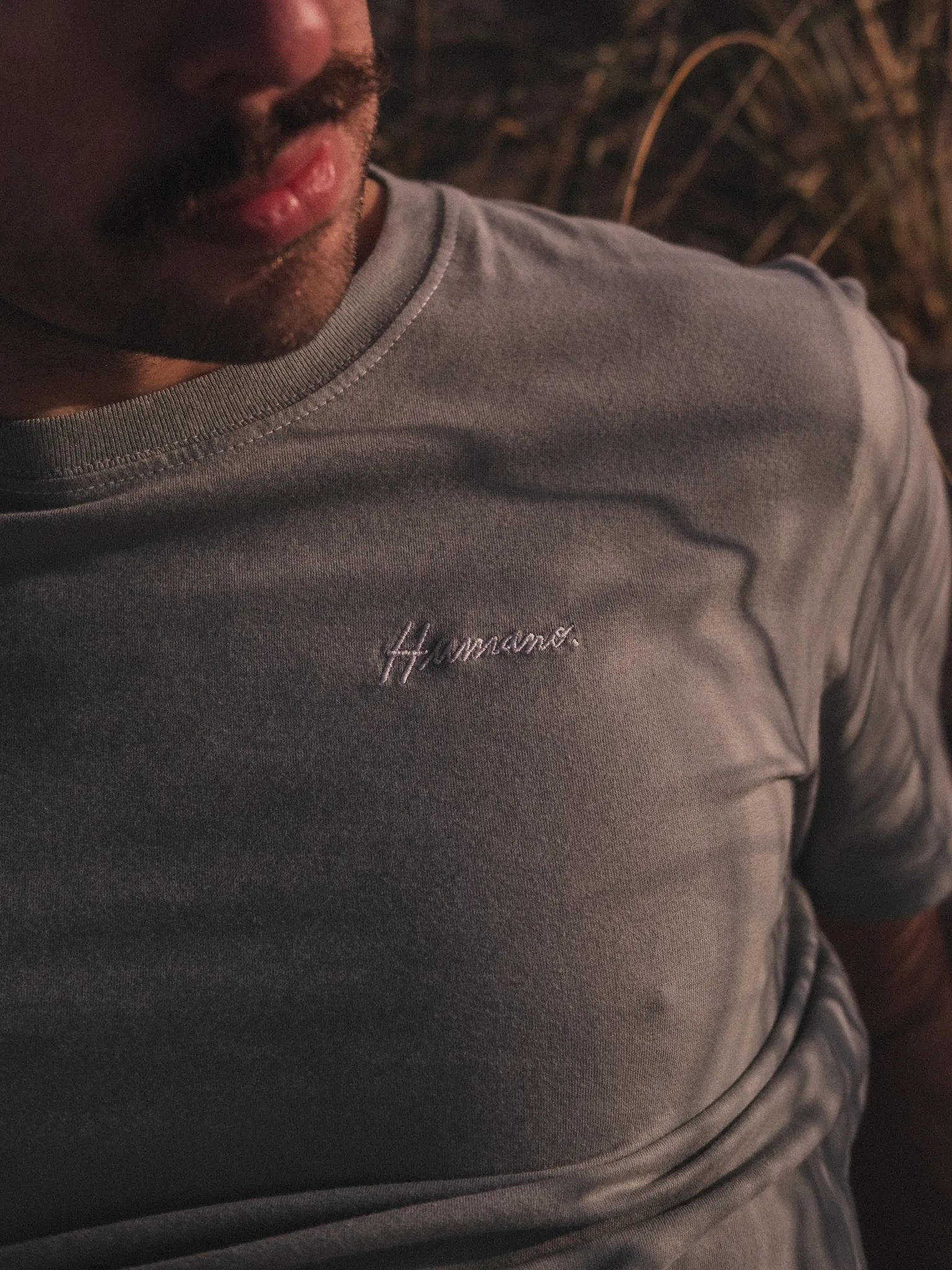
When I started designing the branding for Humano, I knew the logo had to feel as human as the name itself. This is a brand built on real stories, transformed into pieces of clothing — and the identity needed to reflect that emotional depth without being overly literal.
I chose to work with a handwritten, hand-drawn typeface that feels raw and personal, almost like a note someone wrote to themselves. That imperfect, expressive line speaks to the idea that we’re all shaped by our experiences, and that there’s beauty in that imperfection. To balance it, I paired it with a minimalist typeface that adds clarity and quiet strength.
The logo became a reflection of the brand’s core: honest, emotional, made by people and for people. It’s not just about what the clothes look like — it’s about what they mean.
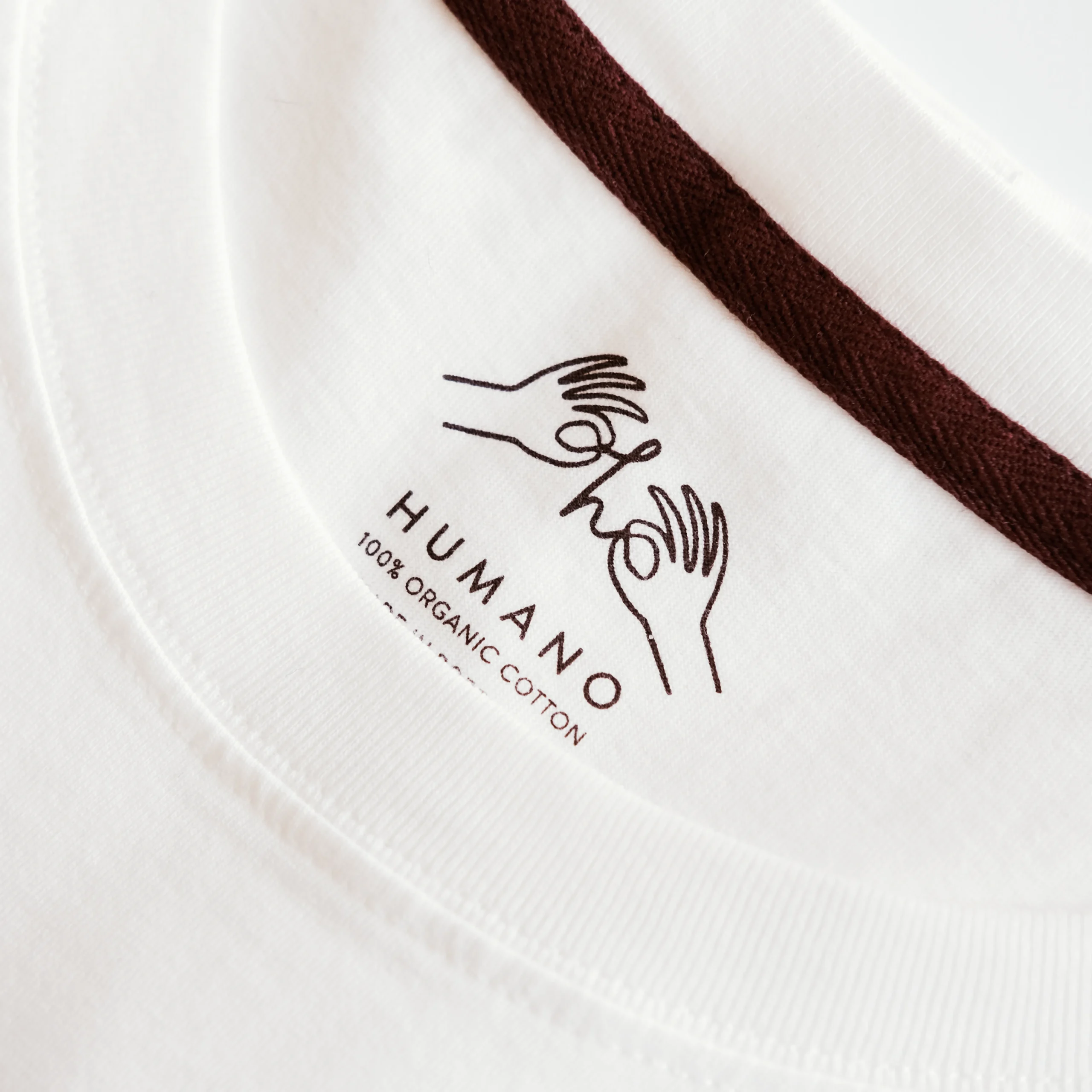
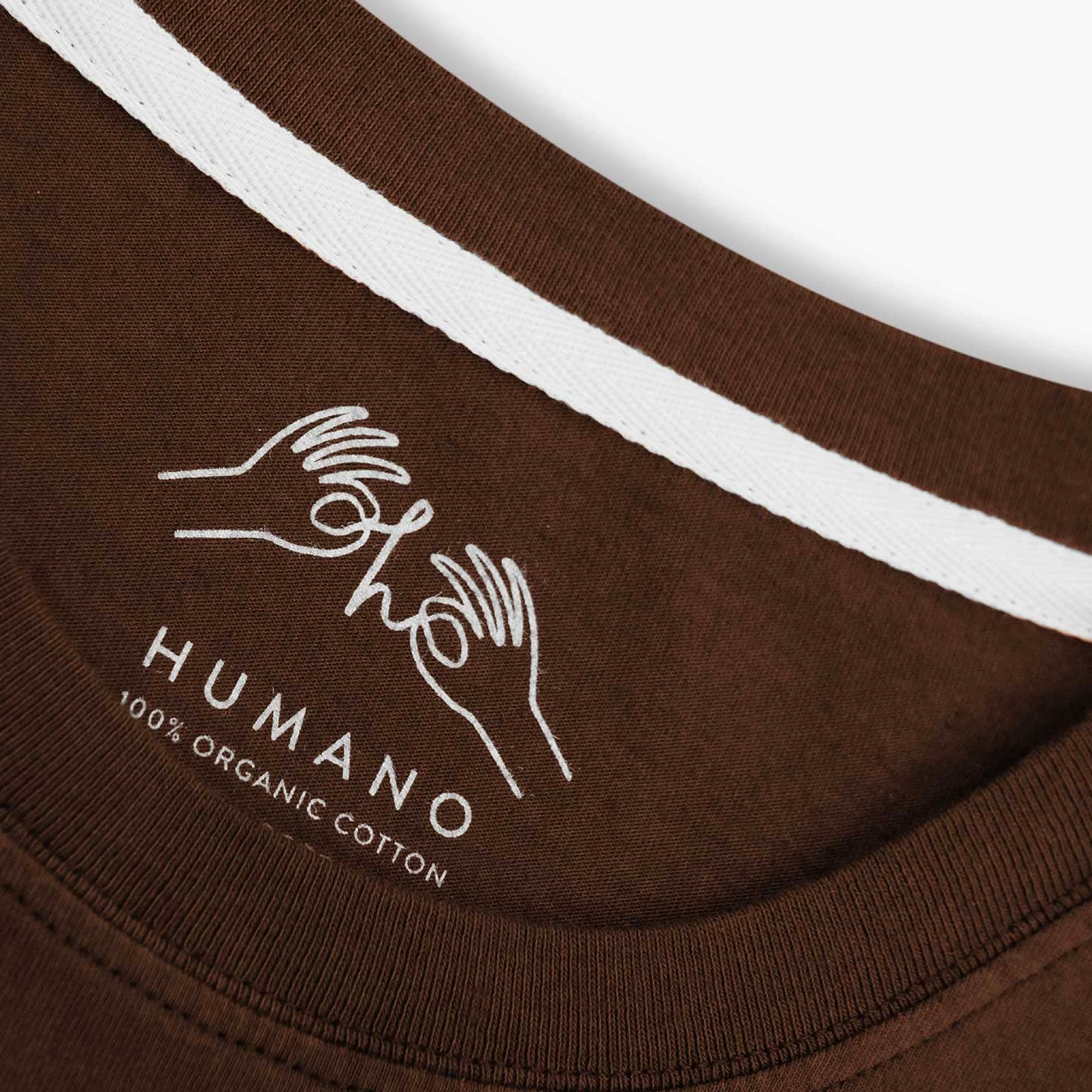
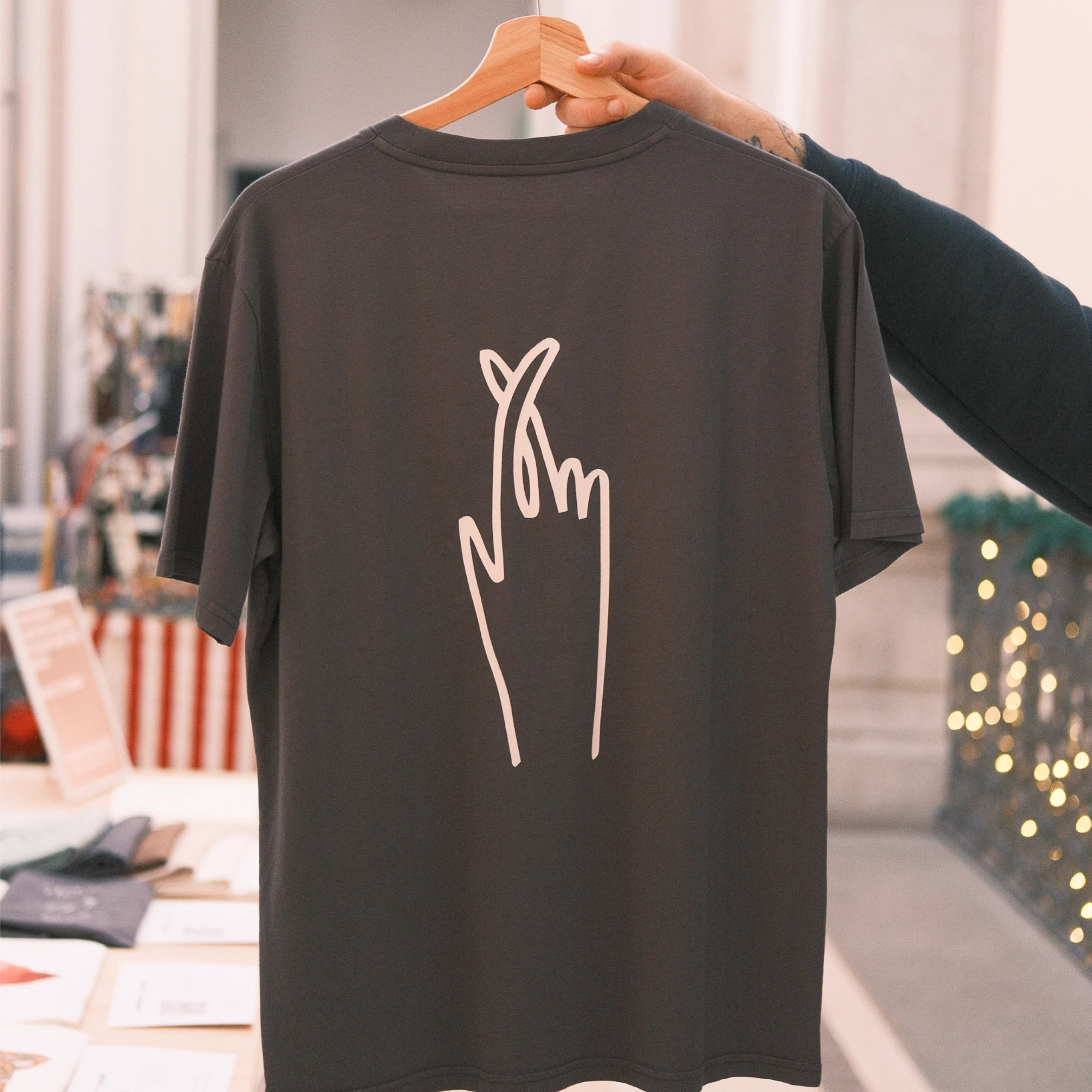
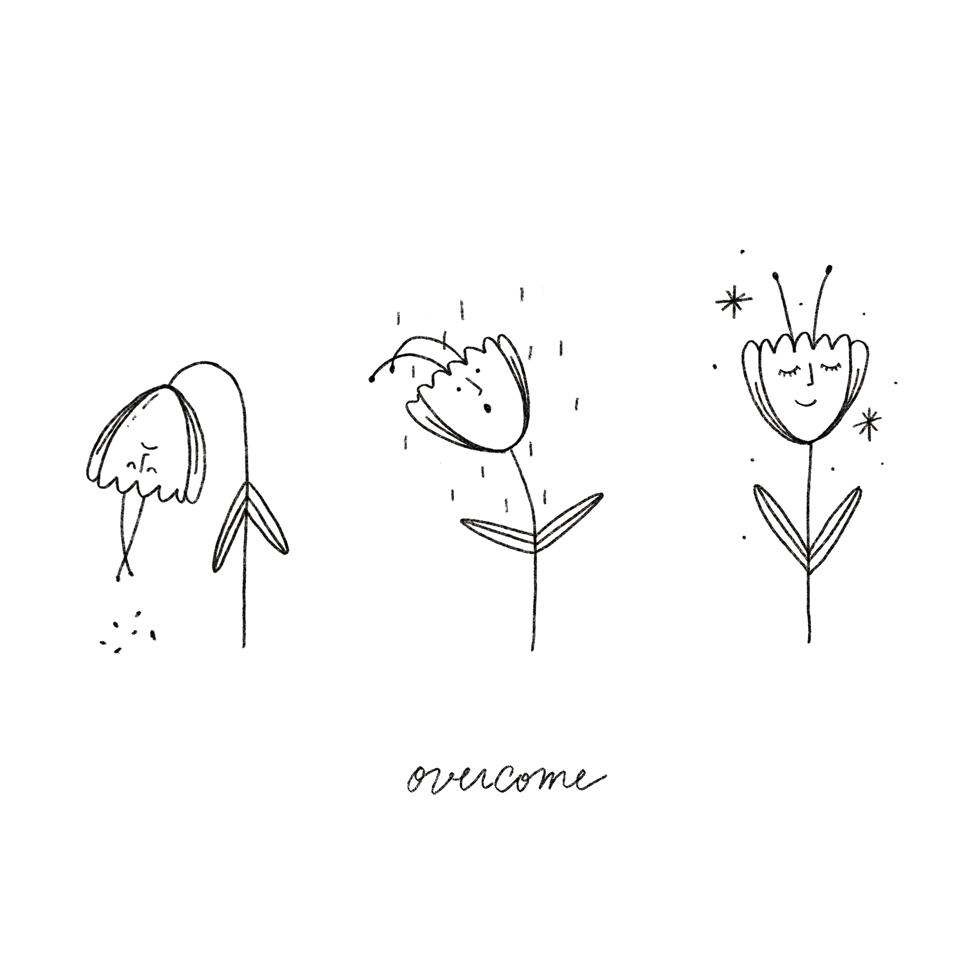
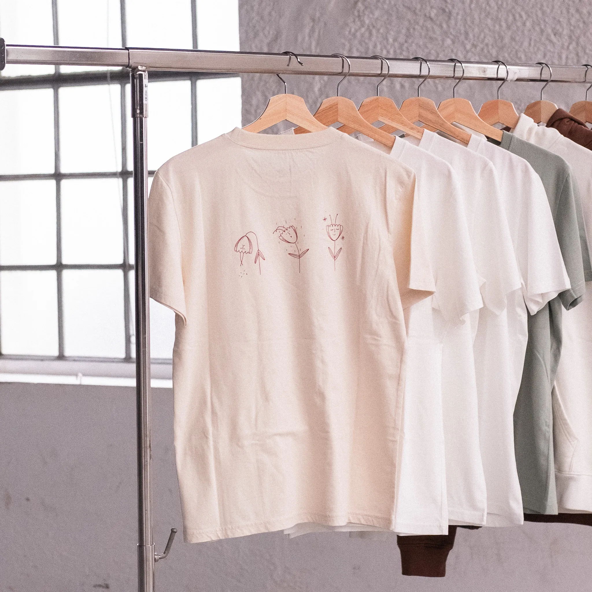
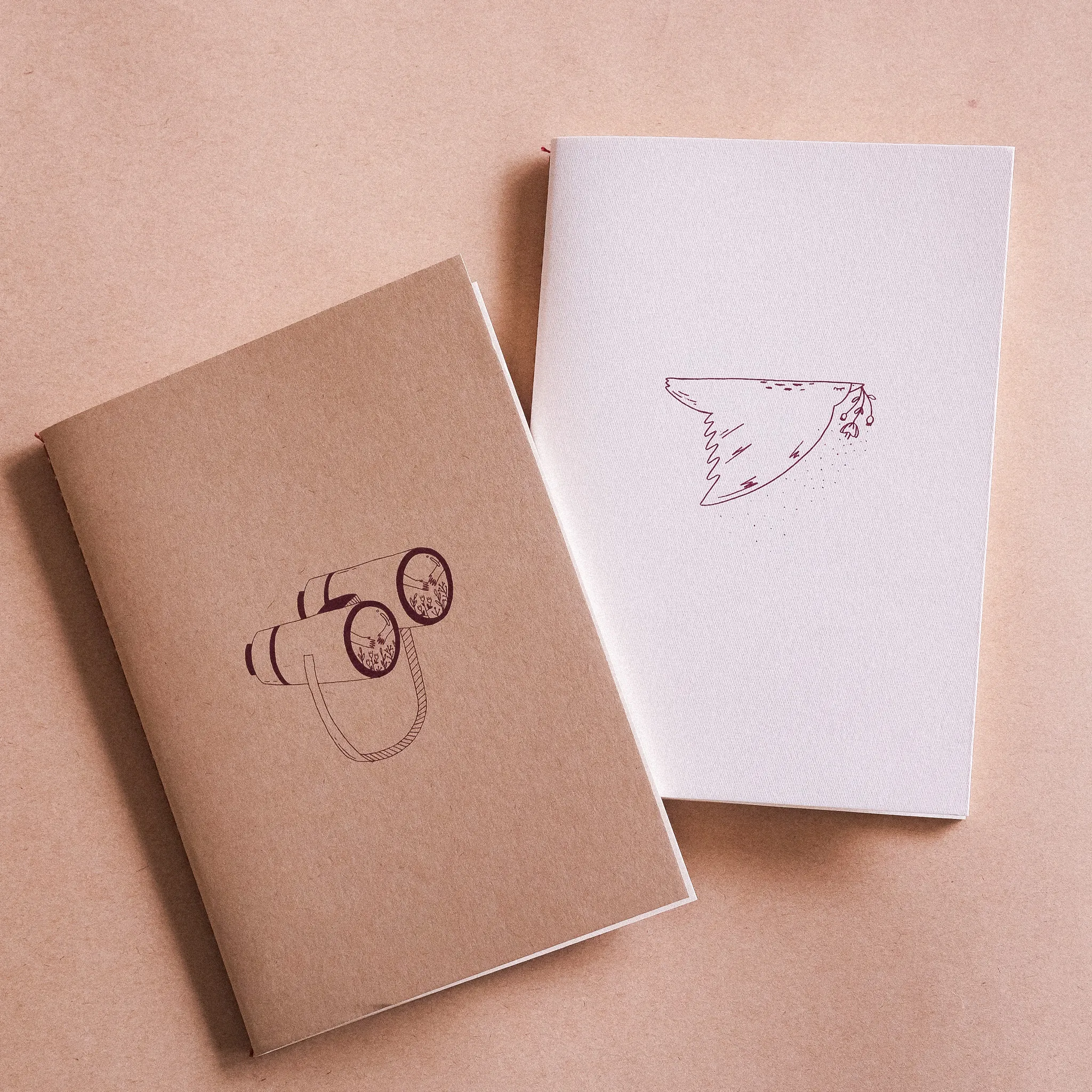
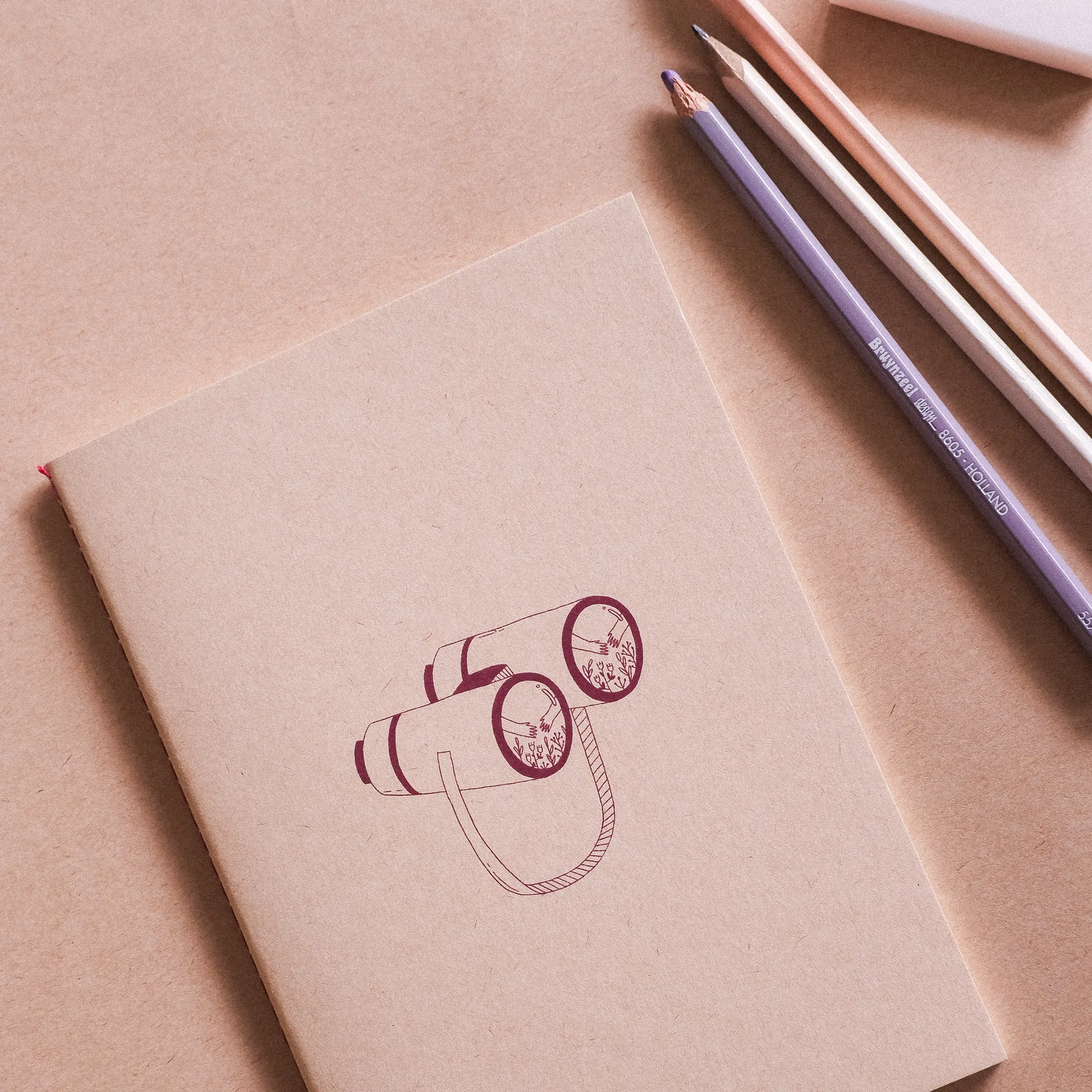
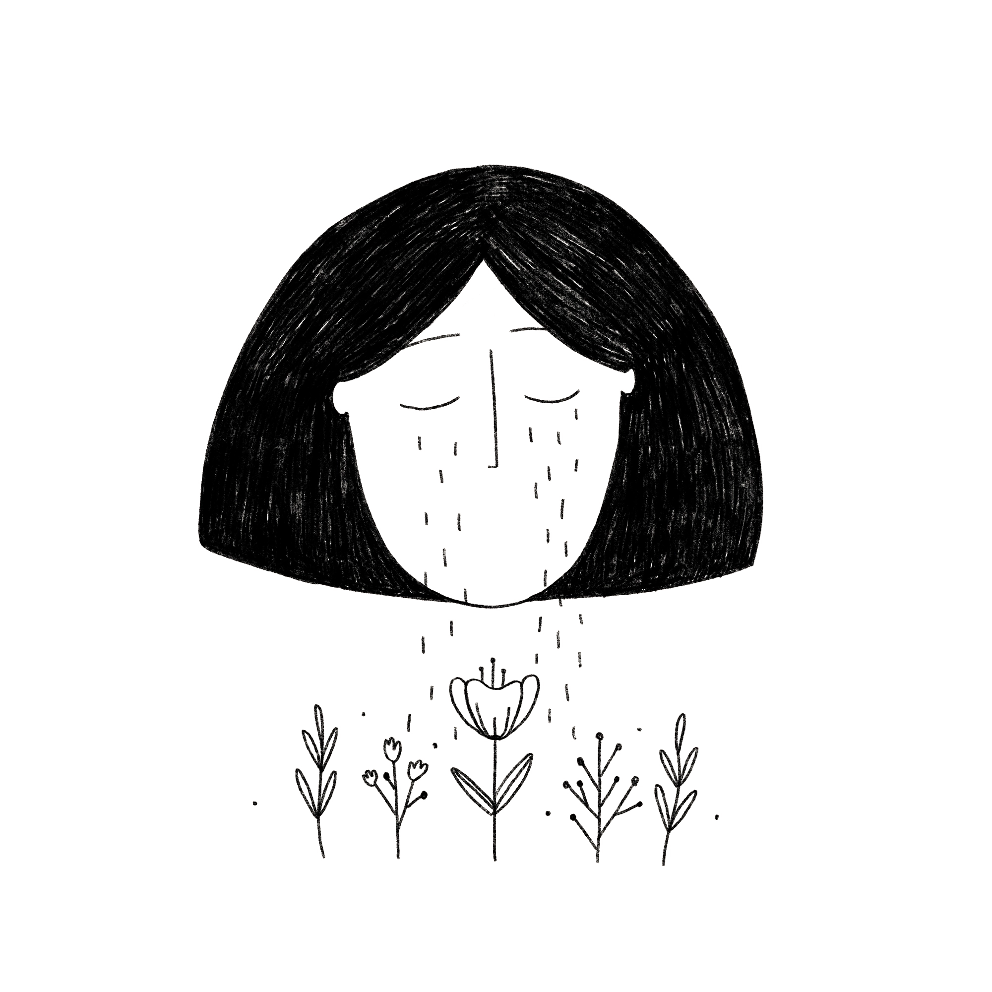
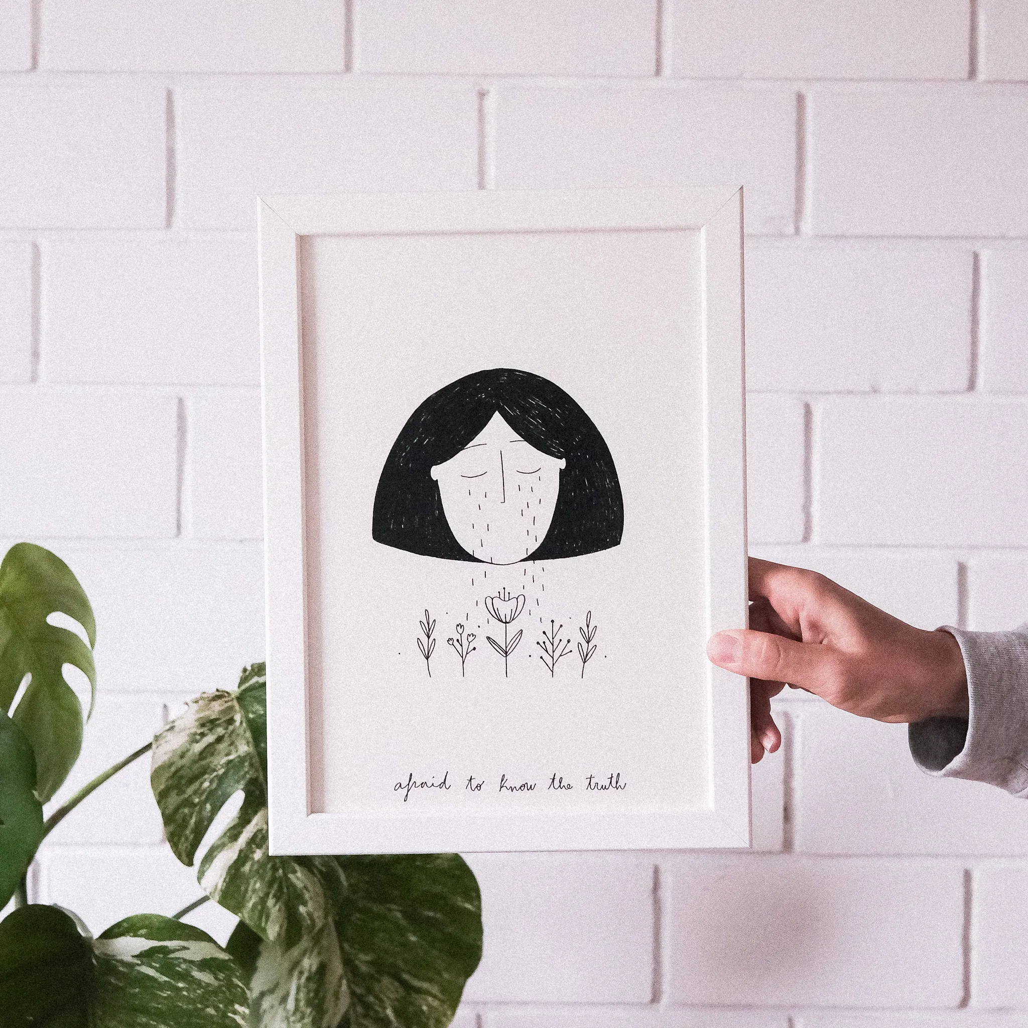
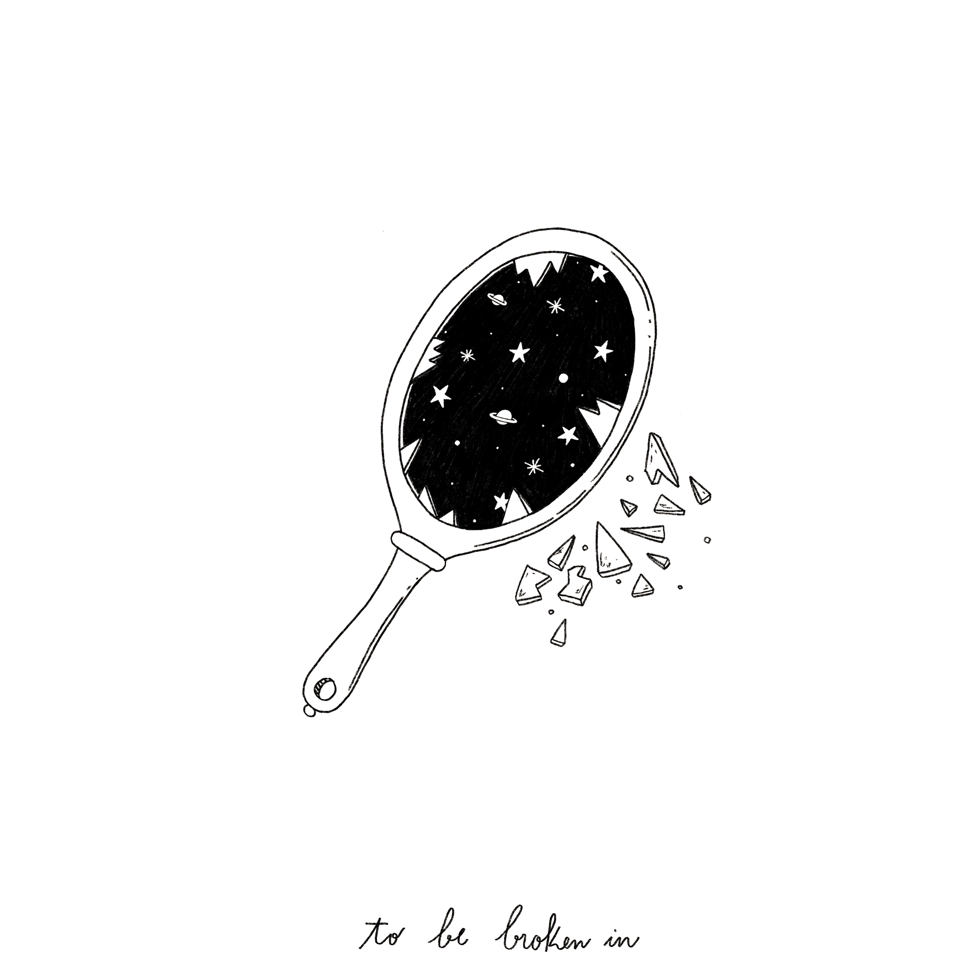
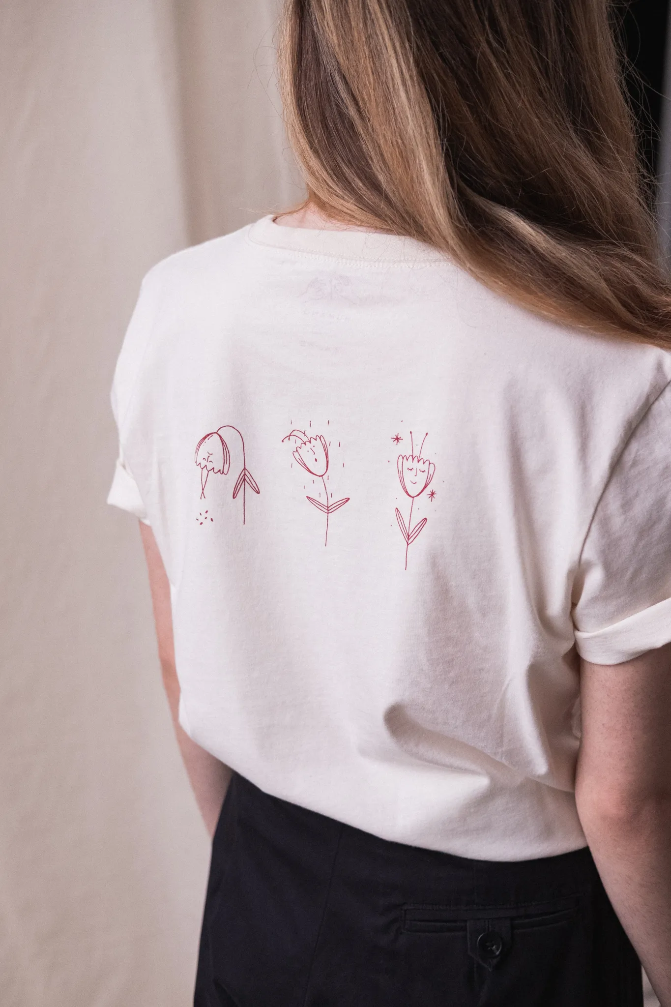
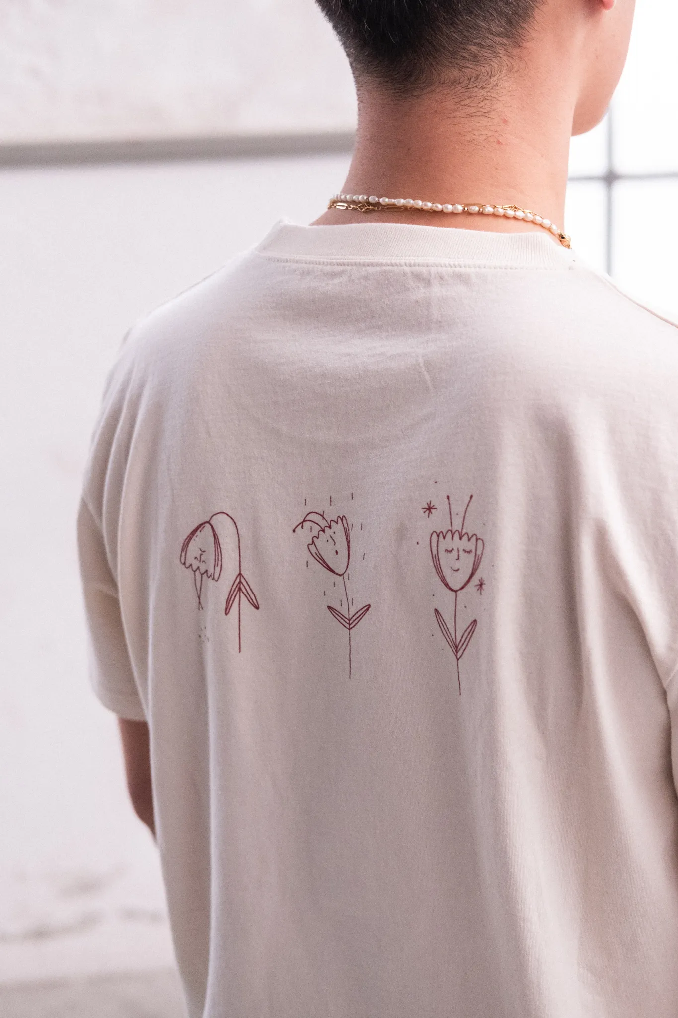
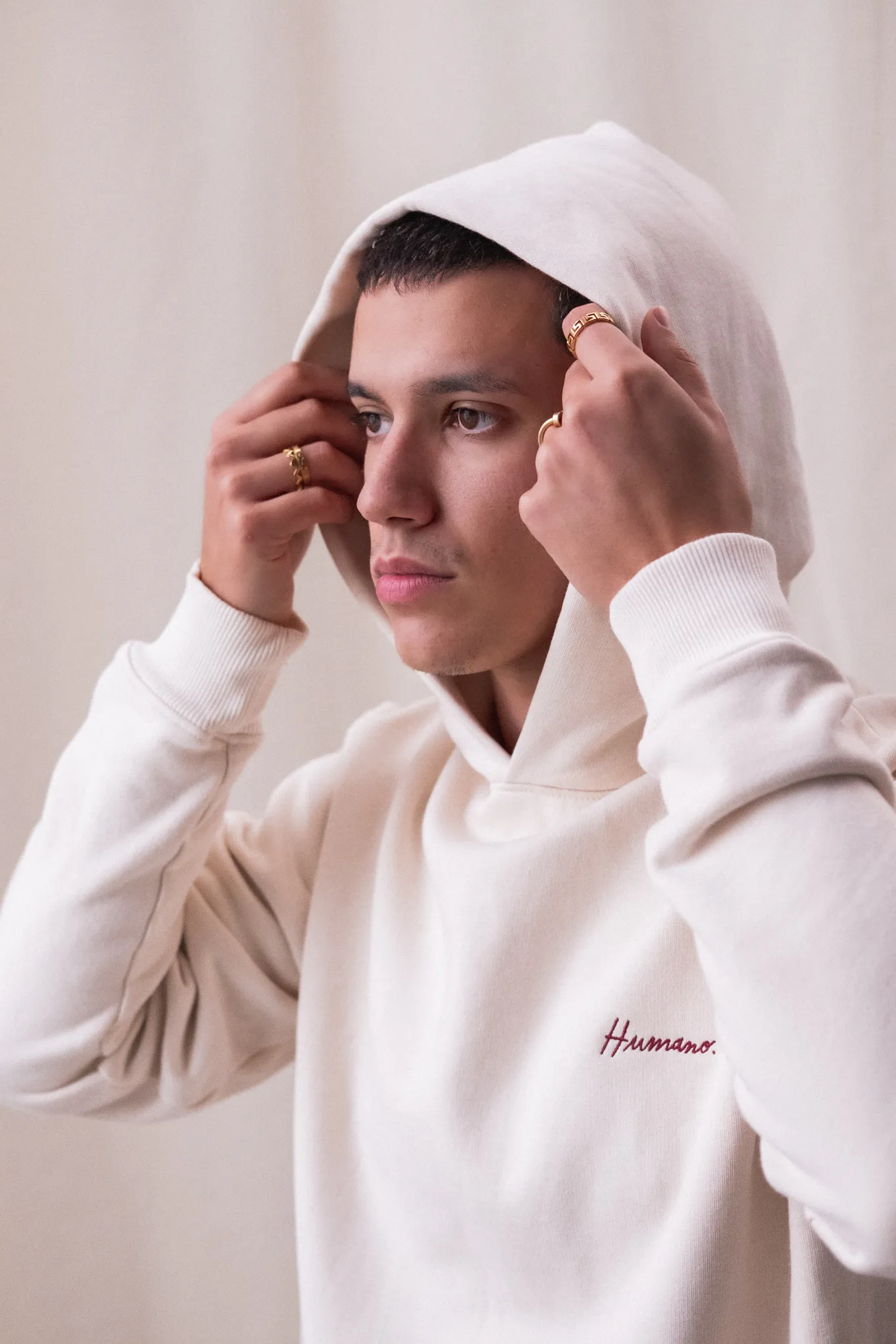
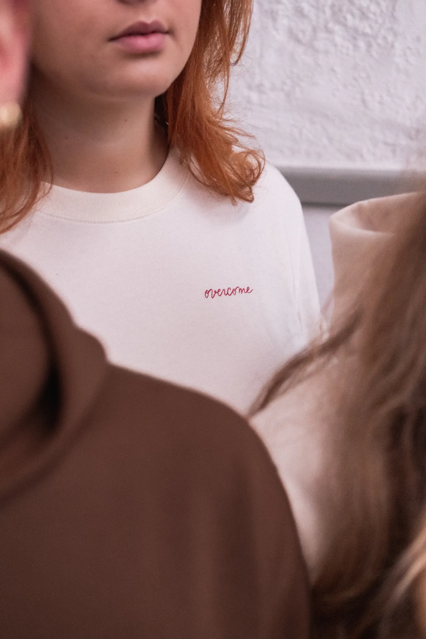
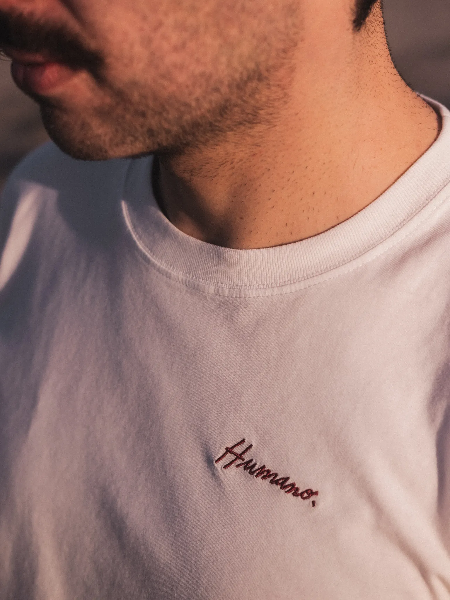
DESIGNING A BEST SELLER
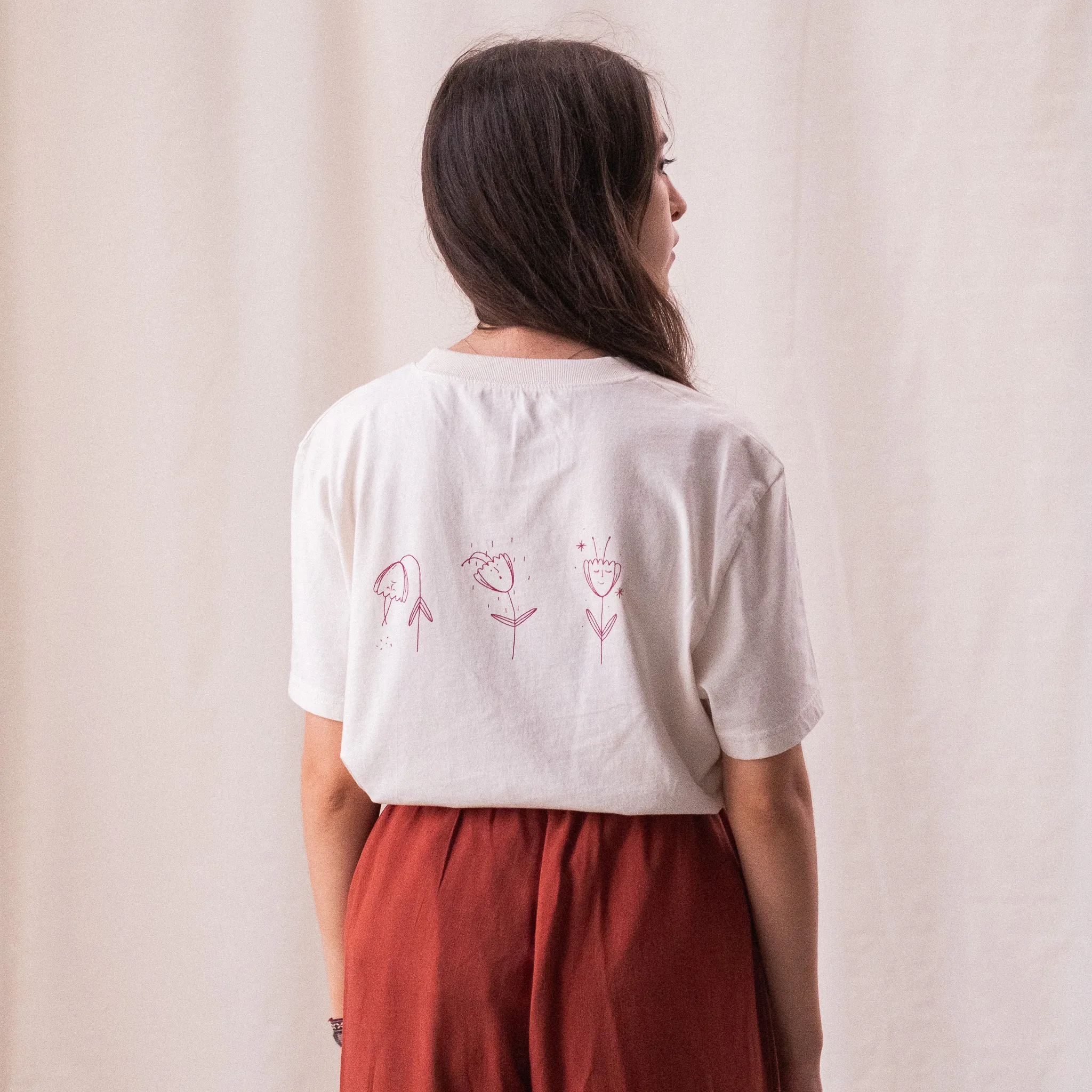
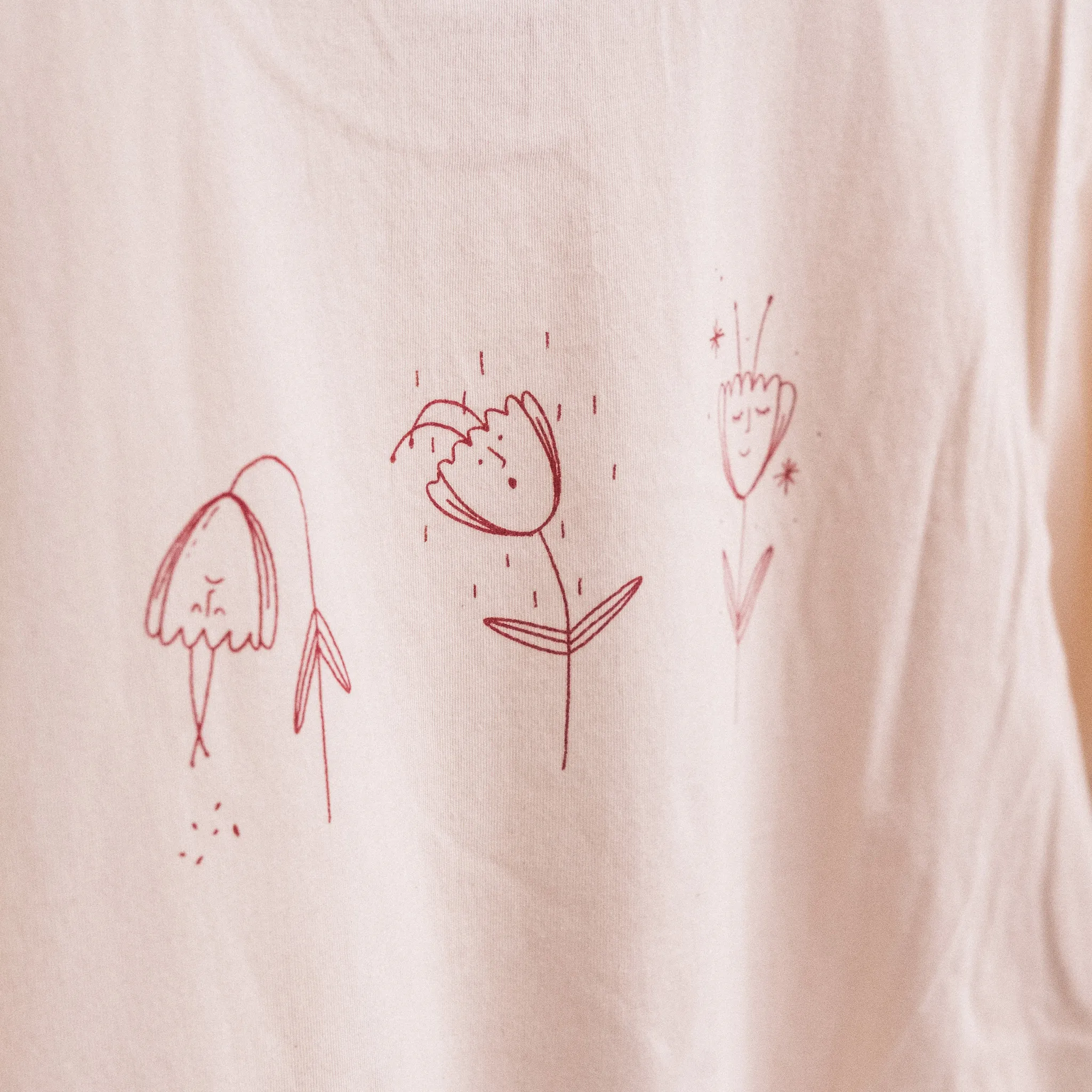
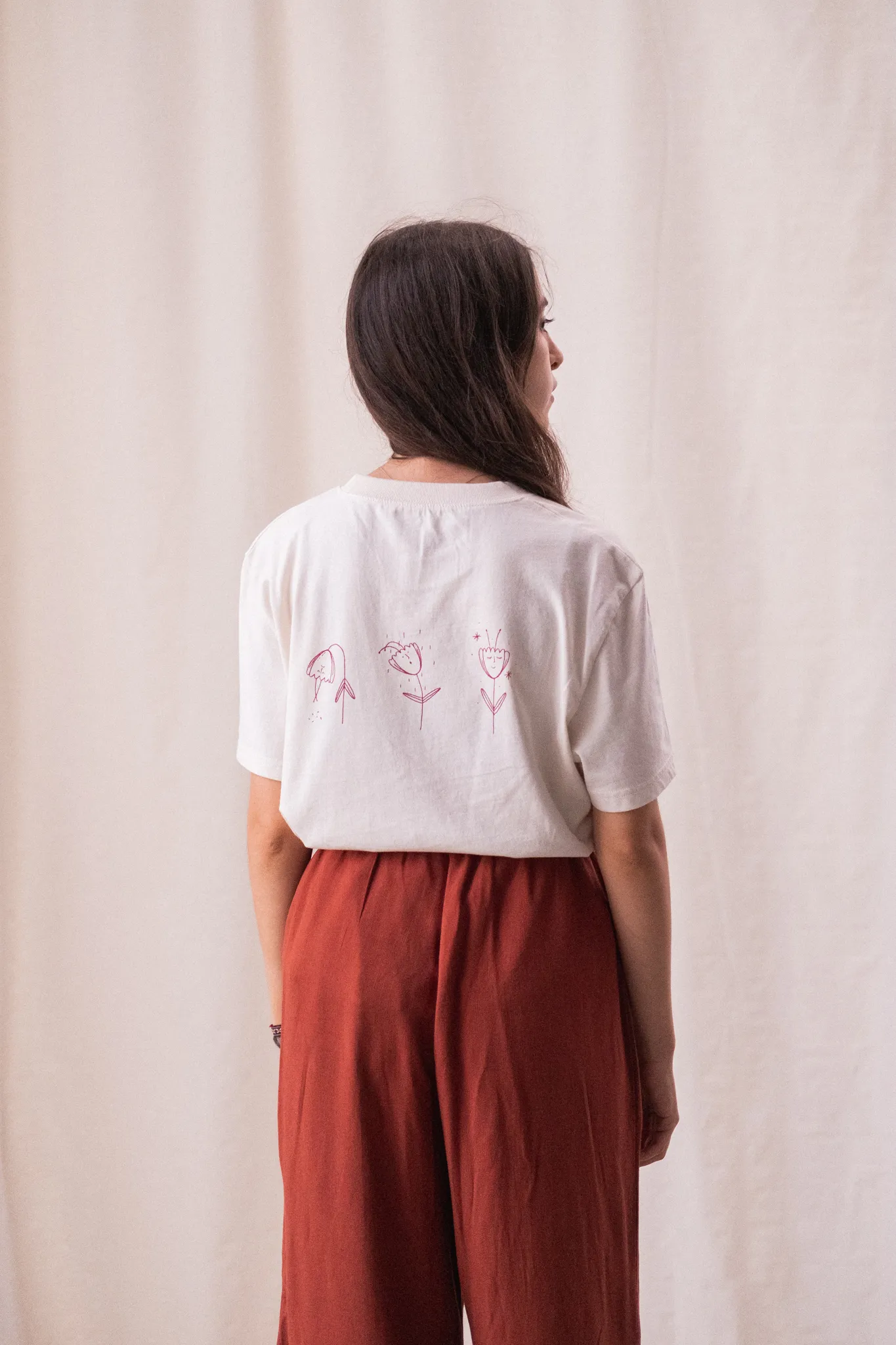
Designing and illustrating for Humano was an intimate and layered process. I didn’t want to be literal — I wanted to channel the emotional core of Epoch’s stories and translate that into visuals that carried the same vulnerability, resilience and depth. Inspired by Felipe’s journey, I pulled fragments from the “I’m HIV Positive” video and let those words shape a series of illustrations that felt like visual poetry.
The idea of being broken and rebuilt, of finding light after trauma, became central to the work. From a collection of concepts, one illustration emerged as the heart of it all and became the brand’s best-selling t-shirt. The rest found their place on prints and notebooks, continuing to tell those stories in different forms. Each piece was crafted with intention — soft, honest and human, just like the brand.
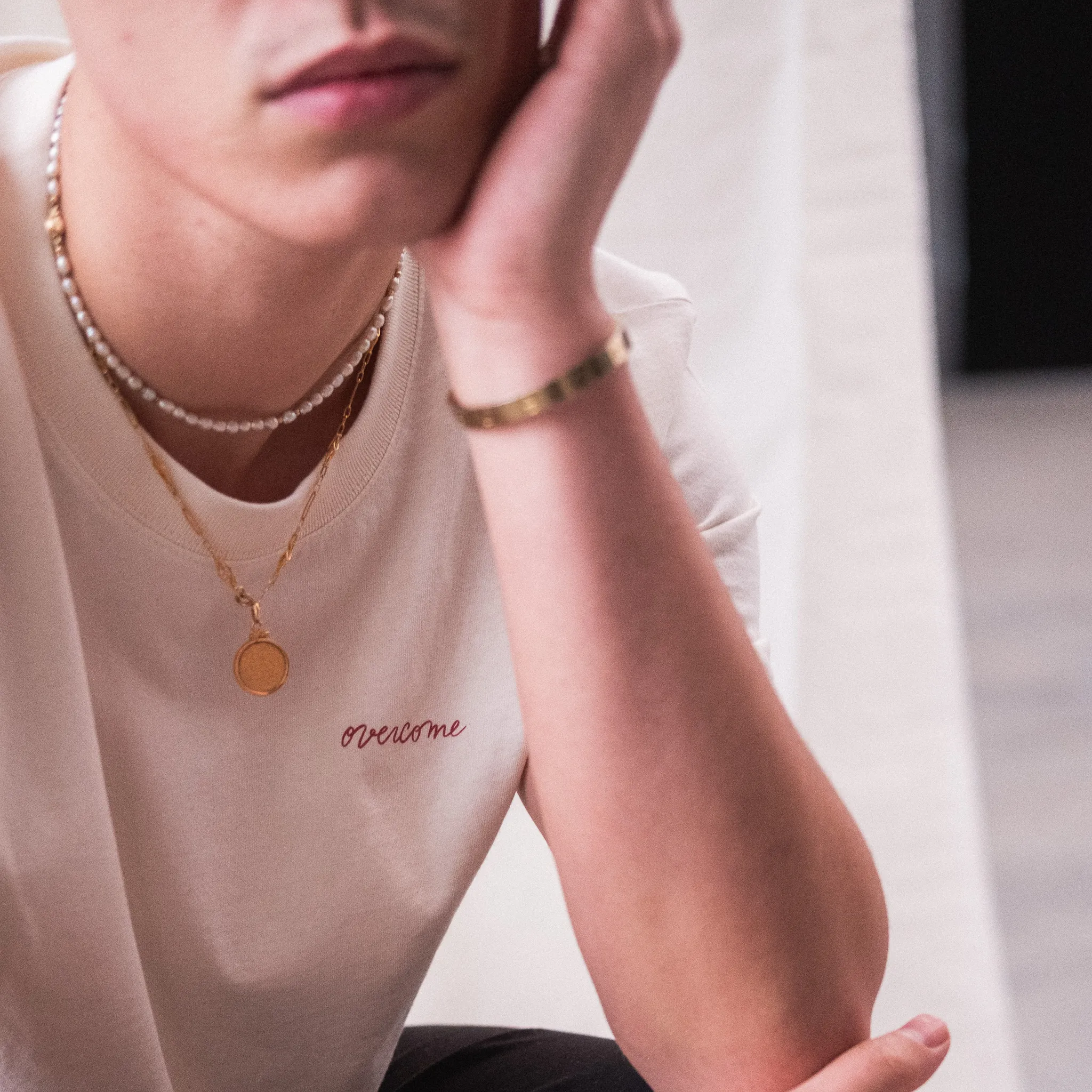
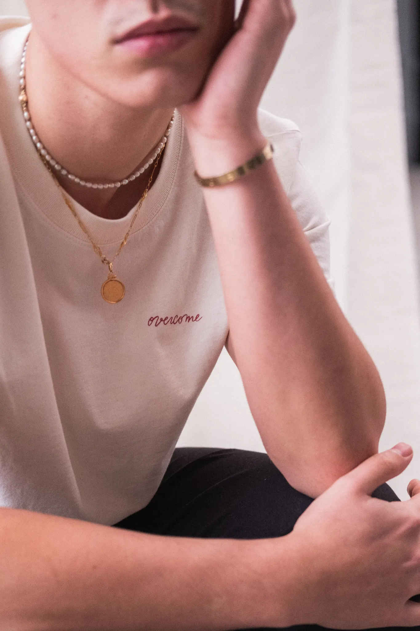
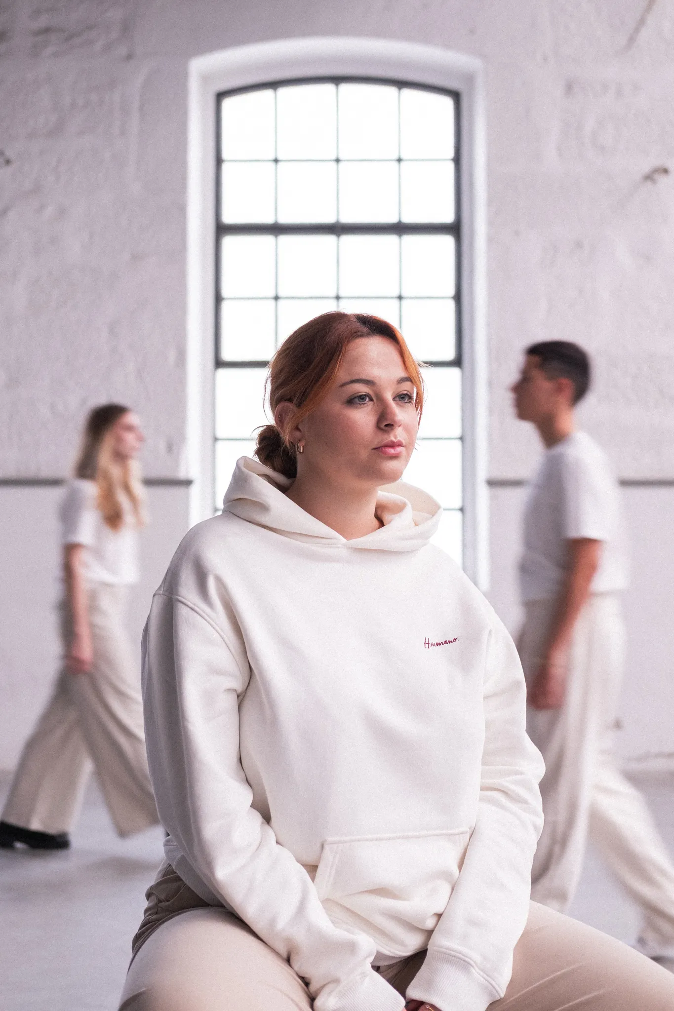
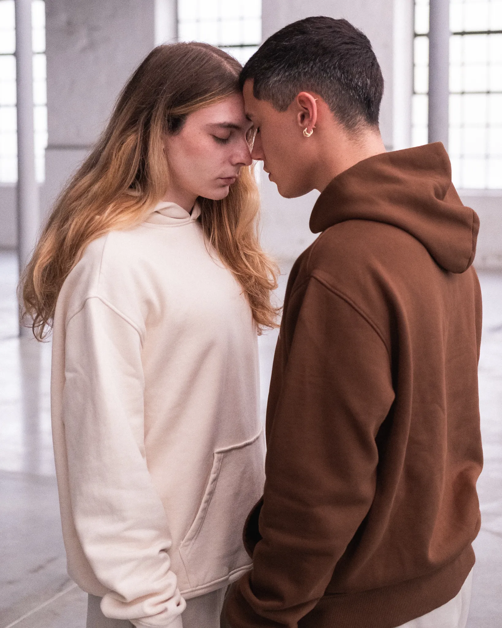
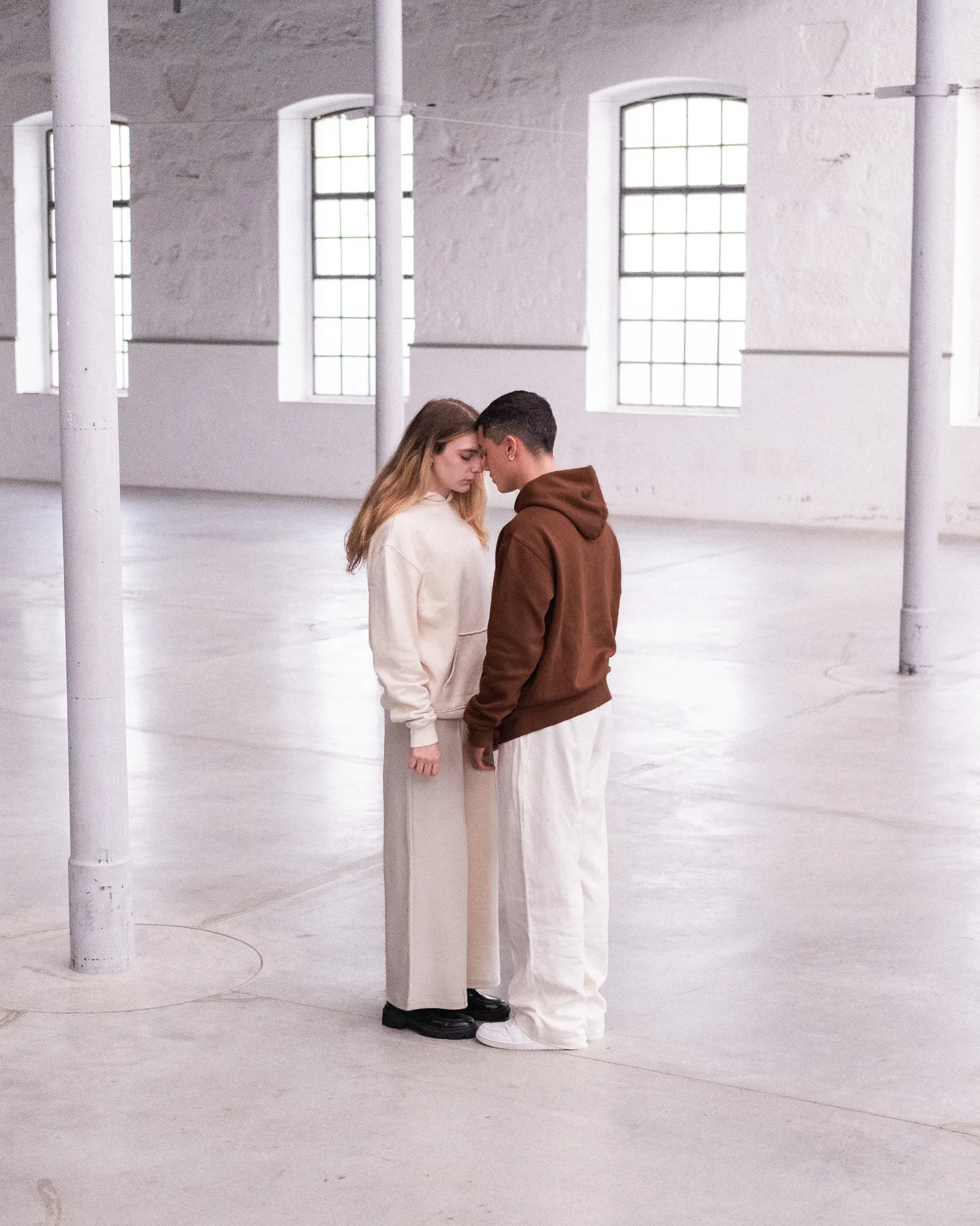
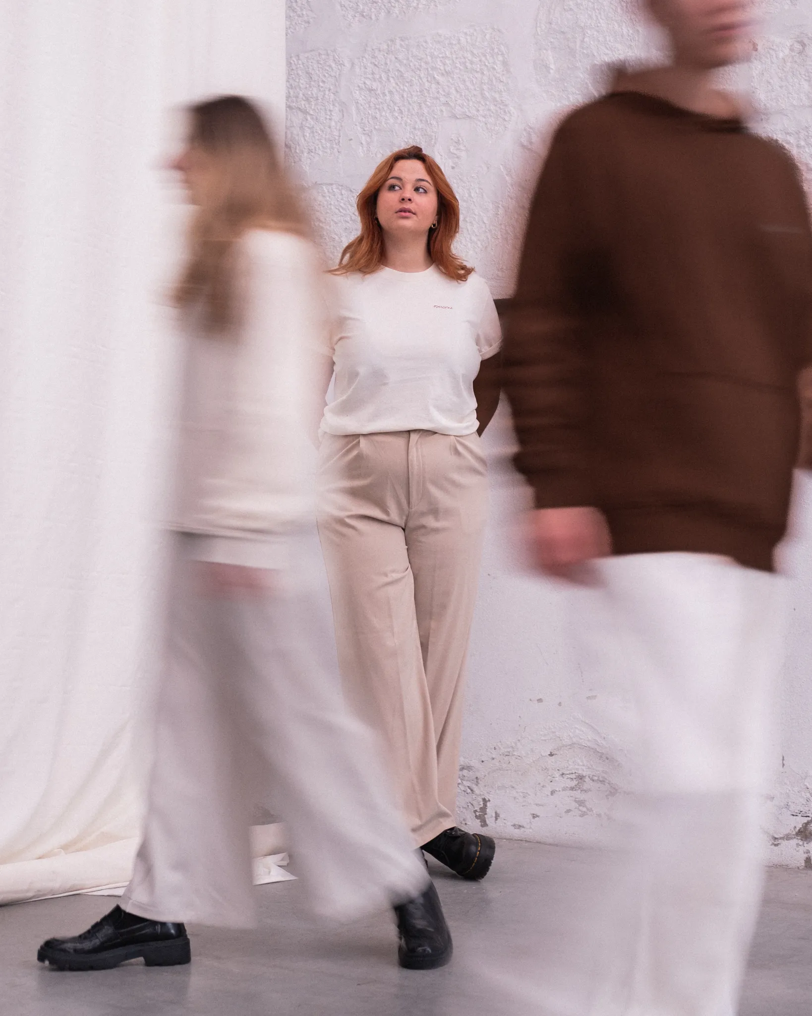
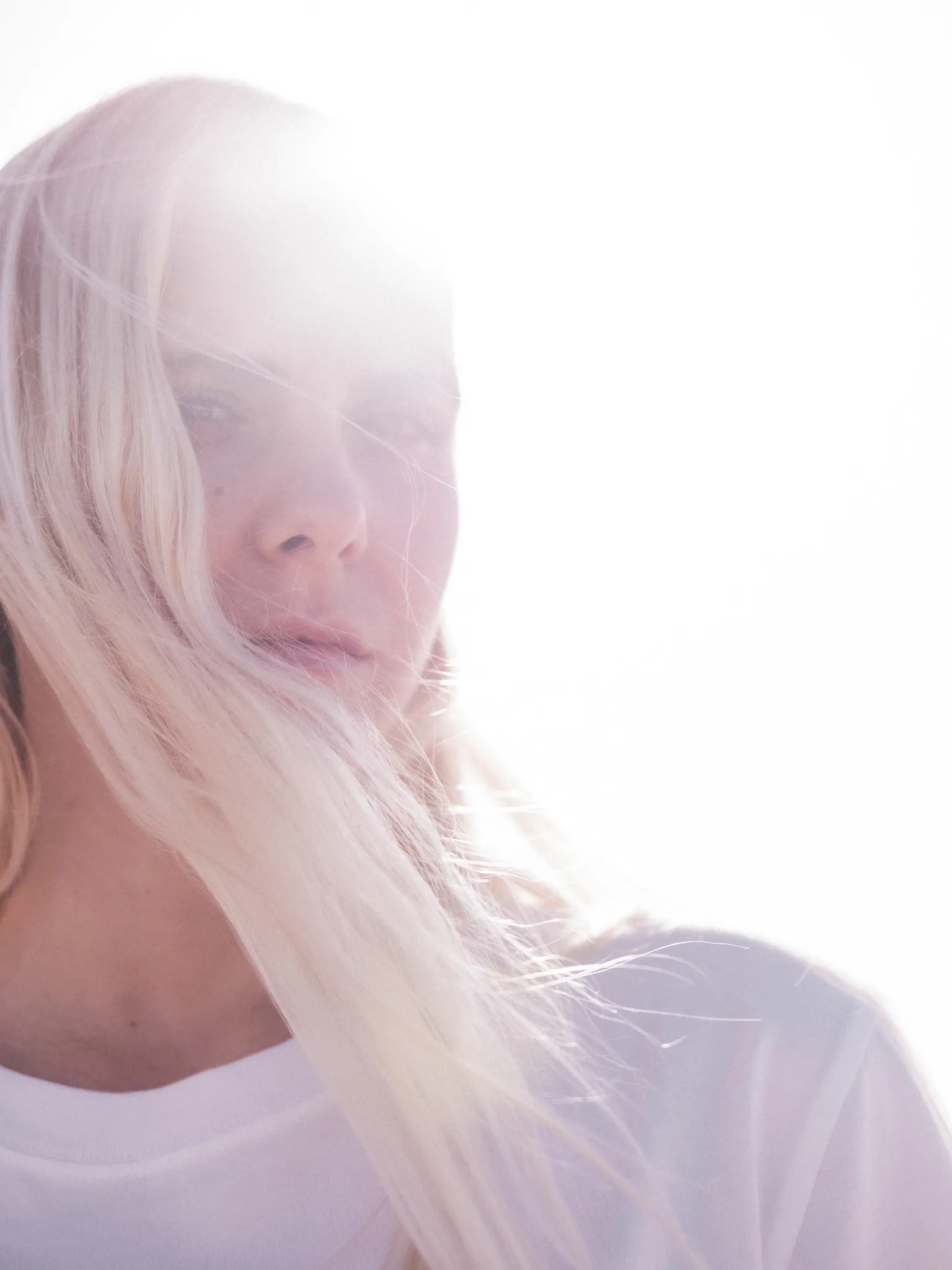
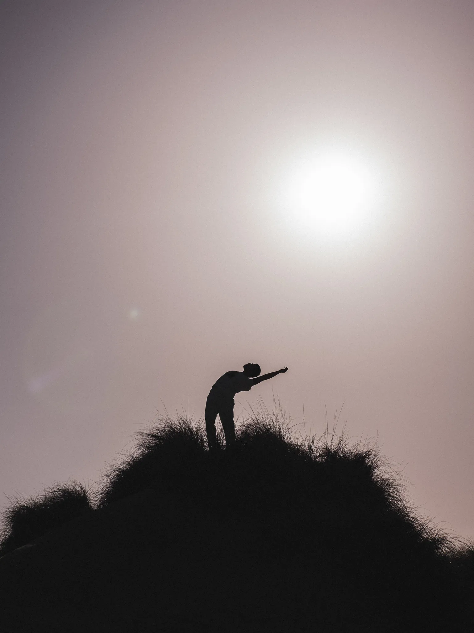
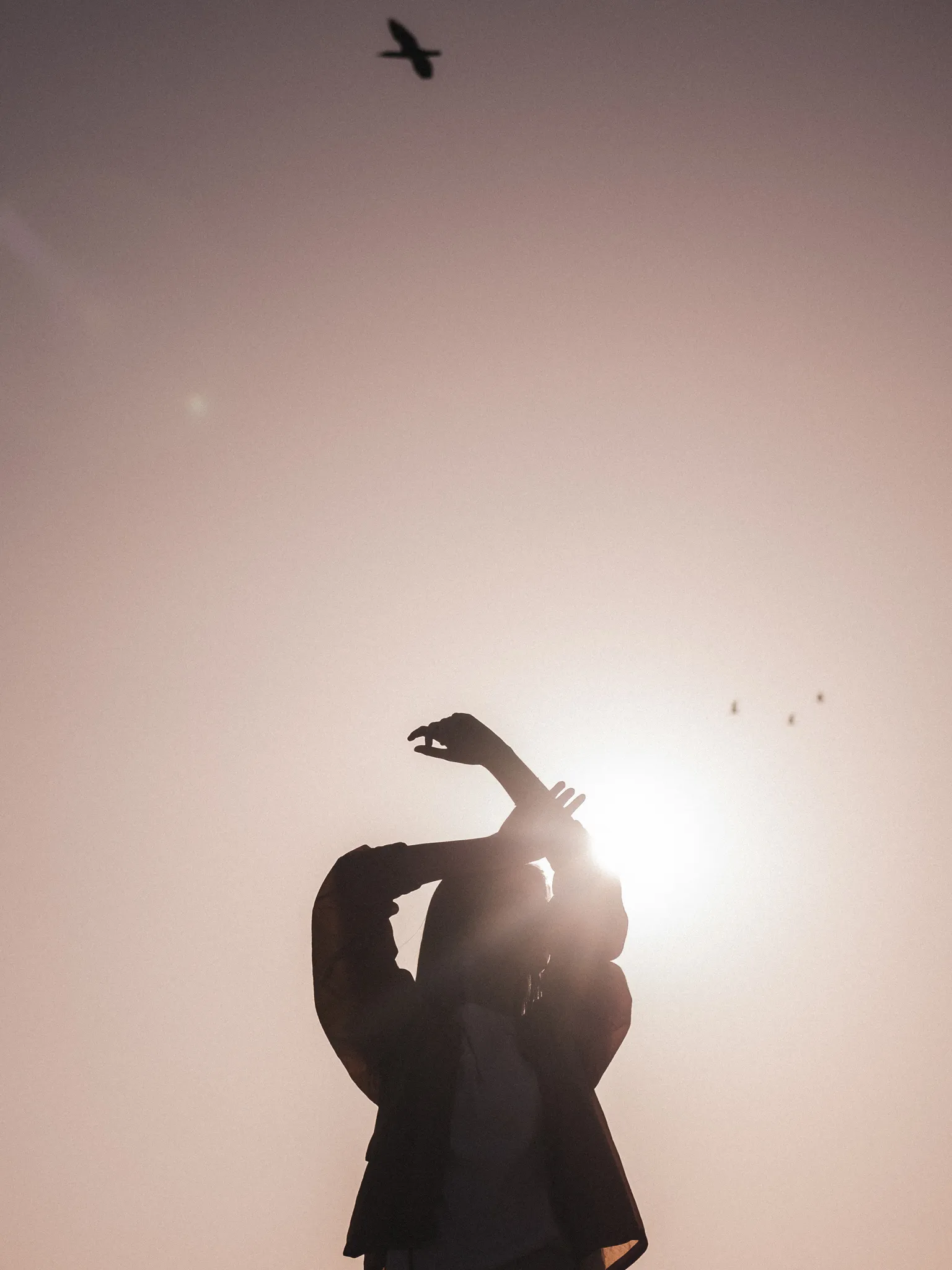
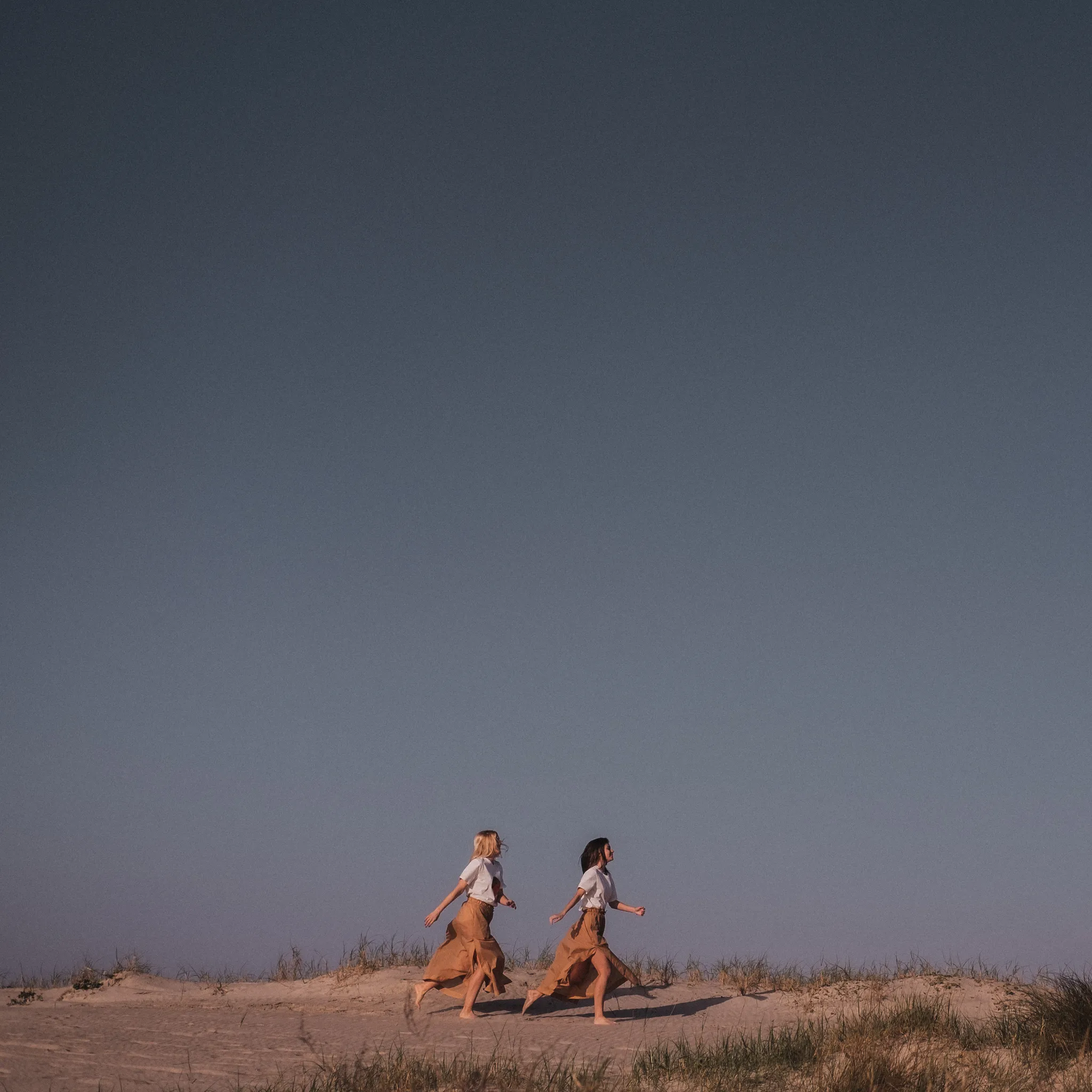
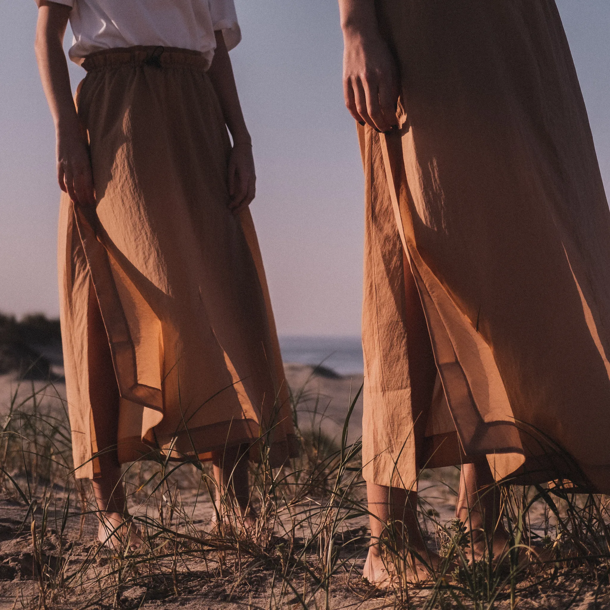
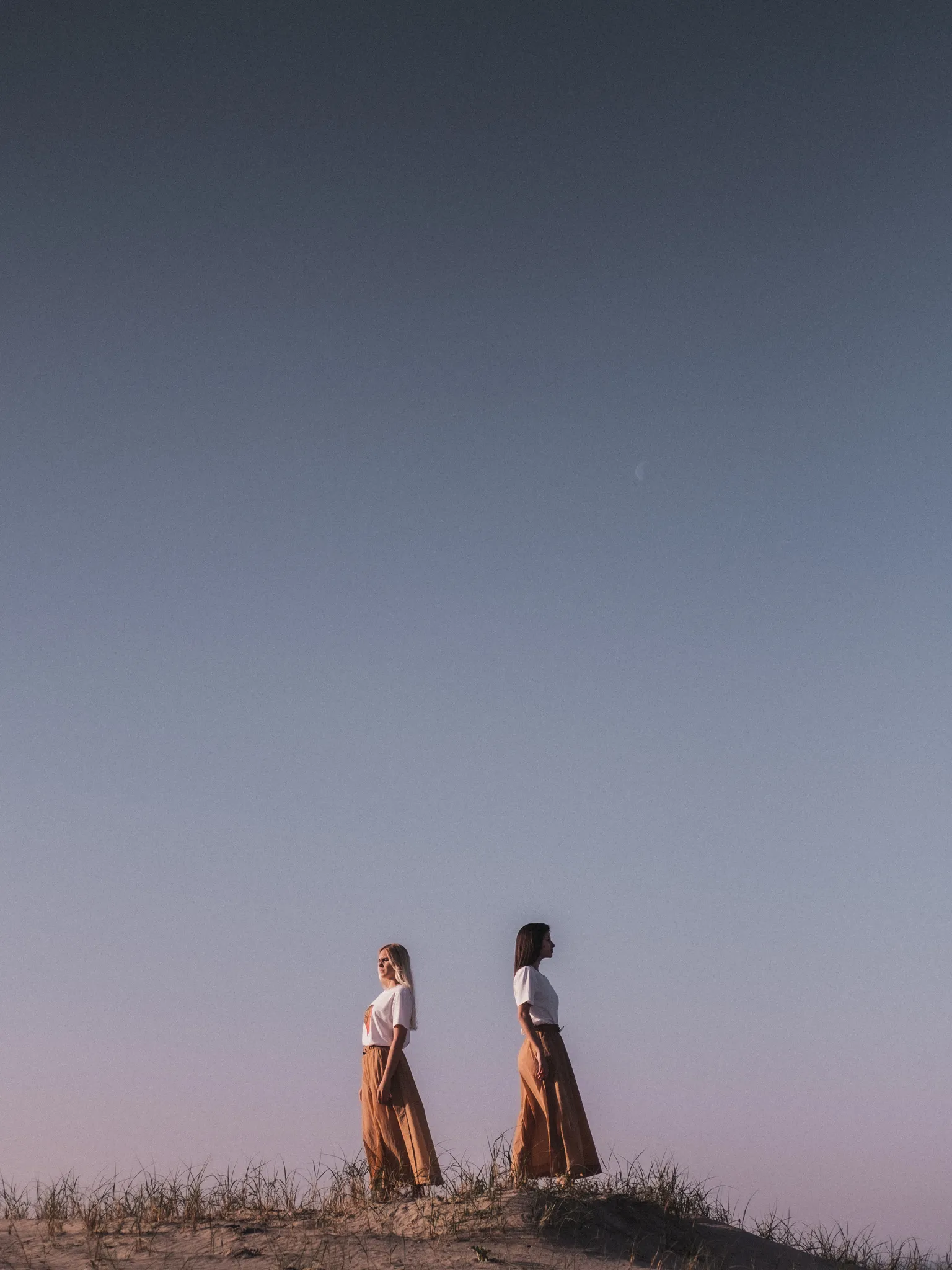
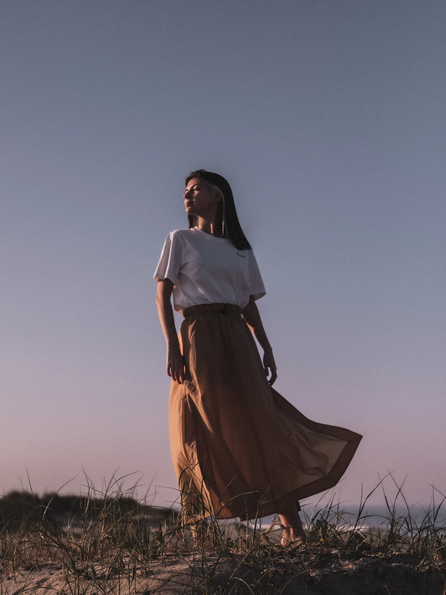
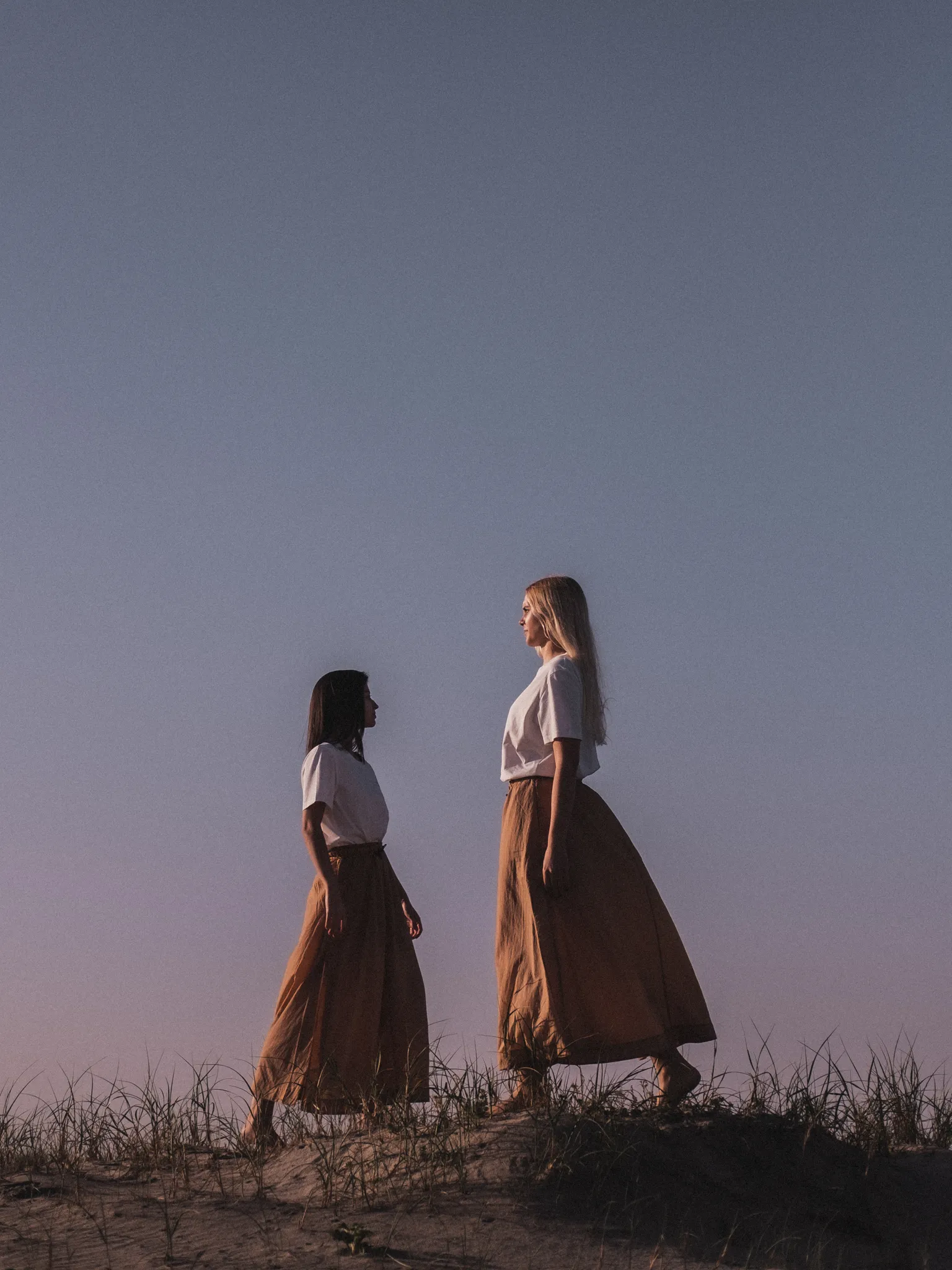
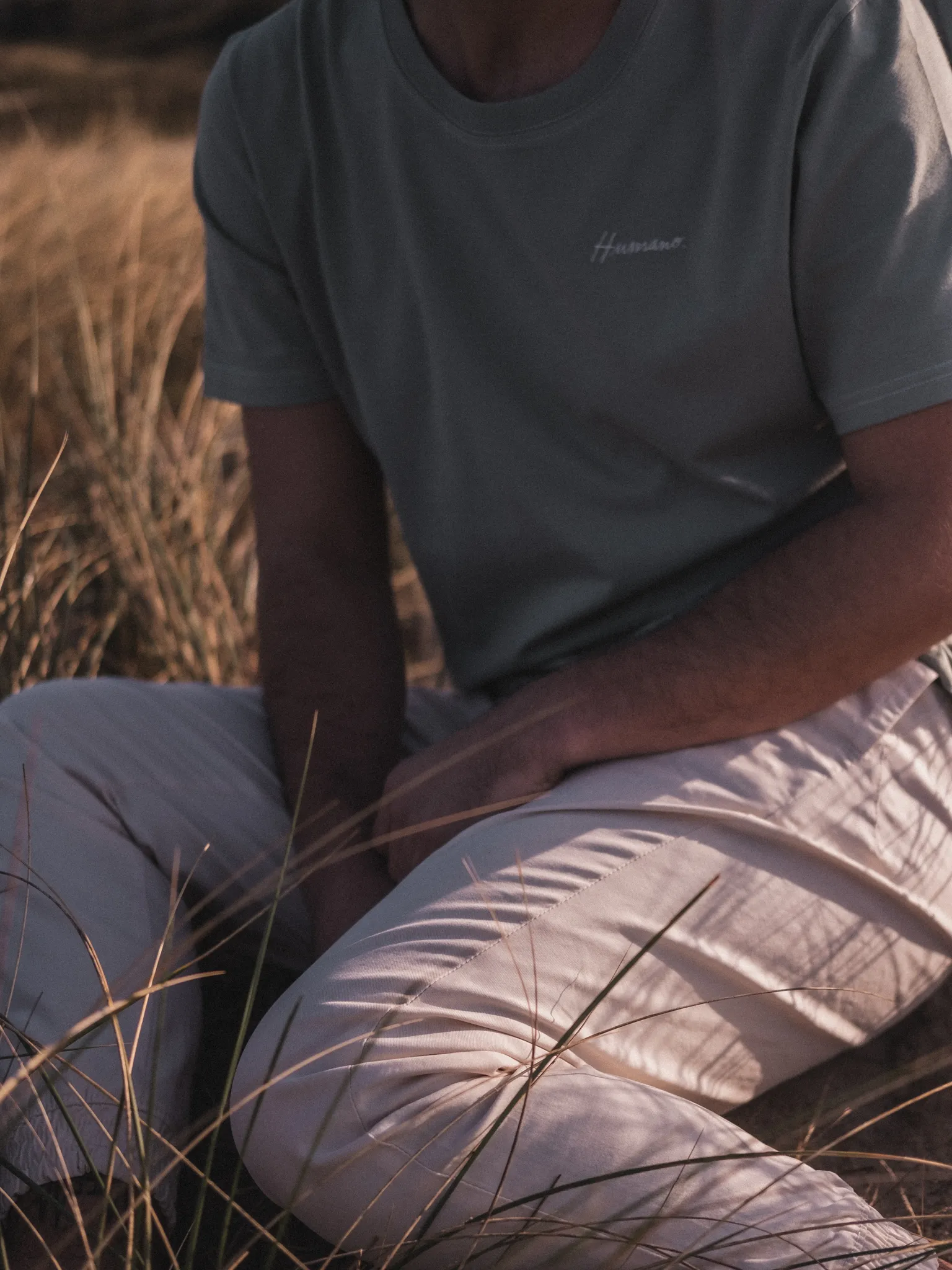
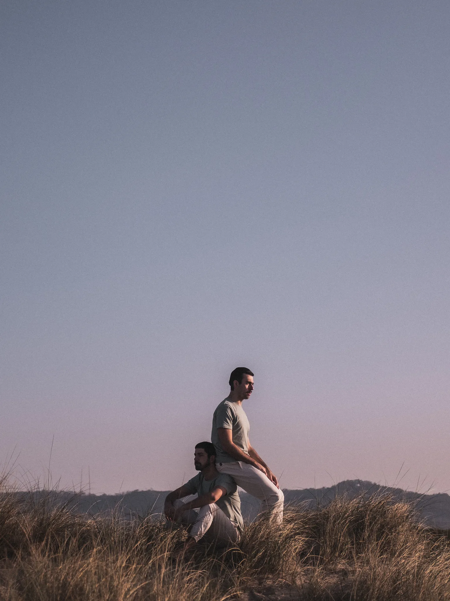
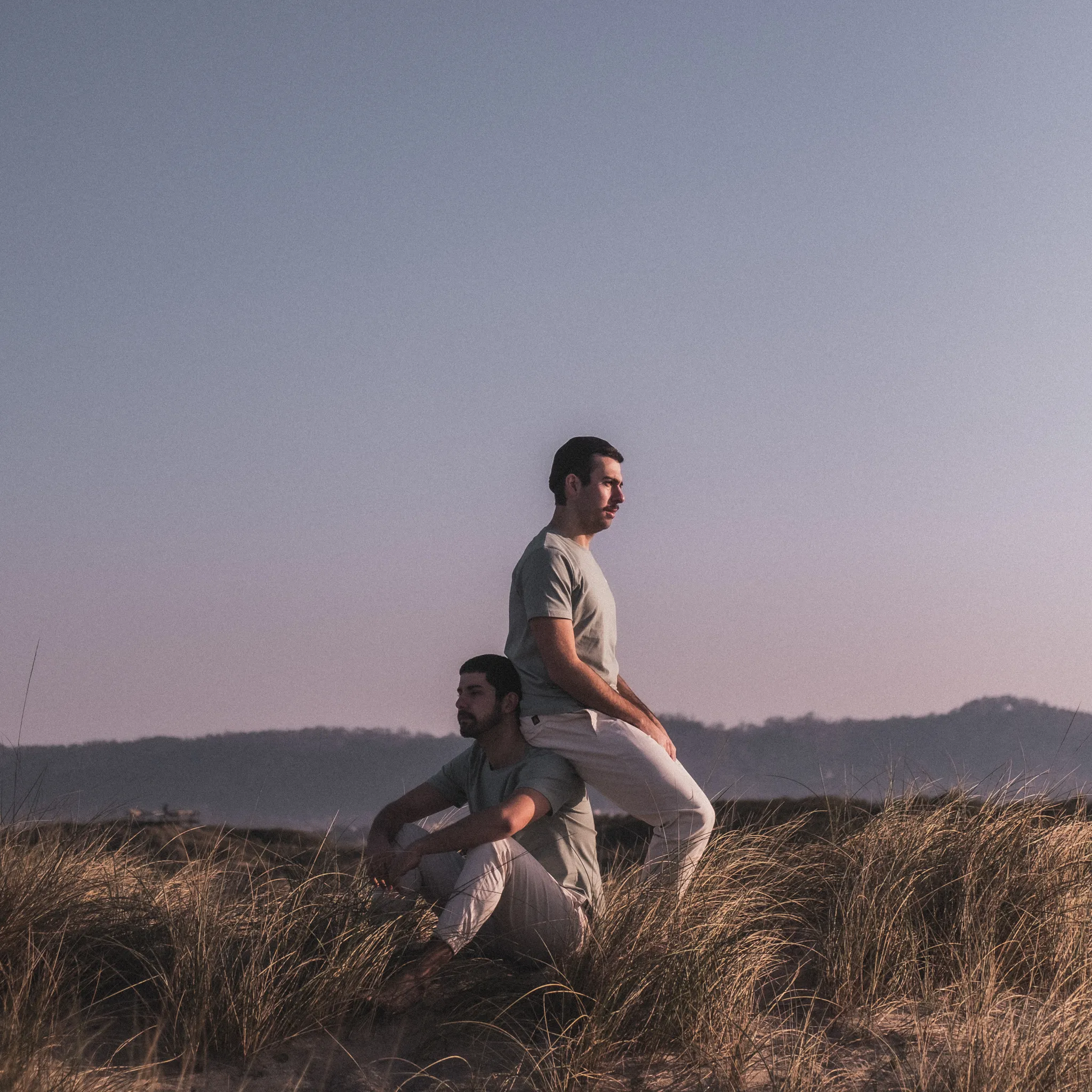
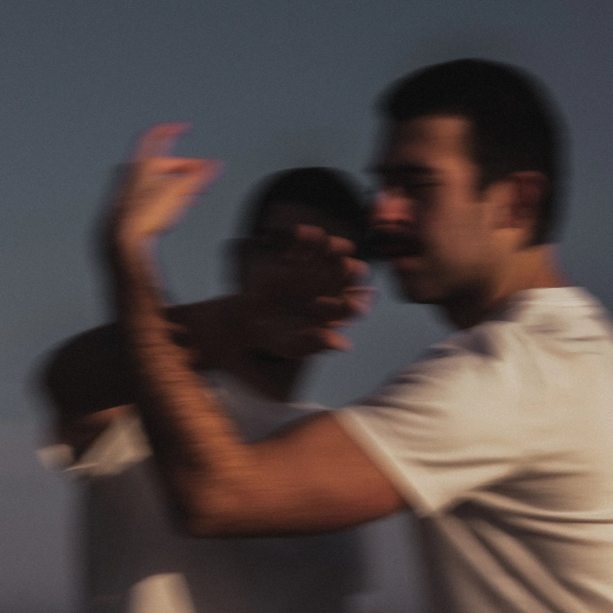
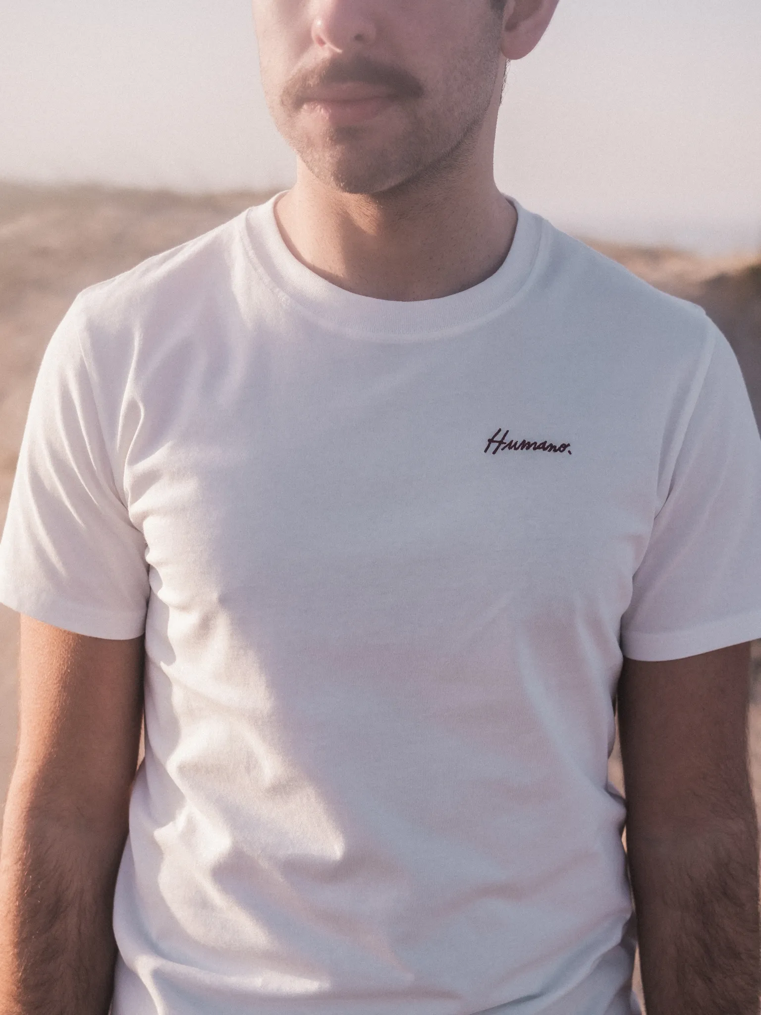
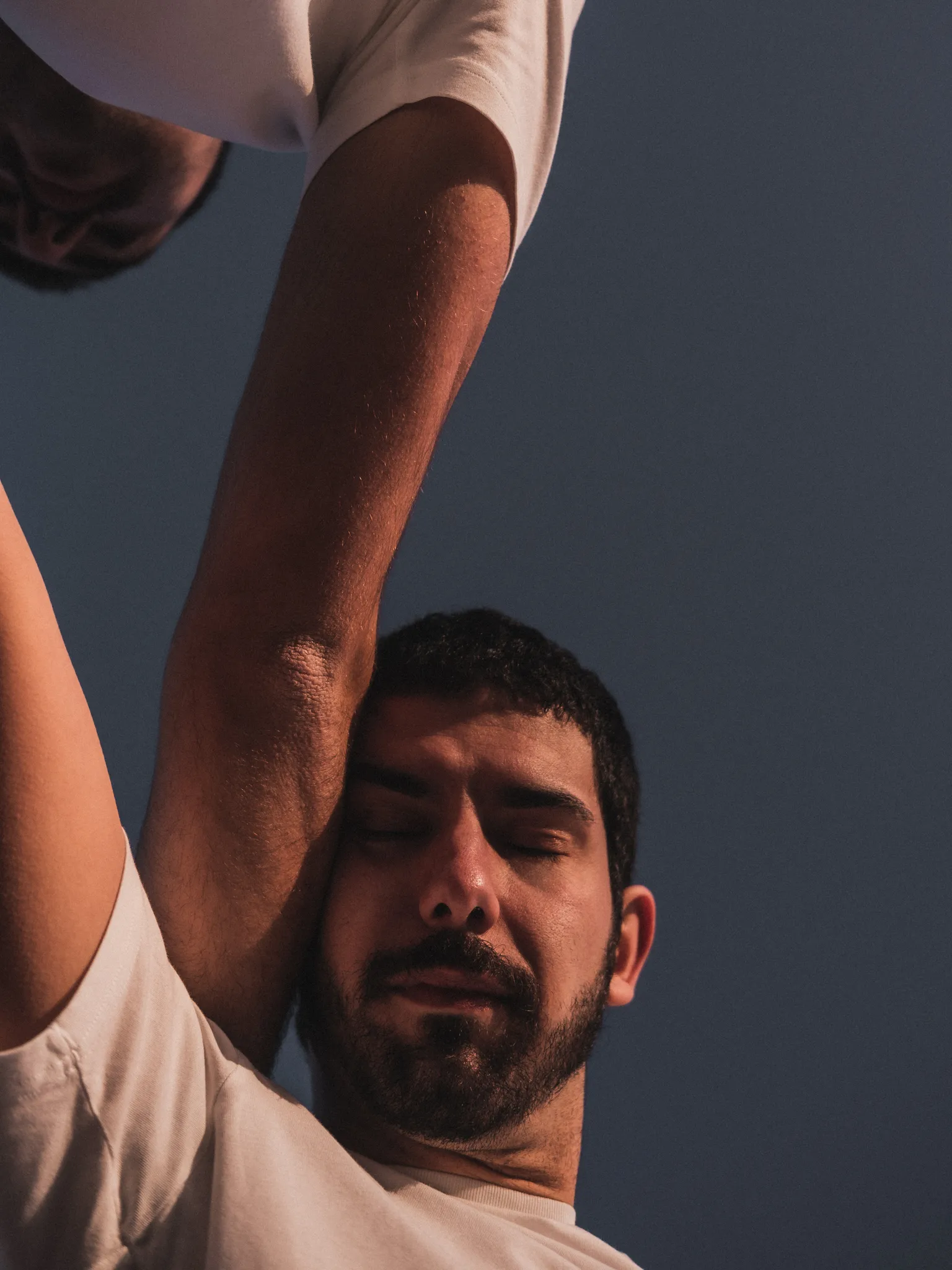
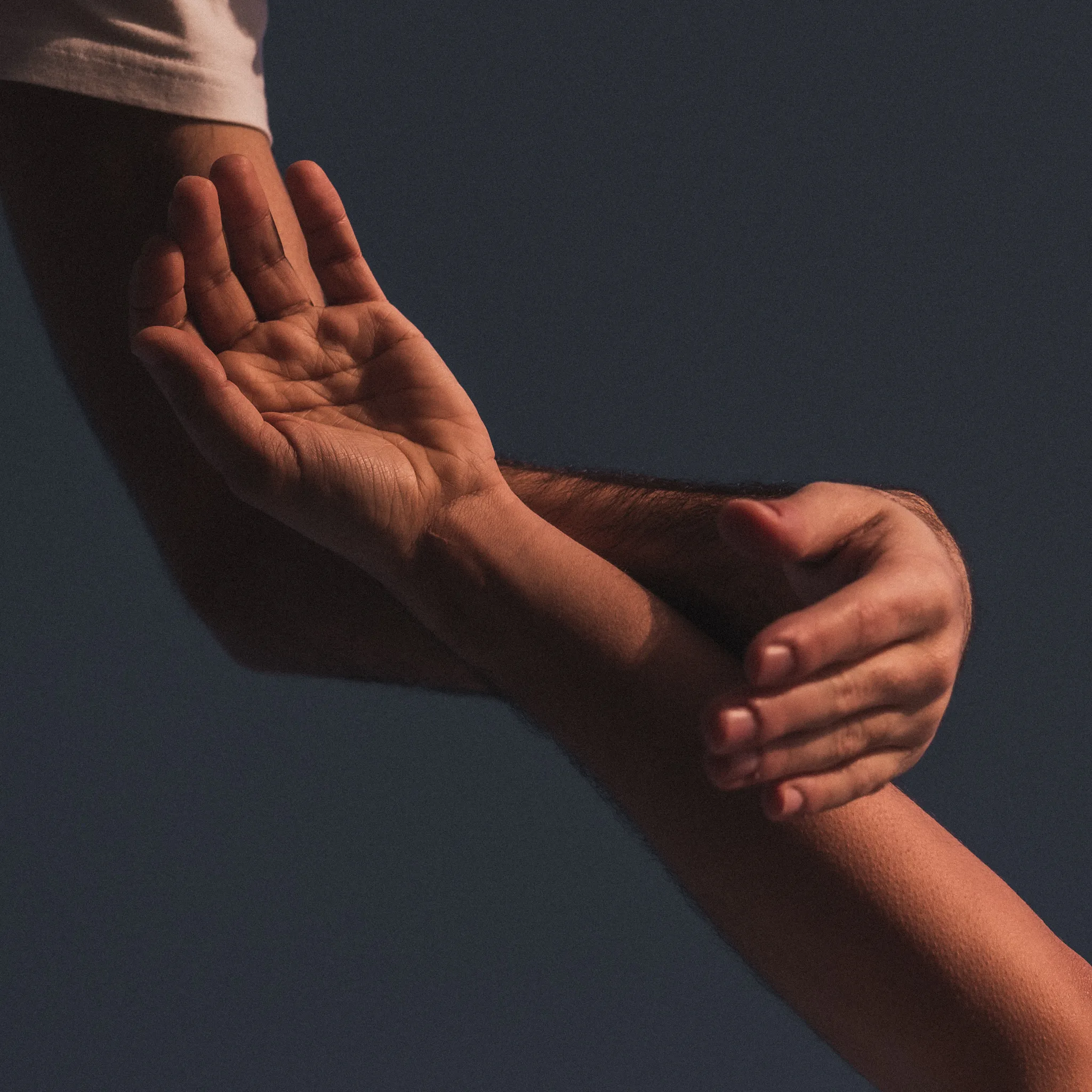
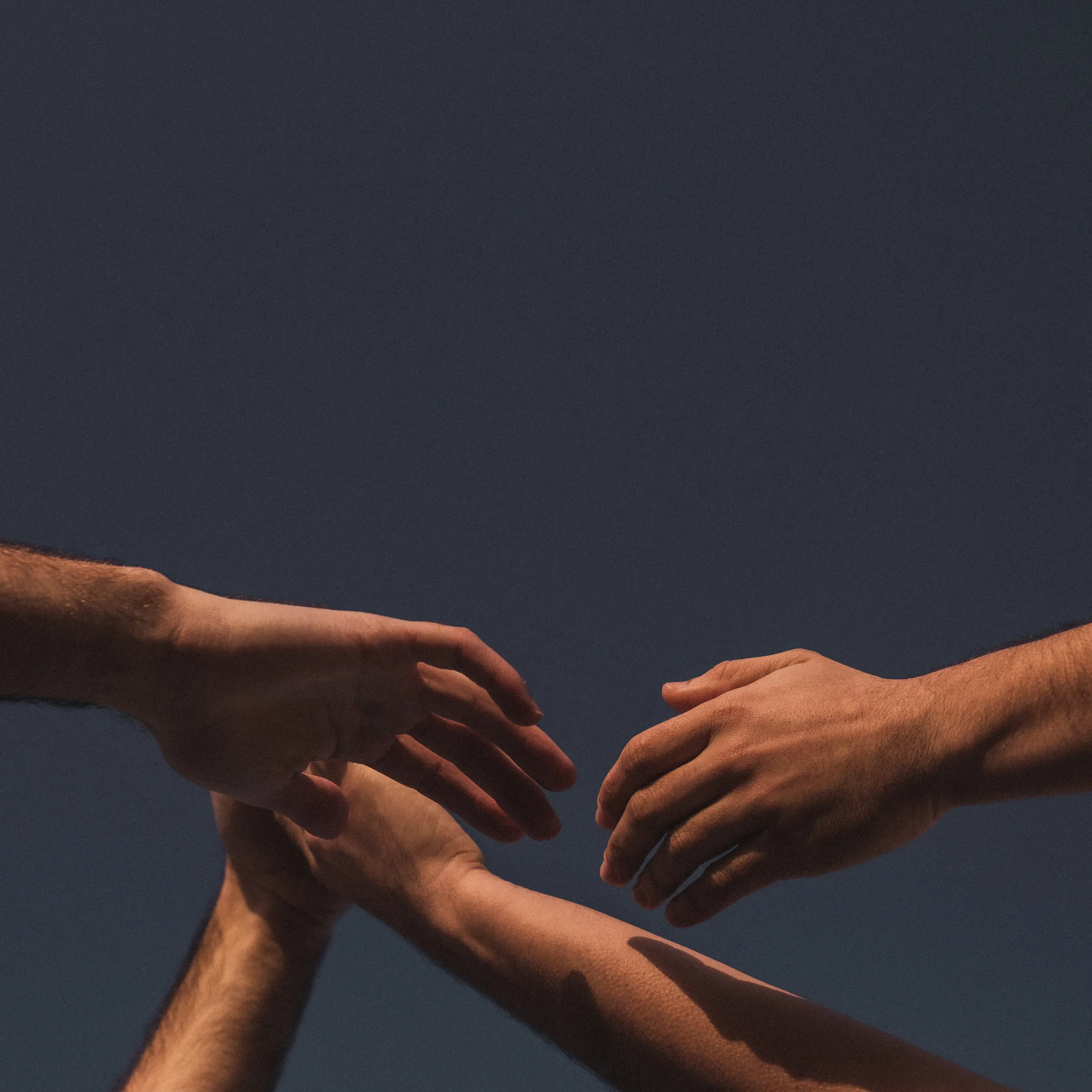
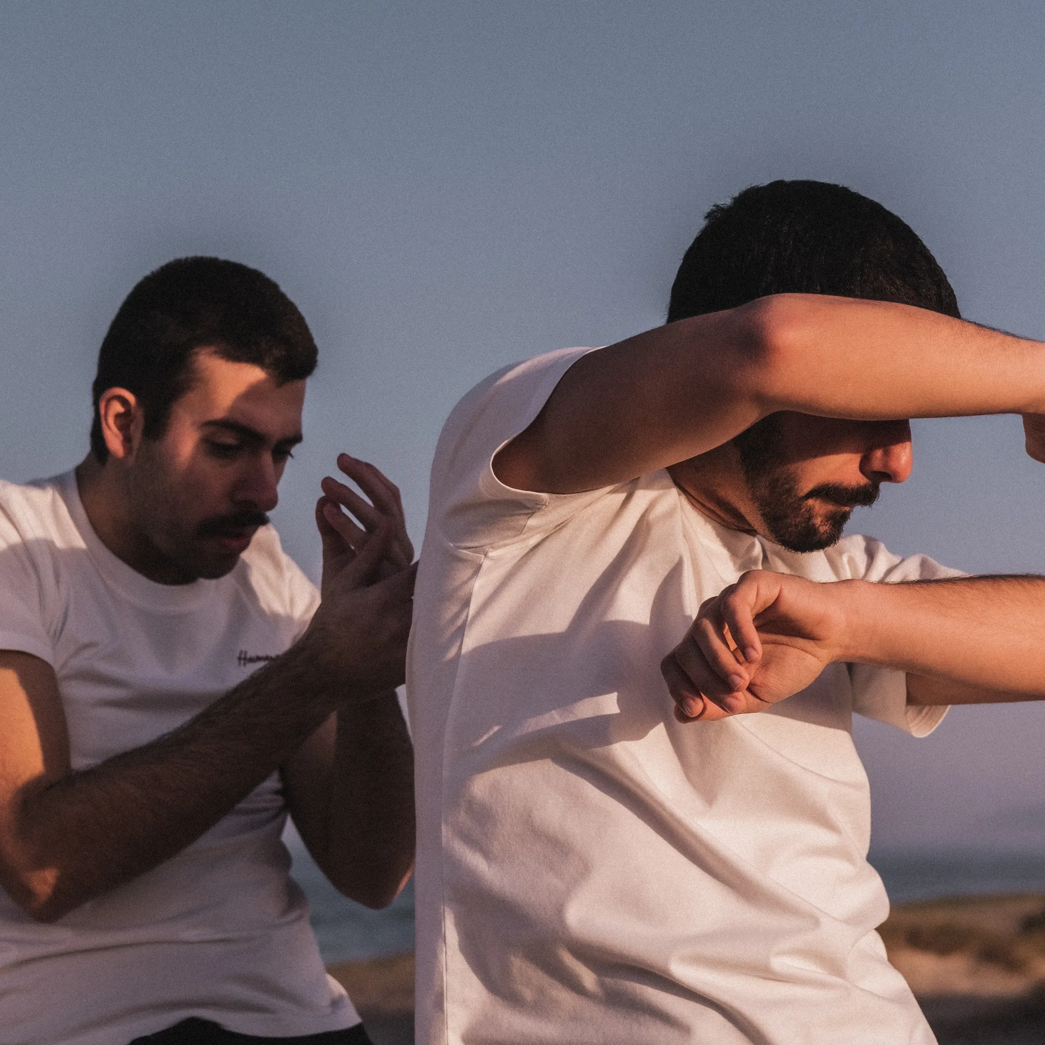
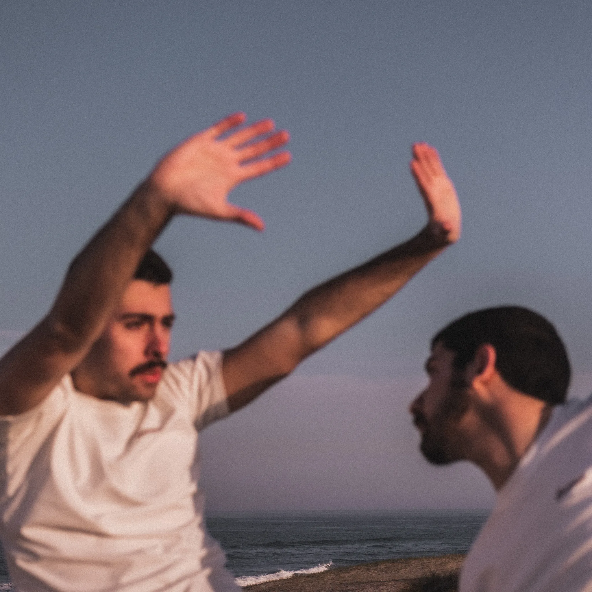
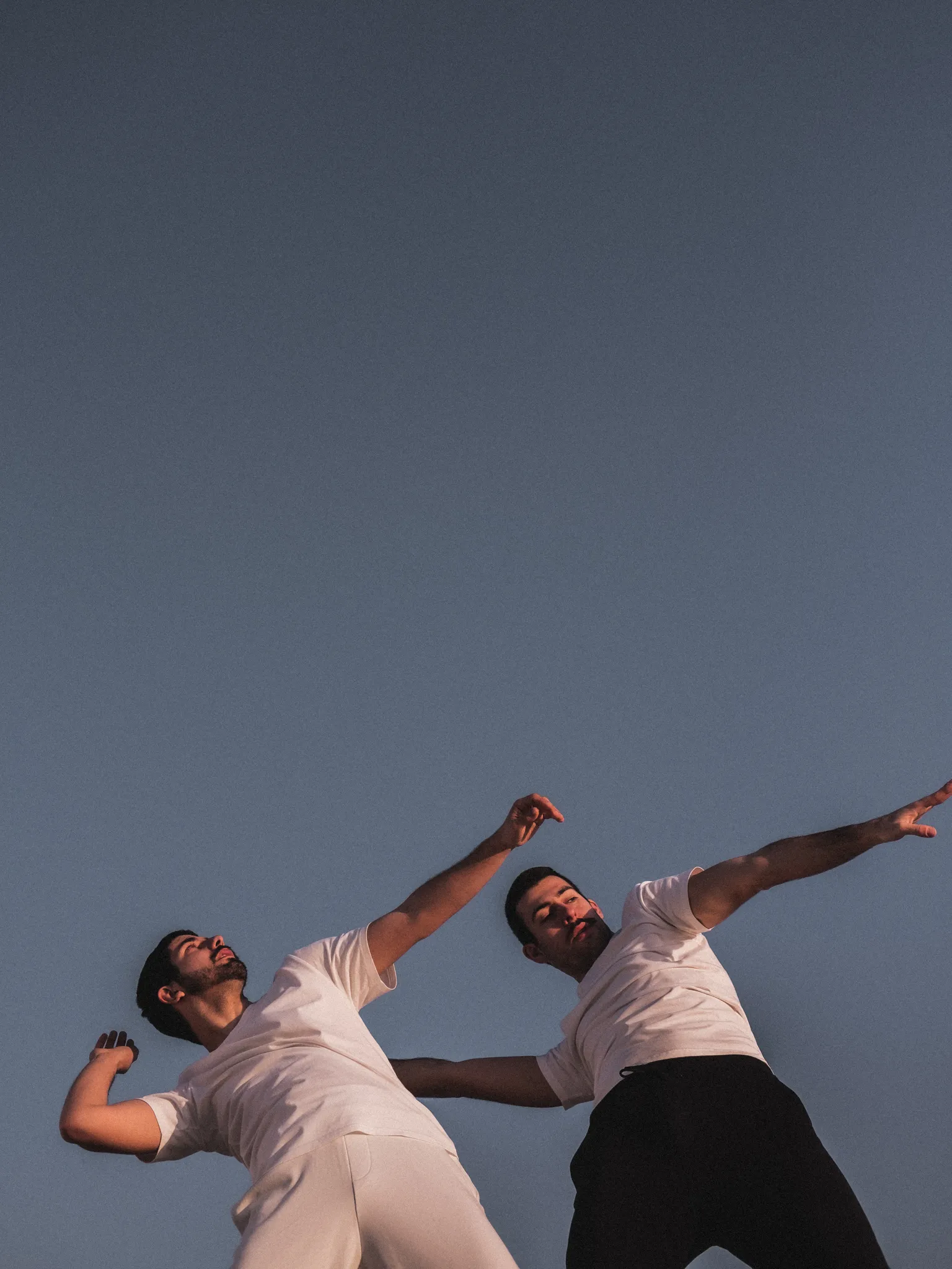
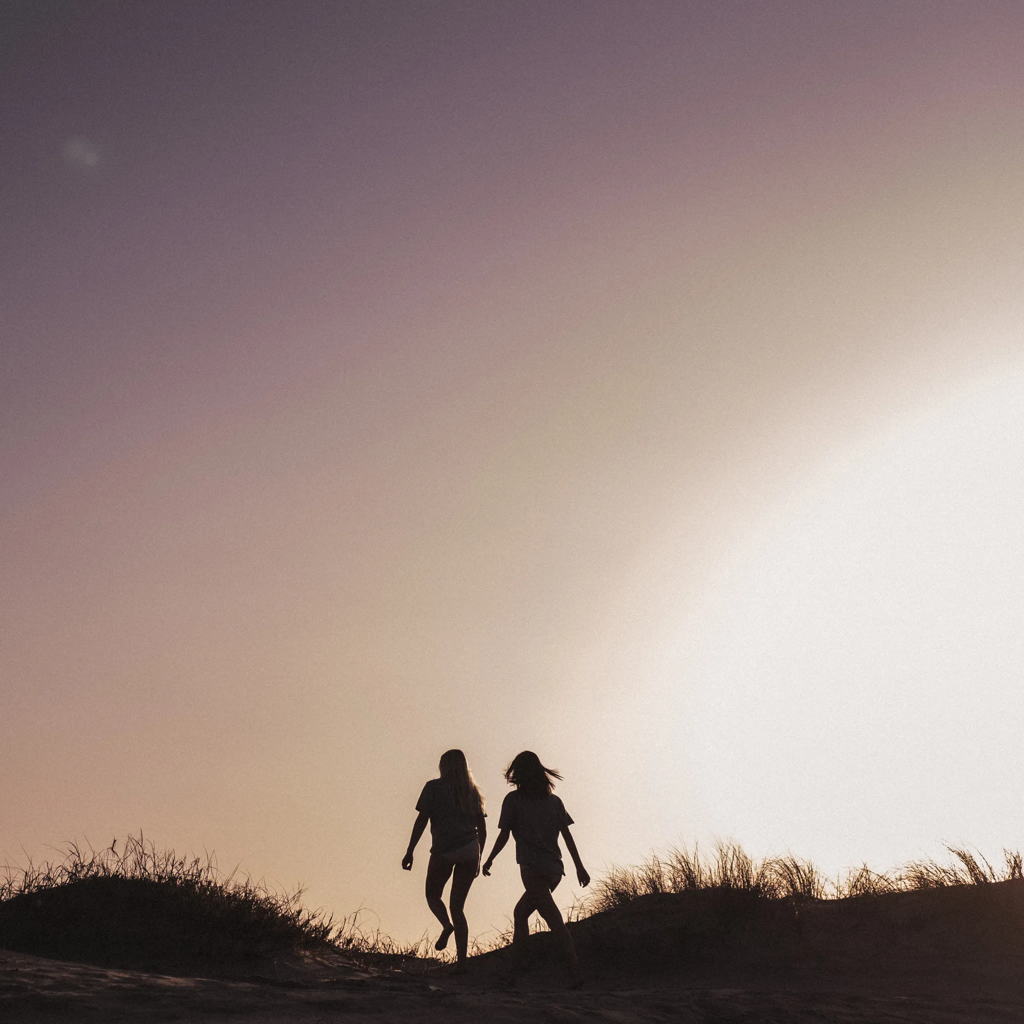
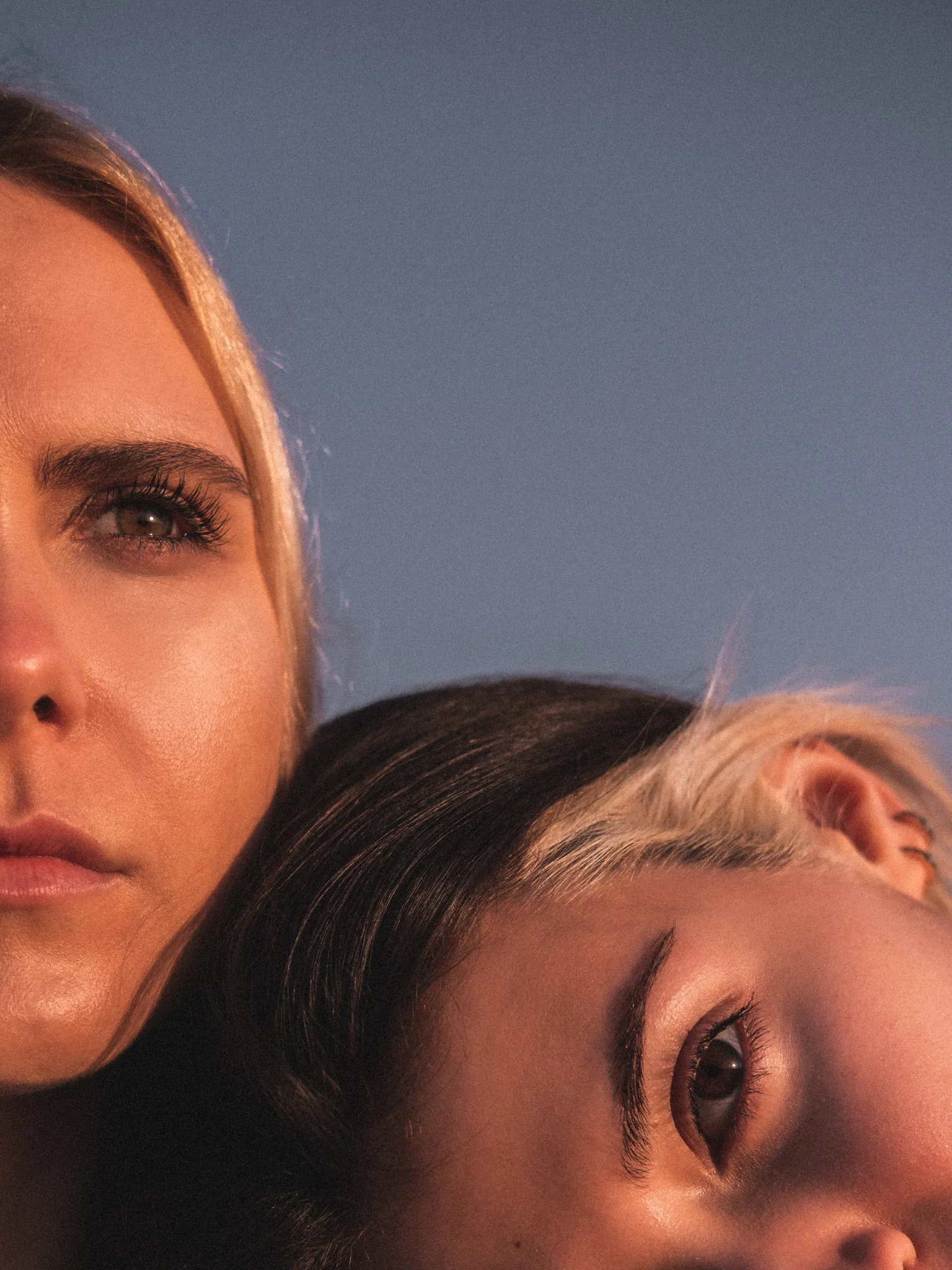
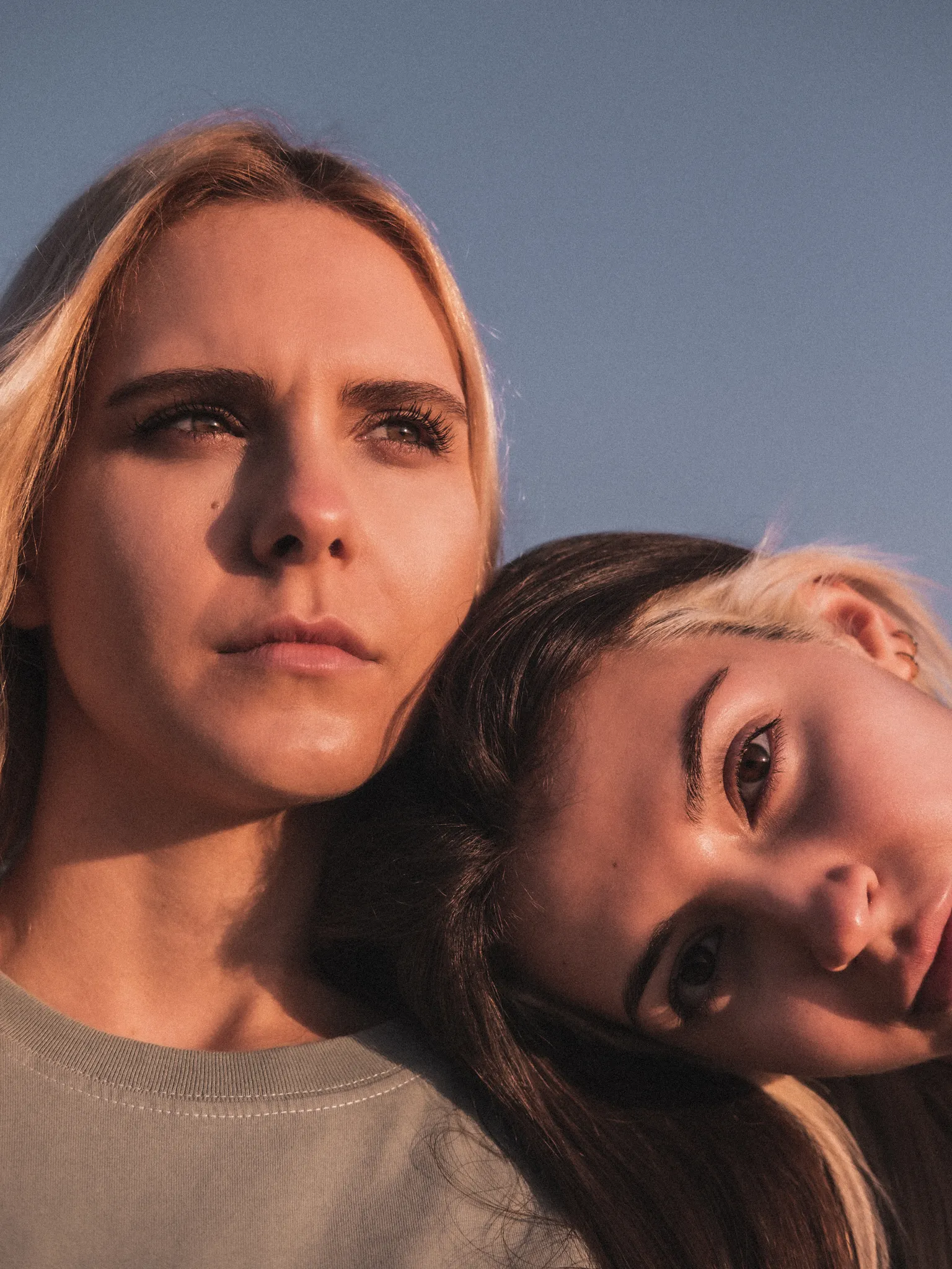
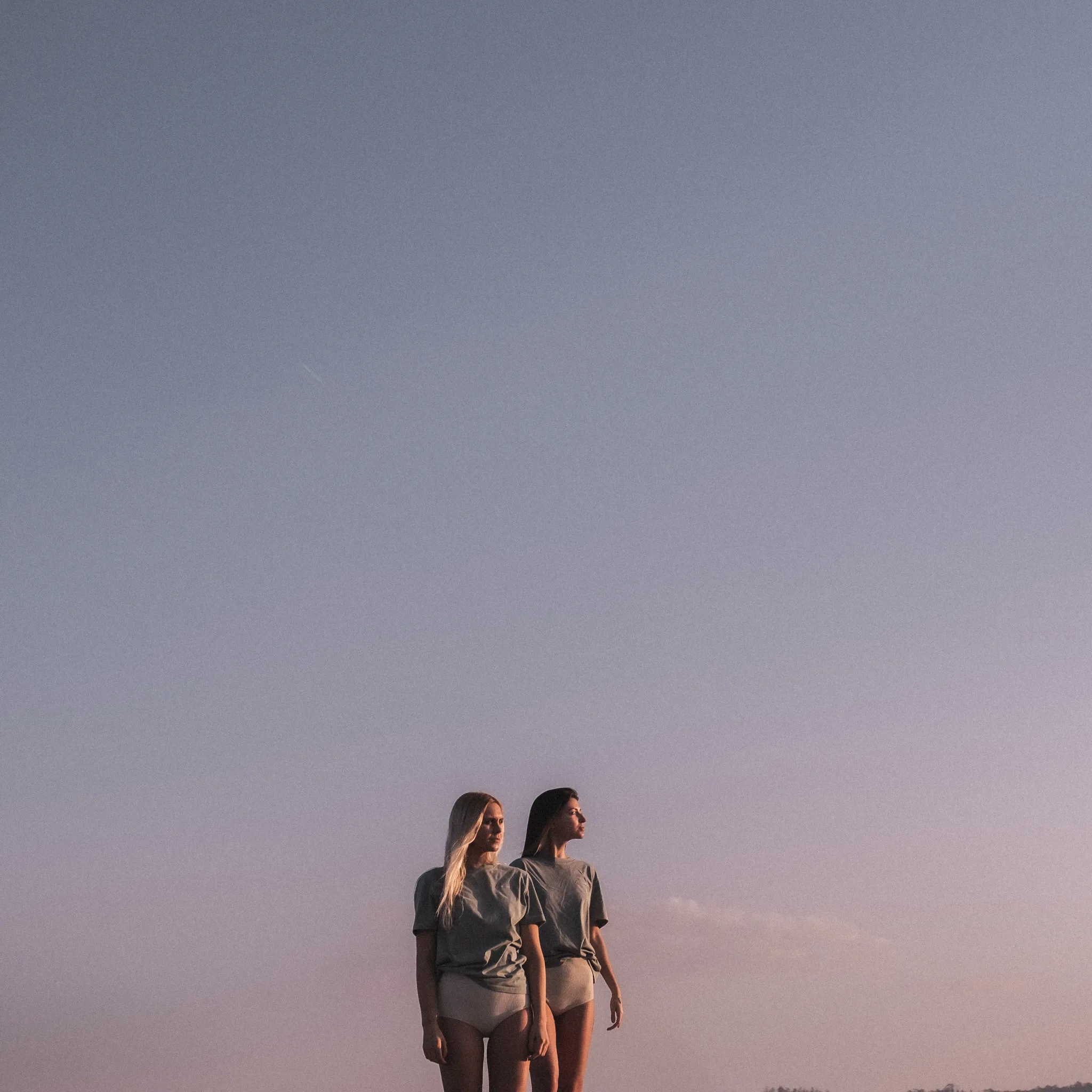
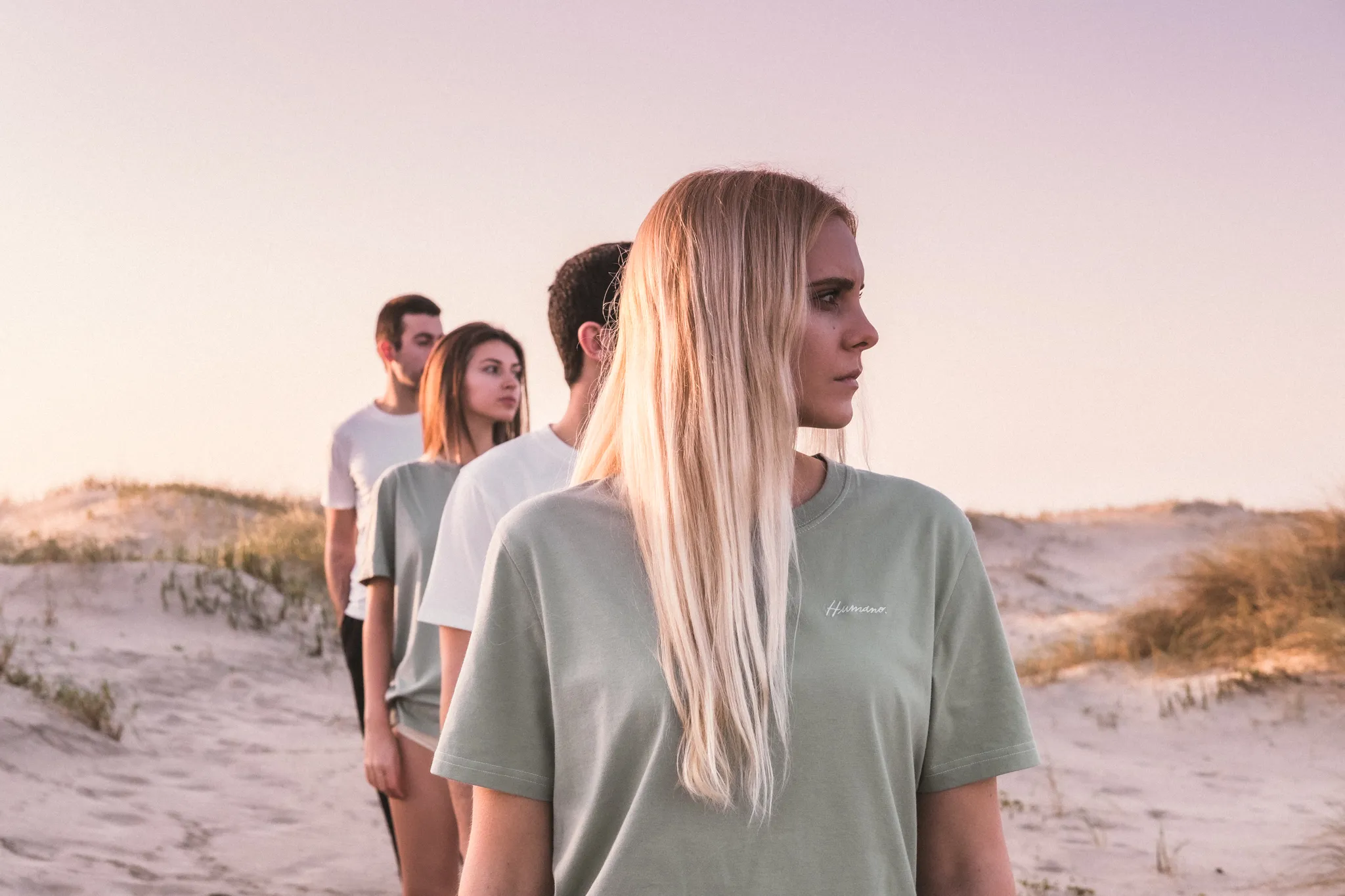
PHOTOGRAPHY
For the photoshoots, the focus was always on the human side of photography. We leaned into softness and honesty—capturing touch, movement, skin, and candour with as little interference as possible. The goal was to reflect the emotional core of each piece through real gestures and quiet intimacy, creating imagery that feels personal, tactile, and alive.
