


Lugar Incomum was born from Catarina’s love for books, language, and the magic of words. It’s a project that grew out of long conversations about turning passion into purpose — and for Catarina, that passion was unmistakably about reading and writing. From the beginning, it was clear this wouldn’t be just another literary blog. It would be a space where language is celebrated, where readers feel at home, and where words are treated with the care they deserve.
I was lucky to be involved from the start, helping shape a visual and verbal universe that felt true to Catarina and everything she wanted this place to be. A space that feels intimate but welcoming, personal but professional — where anyone who loves books can feel a sense of belonging.
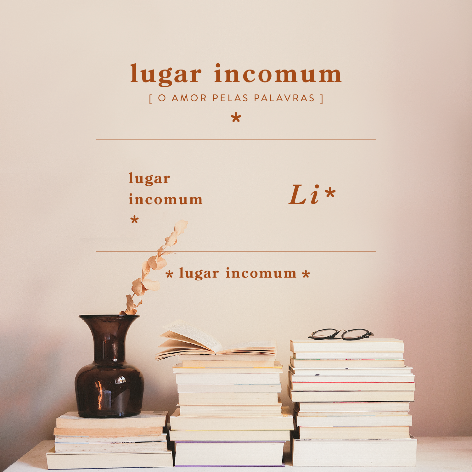
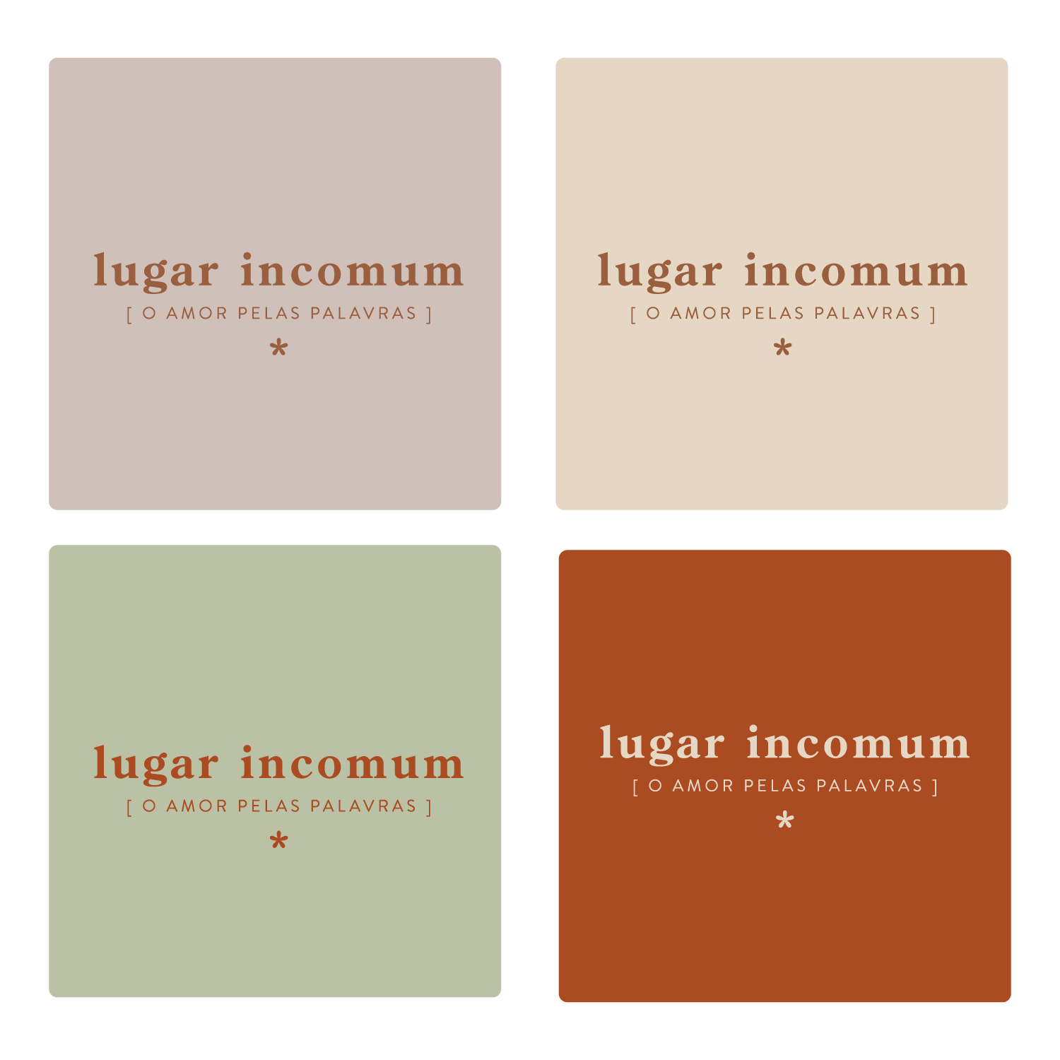
Designing the identity for Lugar Incomum meant finding a balance between neutrality and personality. The brand needed to live beside any book or genre without clashing, but still feel distinctive and full of character.
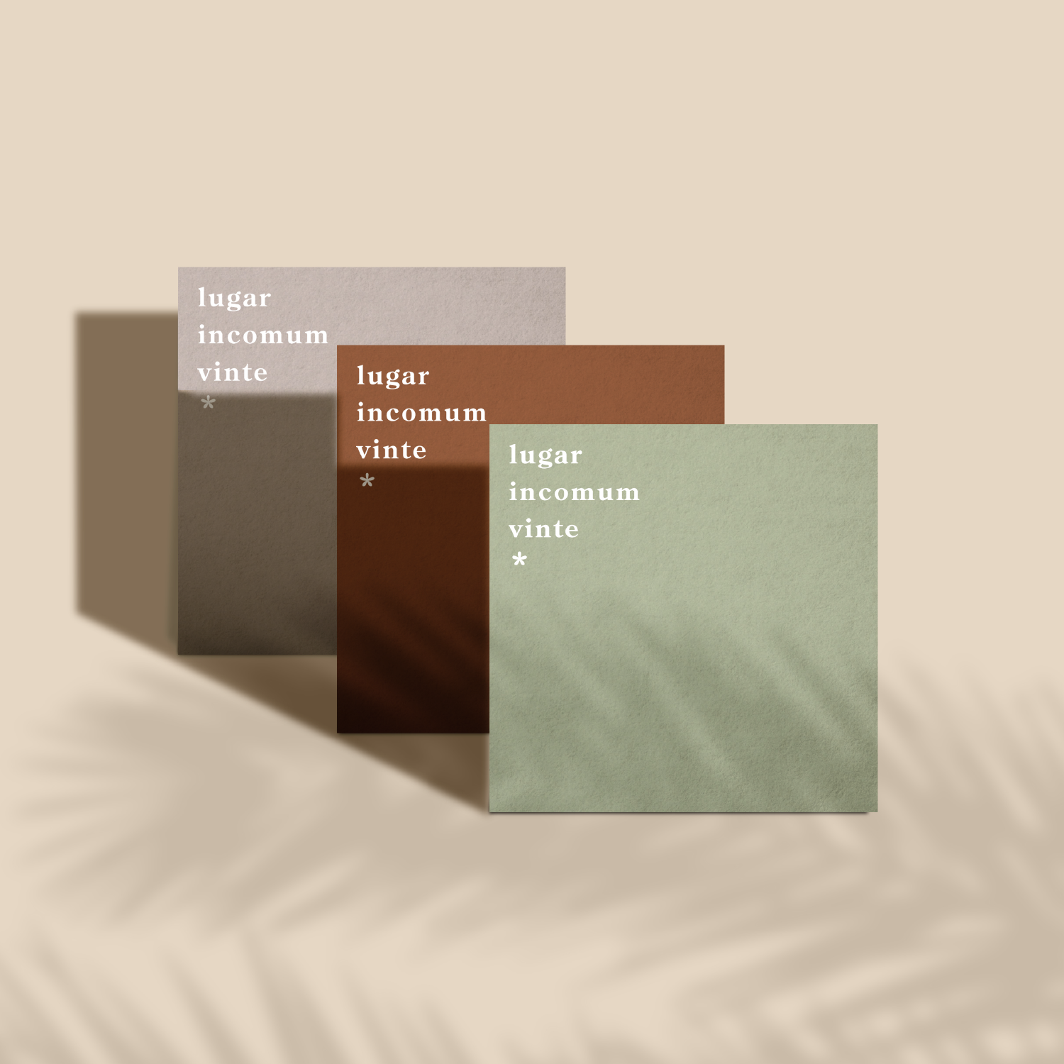
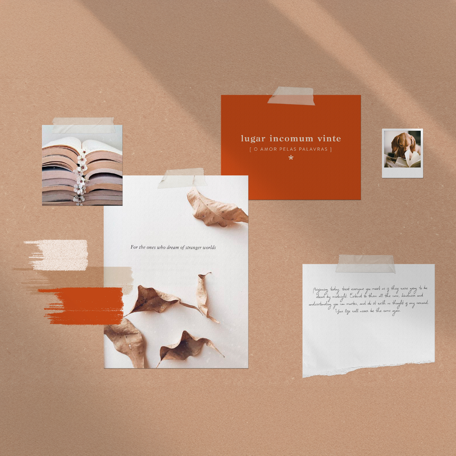
I created a clean typographic system paired with subtle graphic details inspired by the world of books. To bring a more personal and human tone, I also designed a series of handmade symbols and illustrations — like notes scribbled in the margins of a favorite book. These visual touches add warmth and intimacy to a brand built on a deep love of language and storytelling.
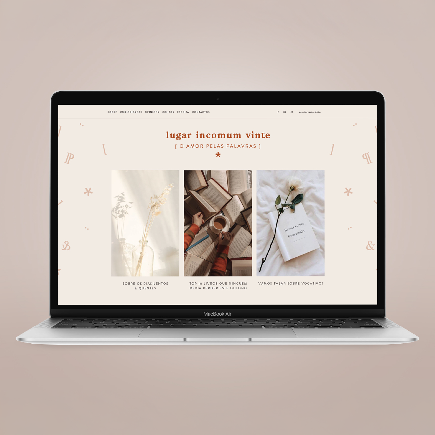
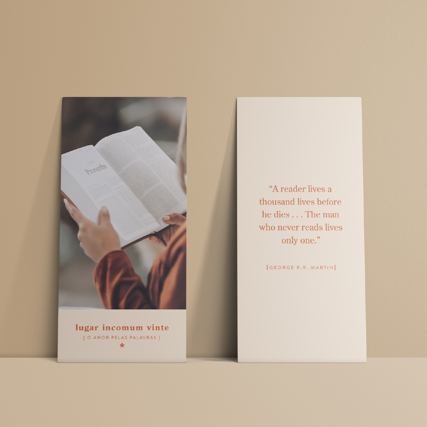
Later on, Catarina asked me to create a set of images for her blog and social media — visuals to live beside her writing. We imagined a cozy and familiar atmosphere, the kind of warmth you feel when curled up with a good book. I used tones inspired by old pages, soft light, and simple objects full of memory. Photographing books without focusing on their content can be tricky, but I found the emotion in the details — the textures, the gestures, the quiet comfort of reading.
