


In a world that loves to box people in, Rafa refuses to be defined. Chef, researcher, creative thinker—she’s in constant motion. The identity we created had to honour that restlessness: something fluid, adaptable, and deeply personal. A system that evolves with her, not just around her.
Because Rafa doesn’t just reinvent food—she reinvents herself. From one project to the next, she brings the same curiosity, the same courage to break the mould. The brand needed to hold space for all those versions: the chef, the storyteller, the cultural bridge.
So the identity isn’t a snapshot. It’s a reflection—of movement, of change, of someone who’s always becoming. It’s not just visual—it’s emotional architecture. Built to stretch, shift, and surprise, just like Rafa herself.
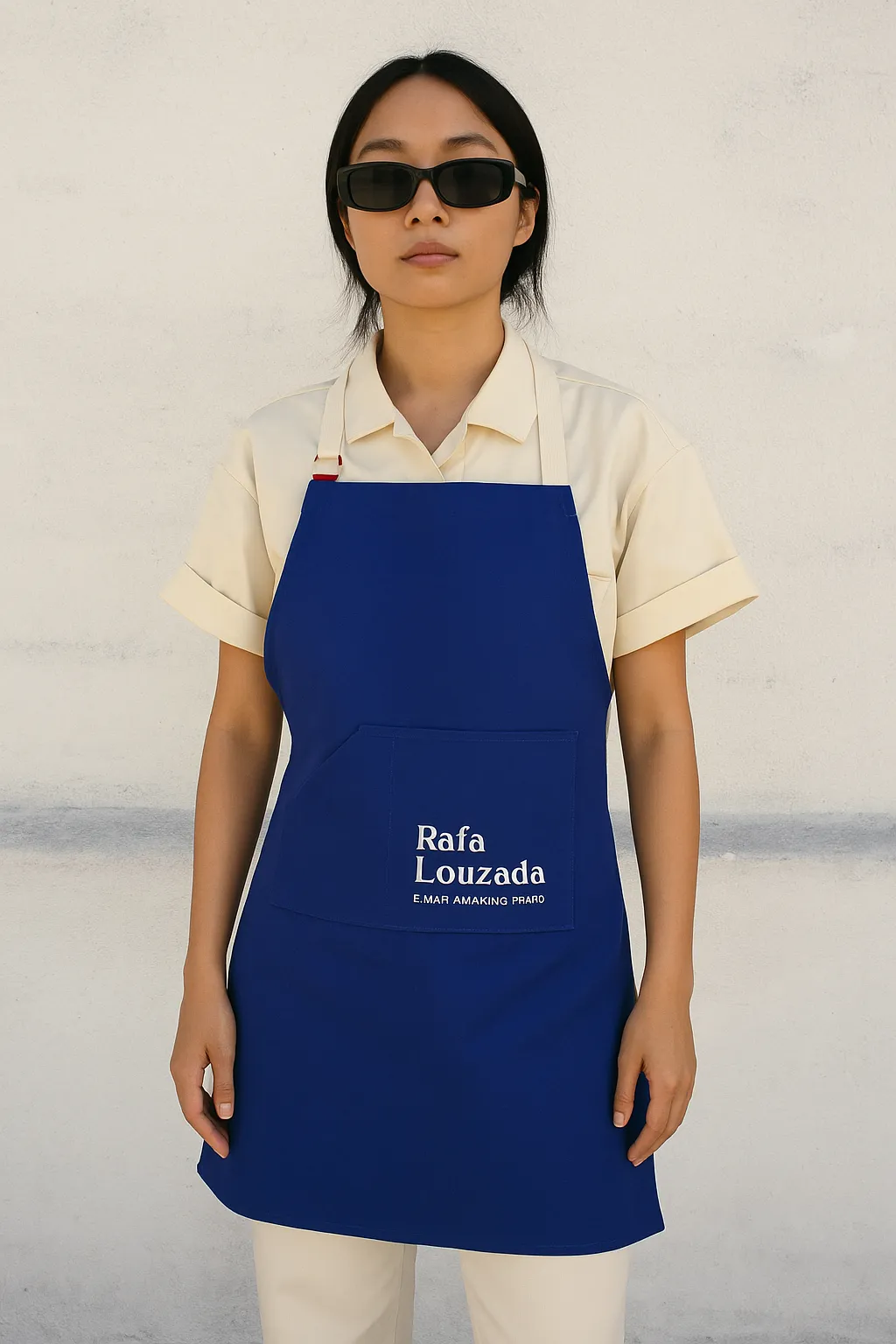
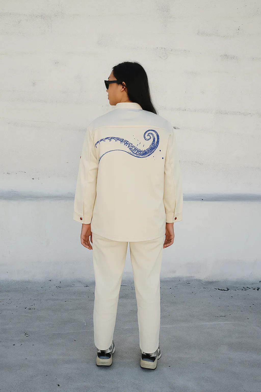
The branding for Rafa Louzada was all about capturing who she is—restless, rooted, and always in motion. From the beginning, it was clear this identity couldn’t be tied to a single format, discipline, or dish. Rafa is a chef, yes—but also a creator of ideas, of spaces, of new ways of seeing.
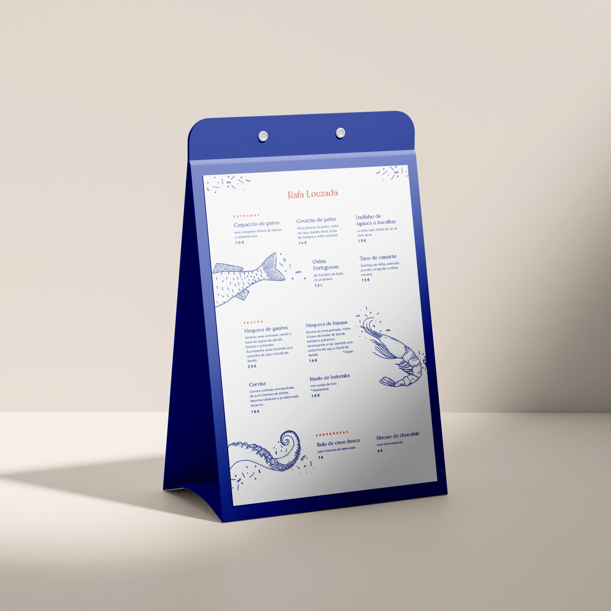
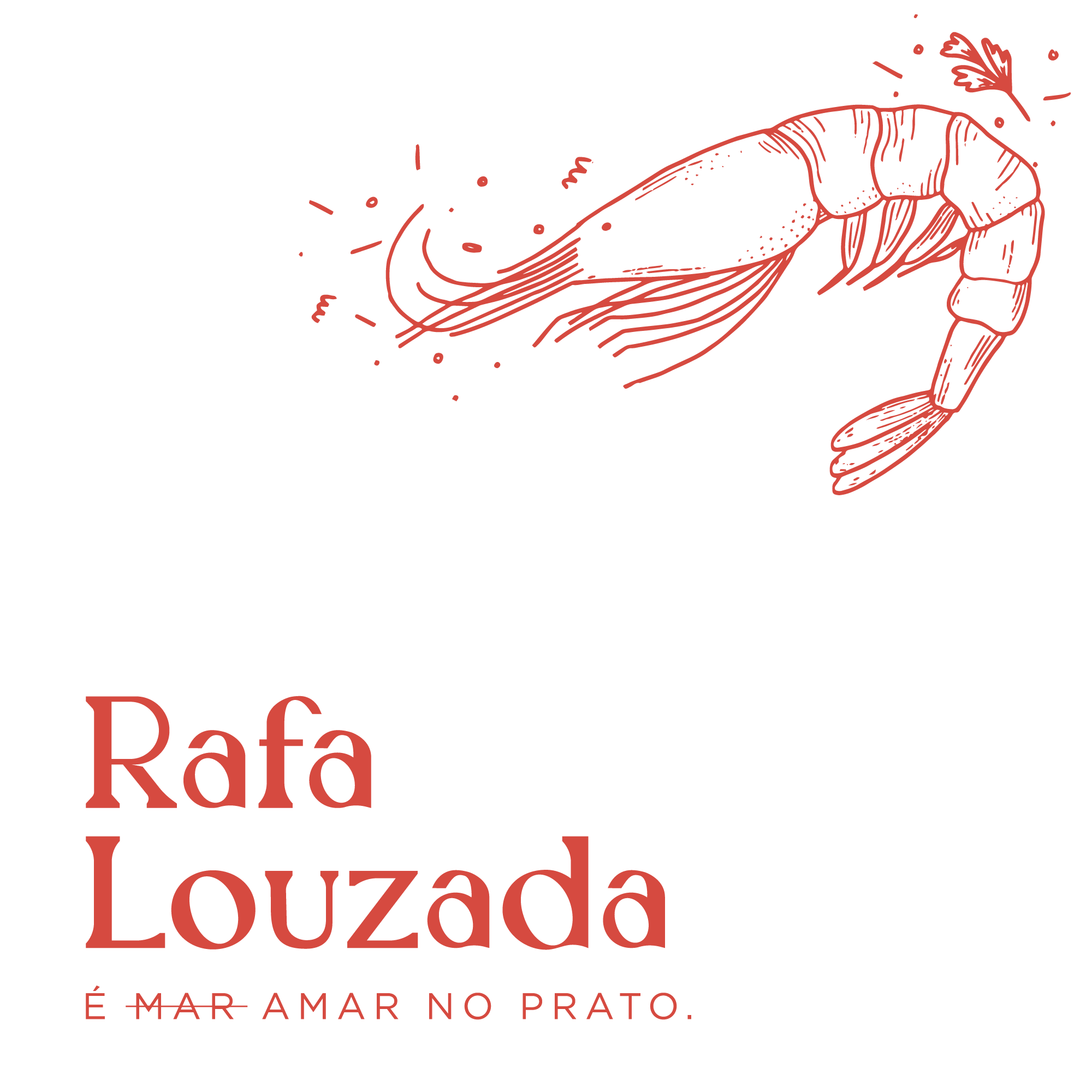
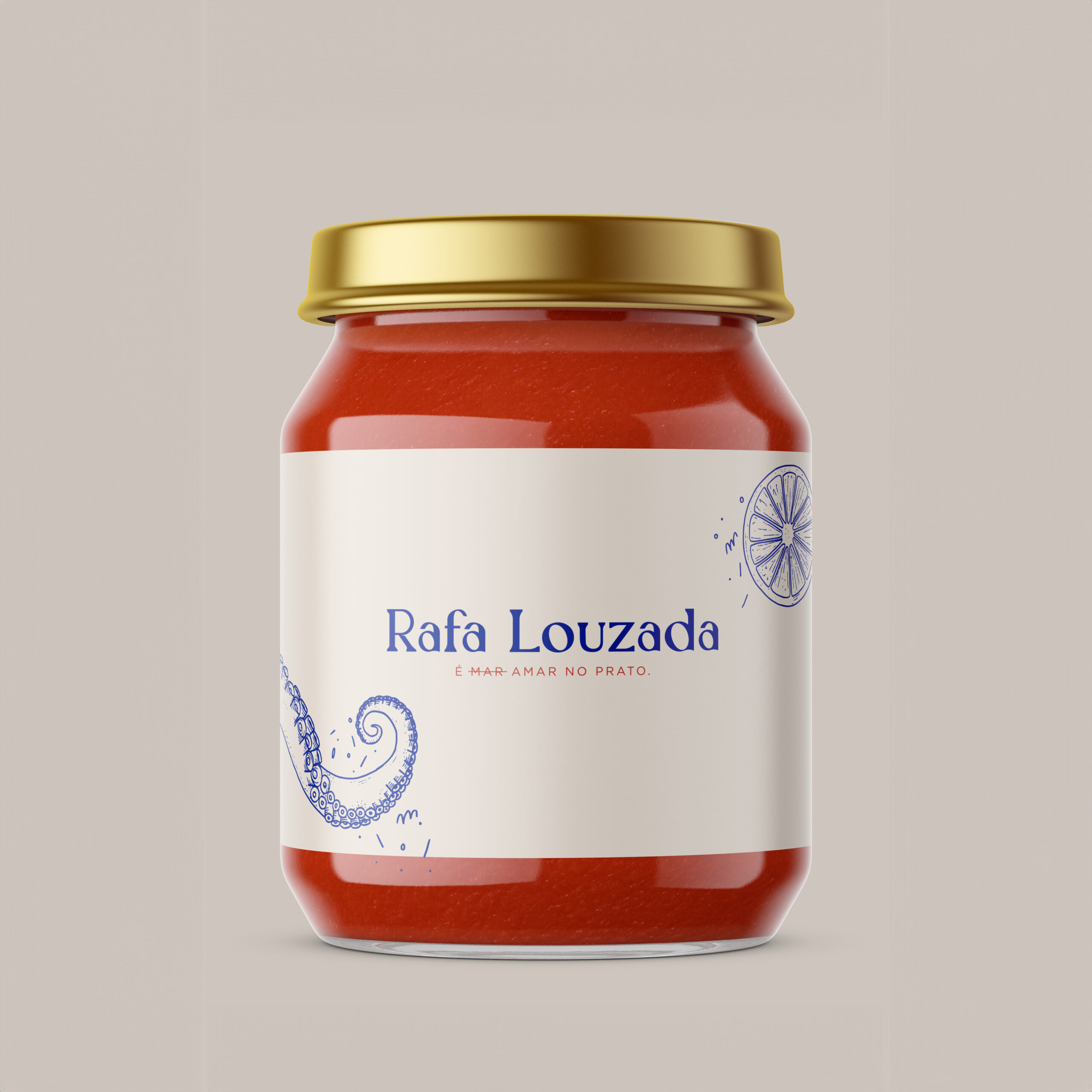
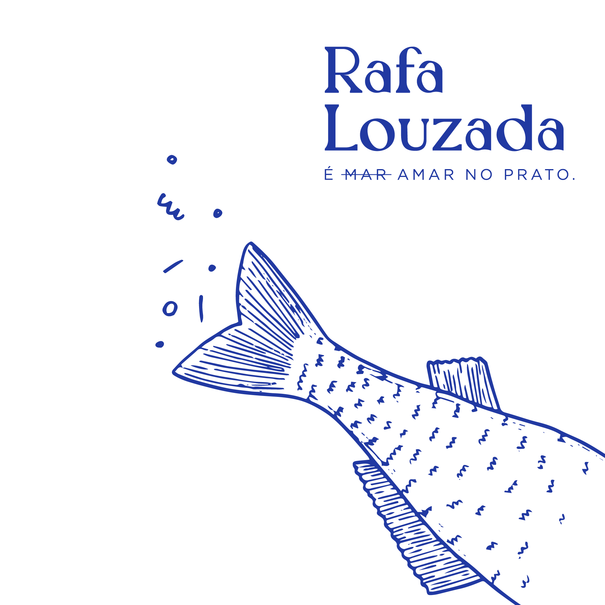
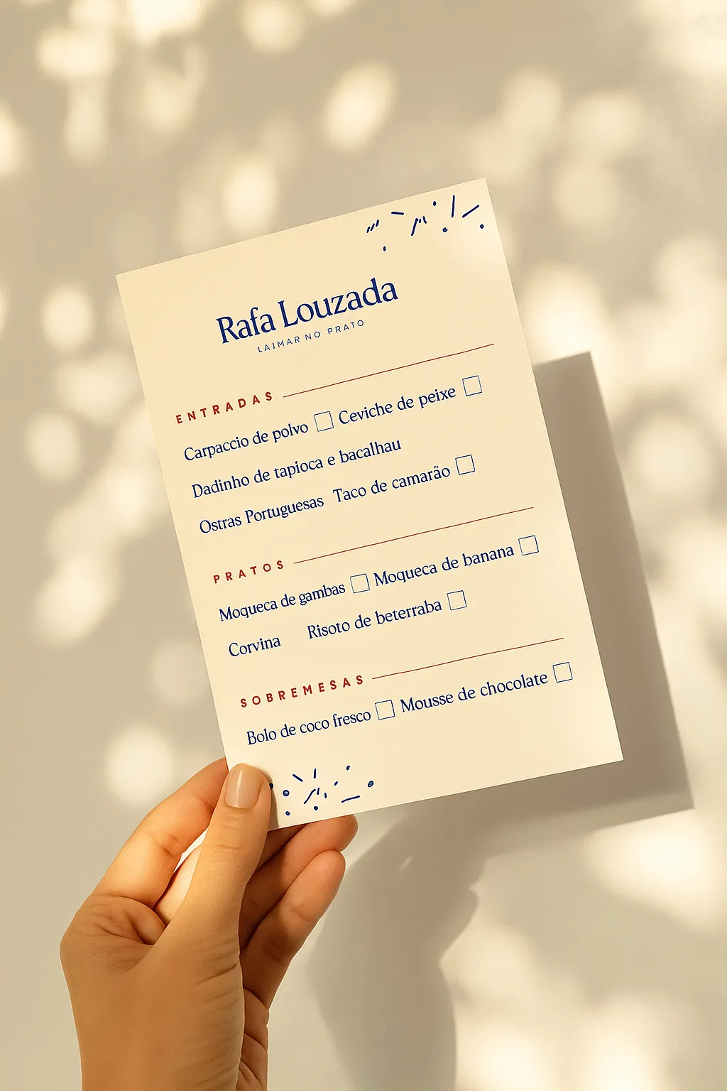
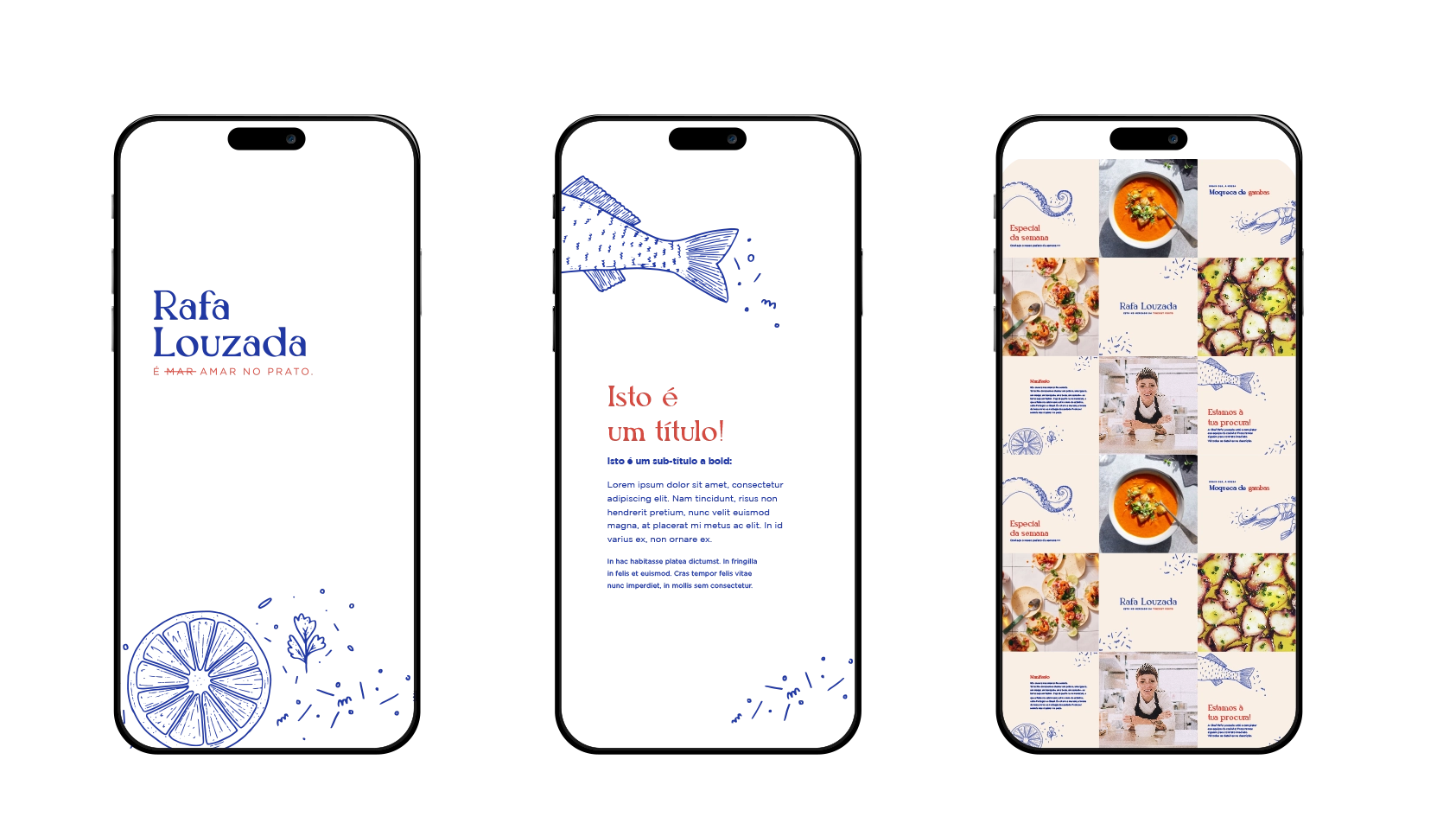
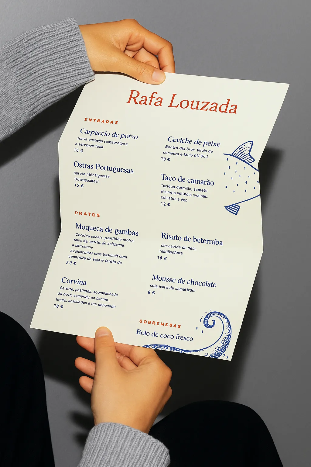
I immersed myself in her world—her stories, her ingredients, her rhythm. I knew the brand had to move with her: bold but fluid, expressive but grounded. That’s why we built a system of contrasts. A classic serif logo to anchor her presence, surrounded by hand-drawn textures and oceanic illustrations that bring movement, memory, and play.
The identity holds together because it holds space—for reinvention, for new projects, for the many Rafa’s still to come. It’s not just a visual mark. It’s a living system. Designed to flex, shift, and stay unmistakably hers.
